Turner Duckworth
Turner Duckworth is a globally recognized branding agency with studios in London, New York, and San Francisco. Founded by Bruce Duckworth and David Turner, the studio is celebrated for creating unmistakable visual identities that elevate the world’s most iconic brands. Their work spans brand identity, packaging, and motion design, blending clarity with bold creativity. Turner Duckworth’s clients include Coca-Cola, Amazon, and Levi’s, among others. The studio has earned numerous accolades, including a Grammy Award for design excellence, reinforcing its reputation as a leader in contemporary brand expression.
Works with Alec Tear, Lewis MacDonald, Refraktiv, Aktiv Grotesk, Crumbl Sans, Kilotype, Mika Melvas, Footlong
Their own site is set in Founders Grotesk, Founders Grotesk Mono
Cases
- Amazon
- Brand Identity Evolution for Amazon

- Blue Diamond
- Packaging Design for Blue Diamond Barista
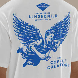
- Blue Diamond
- Packaging Redesign for Blue Diamond Almonds

Awards
Explore awards →Awarded work credited to Turner Duckworth. Coverage is partial; projects may be shared with other studios.
Pentawards2009–2025Gold 12Silver 17Platinum 1Bronze 9Diamond 140 entries · 38 projects
Explore studios with Pentawards awards →
2025
Vocation Brewery
- Gold · BRAND IDENTITY & CONNECTED PACKAGING / E.06 Packaging Brand Identity Projects
Awarded Company: Turner Duckworth
2024
Nominations
Projects named as nominees, finalists or shortlisted entries in the official archive. Listed separately from award wins; coverage is partial.
D&AD1 nominations
Explore nominated studios →
Kleenex
2025 · Shortlist · Type Design & Lettering / Single Typeface
3D Visualiser: Howard Barrett · 3D Visualiser: Mick Connor · Creative Director: Erin Dameron · Executive Creative Director: Andy Baron · Global Director Of Creative Excellence: Jen Kasmarick · Global Director Of Creative Excellence: Beverly Wright · Junior Designer: Mona Monahan · Junior Designer: Michael Zamojcin · Senior Designer: CJ Draper · Senior Designer: Kasi Turpin · Senior Designer: Simon Hayes · Typographer: Alec Tear · Typographer: Lewis MacDonald · Account Director: Gerard Vasco · Entrant Company, Design Agency: Turner Duckworth New York · Brand: Kleenex · Client: Kimberly-Clark
Commendations
Projects receiving Highly Commended, Honorable Mention or Special Kudos in the official archive. Listed separately from award wins; coverage is partial.
Transform Awards1 commendations
Explore commended studios →
Icelandic Provisions
2023 · Highly Commended · Europe — Best visual identity from the food and beverage sector
Agency: Turner Duckworth
Graphis Design Awards3 commendations
Explore commended studios →
Sprite Packaging
2024 · Honorable Mention · Print / Packaging
Design Firm: Turner Duckworth: London, San Francisco & New York
Tastes Like Miller Time, America Branding
2024 · Honorable Mention · Print / Branding
Design Firm: Turner Duckworth: London, San Francisco & New York
Key people
Designers and creative leads attributed to Turner Duckworth in press coverage.
News & interviews
Clients
Tech Stack
Technologies detected on Turner Duckworth's website.