Coffee is one of the most crowded briefs in branding: the product is a brown liquid, the category conventions are settled, and almost every roaster sells the same three things — origin, craft and a room to sit in. What separates the work below is not style but which problem each studio decided to solve first.
This page reads fourteen projects from the D1S1 catalogue in four groups, by the decision that carries the identity: the typography, the way a range is organised on shelf, the illustrated world, or the colour and voice. Each entry links to the full case on D1S1 and to the studio’s own writeup, which is where the credits come from.
These four carry almost everything in the letterforms. There is no mascot and no illustrated world to fall back on, so the choice of face, and the hierarchy built from it, has to do the differentiating on a shelf where every neighbour is also using a grotesque.
Oddity · Set in Matter by Displaay
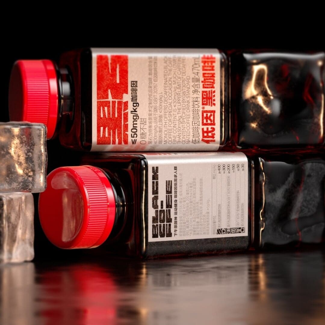
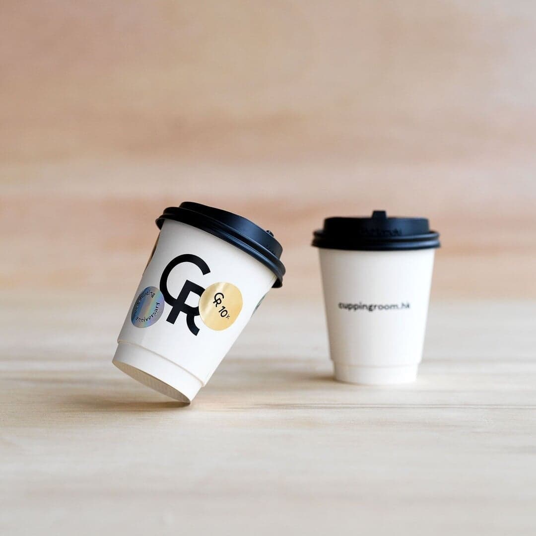
Oddity built the Hong Kong roaster’s system out of a strict typographic hierarchy, structured grids and monotone photography — a deliberately quiet base that reads as laboratory rather than café. The release valve is colour: bright labels and stickers carry special editions and collaborations without touching the core system. It is the cleanest example here of separating a permanent identity from the seasonal layer on top of it.
Alter · Set in Quadrant + Beatrice
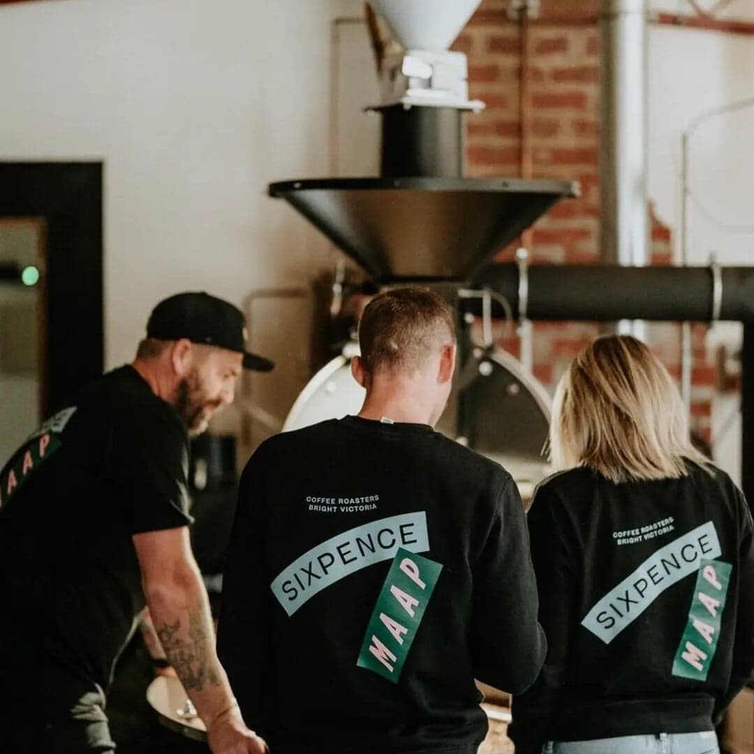
Alter took the historical sixpence coin — bent and given away as a token of affection — and turned that gesture into type. The curves and terminal details in the wordmark are the argument; the rest of the system stays restrained so the reference does not become a costume. A small-batch roastery in Bright, Victoria, given a story that survives being printed at bag scale.
Order Design · Set in American Grotesk Condensed
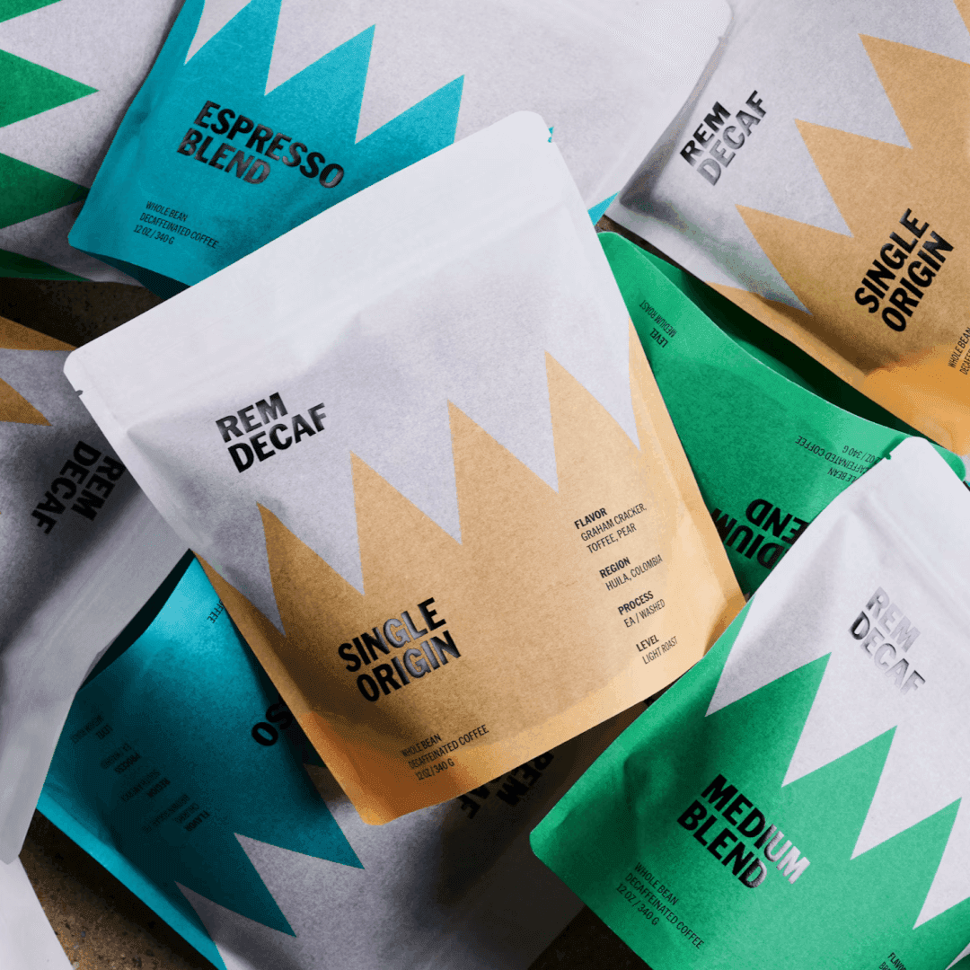
Decaf is usually branded apologetically — the same identity, quieter. Order instead made sleep the subject, structuring the identity and packaging around the stages of the REM cycle, so the thing the product lacks becomes the thing it is about. The condensed grotesque keeps the tone awake rather than sedate.
Hondo · Set in Chroma Sans
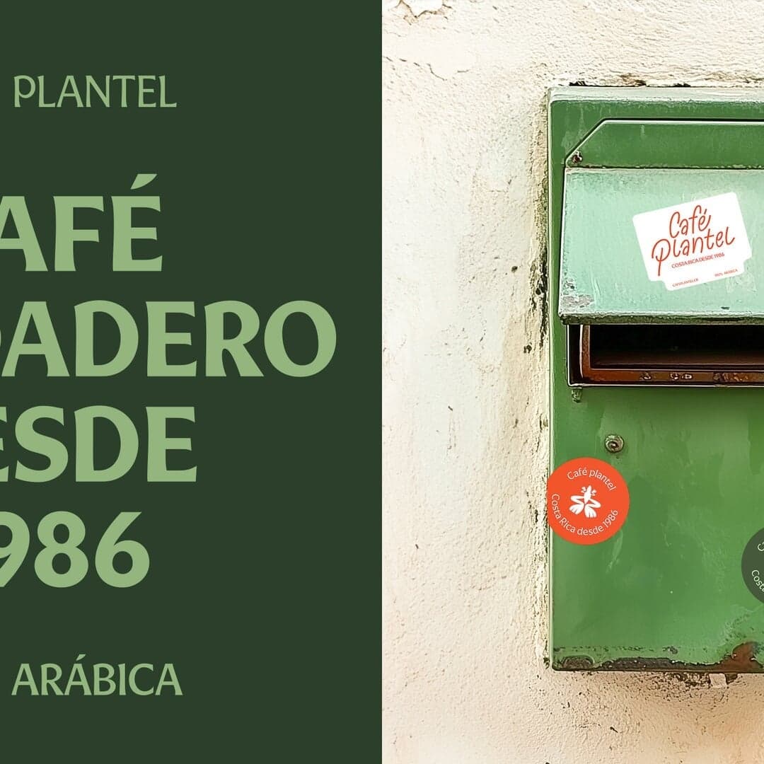
HONDO rebuilt a Costa Rican family coffee brand around landscape and local symbolism rather than the usual origin-story photography. The result is warmer and more graphic than the specialty-coffee default, and the type does the heavy lifting in holding it together. Useful as a counter-example to the idea that heritage has to look archival.
A roaster’s packaging is an information design problem before it is a decorative one: blends rotate, roast profiles have to be told apart at arm’s length, and the system has to survive new SKUs nobody has thought of yet. These four all solve the range, not just the bag.
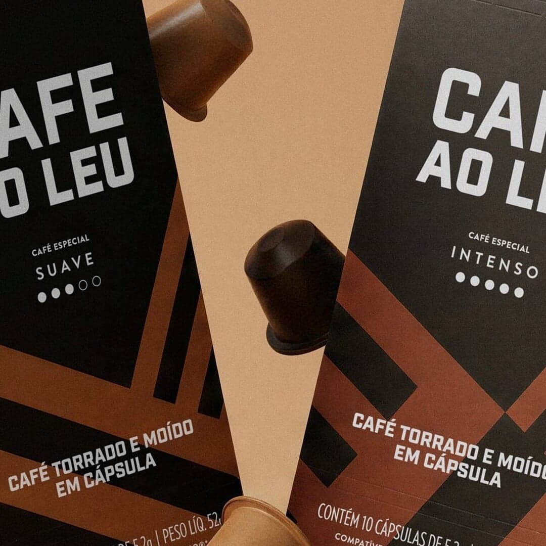
The brief was not a new identity but an extension of an existing one into Nespresso-compatible capsules. Céu Design kept the recognisable brand elements intact and used the new format to separate one Brazilian coffee into two roast profiles — Intenso and Suave — so body versus sweetness and acidity is legible before the box is opened. A good model for how far an identity can stretch without being redrawn.
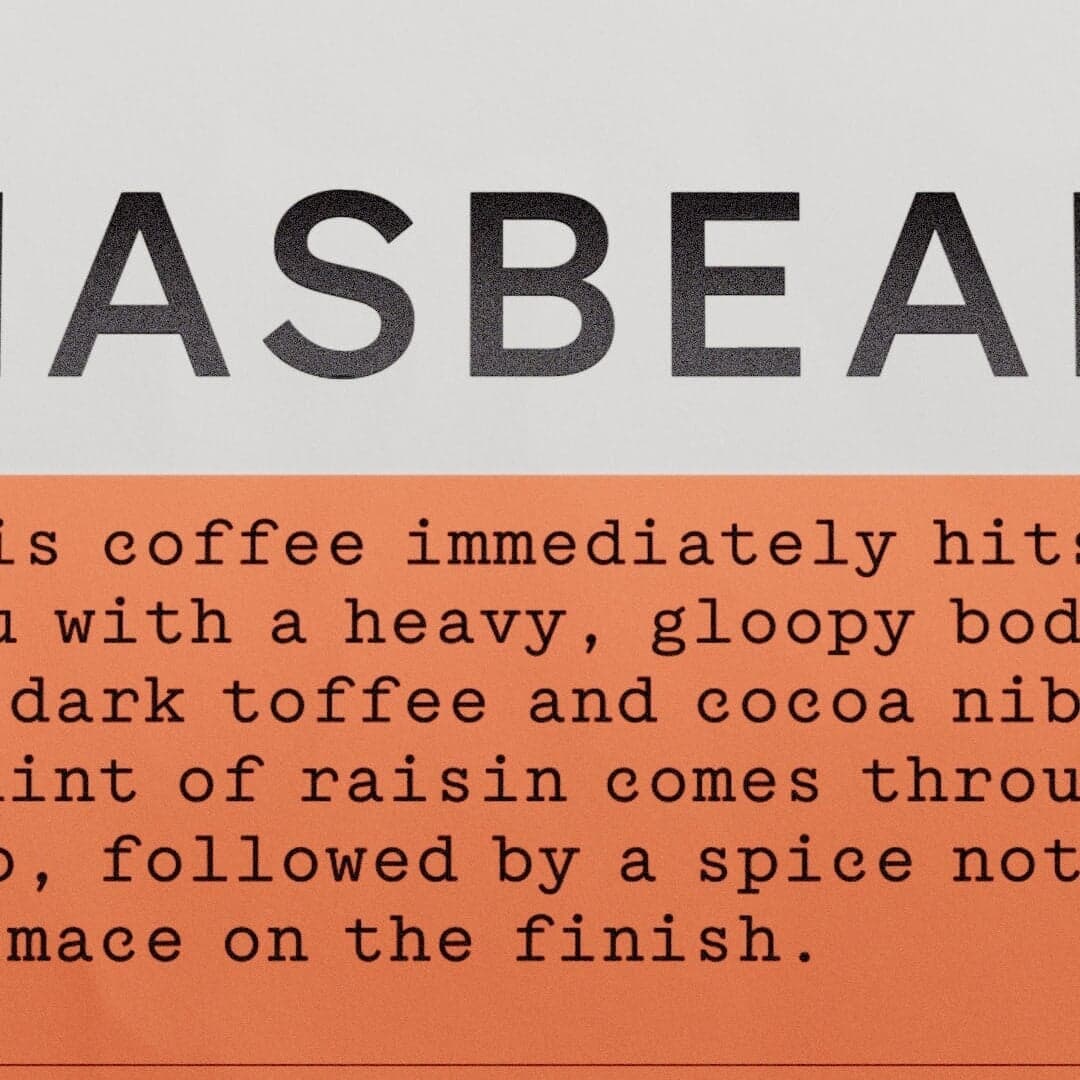
Studio Tyrrell organised an evolving blend range taxonomically, around flavour, and gave each entry a character — so the shelf reads as a collection rather than a list. Identity, packaging and website were built on the same structure, which is what keeps a rotating range from fragmenting. The packaging took the Coffee Design Award for best packaging.
Where the previous group organises, this one narrates. Illustration is the fastest way to give a café somewhere to live, and the risk is the same every time: a world charming enough to draw is rarely disciplined enough to run a menu, a cup and a shopfront.
Studio Mast anchored a barista-owned shop in Colorado Springs on six interlocking rings — one per founder — so the mark encodes the ownership story rather than the product. Landscape illustration ties it to the place. The symbol is simple enough to work at cup scale while the illustrated layer stays optional.
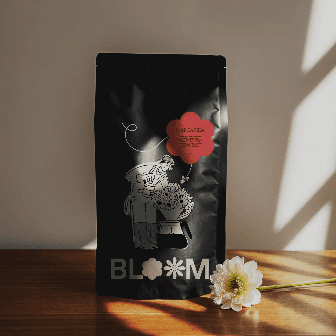
Céu Design built an independent café in Volta Redonda around “blooming” — the moment water first hits fresh grounds and releases bubbles — and let that supply both the graphic language and the pacing of the brand. Organic shapes and editorial compositions carry the system; a gardener and a bee give it recurring characters. A clear answer to the generic-café-aesthetic problem the studio names in its own writeup.
The last group wins on tone. In each, a single colour decision or a line of copy does more work than any mark — which is what you want when most of the brand is experienced standing in a queue.
Colt refused the Scottish visual clichés and went for Glasgow’s dry humour instead, building the café identity on the line “Serves You Right”. Acid yellow, a typographic wordmark and terse copy run across cups, menus, bags, clothing and signage. Proof that in a café the verbal identity is the identity, because customers read it while they wait.
M — N Associates made the ubiquitous Vietnamese plastic stool the core symbol, then built a flexible system around Saigon street-coffee rituals: a blue-and-yellow palette drawn from propaganda posters, halftone newspaper textures, a custom typeface with Vietnamese diacritics, iconography and uniforms. It is designed to scale into sub-brands without losing the street reference. The strongest example here of an identity grounded in a behaviour rather than a product.
The four groups are not styles to pick from a shelf — they are answers to different constraints. This is the trade-off each one is making.
Curated by the D1S1 editors. Last reviewed . Every credit above comes from the studio’s own case page, linked on each entry.
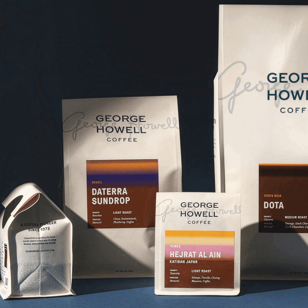
Proportion had to update a name that carries real weight in specialty coffee without flattening it. The two moves worth studying are a deliberately imperfect hand-drawn icon, which returns warmth to a brand positioned on rigour, and a colour-coded flavour palette that turns tasting notes into navigation. It is packaging doing the job of a shop assistant.
The opposite strategy to the systems above: no flexible architecture, just material. Paul Belford Ltd made the craft claim physically, in tactile stock and letterpress typography, so the packaging argues for small-batch roasting by being manufactured that way. It dates far more slowly than a graphic device would.
EightySeven went local and specific rather than universal: Texan Americana, with Dazed and Confused as the reference point, applied across packaging and signage. Verbal and visual were developed together, which is why the tone survives outside the pack shots. Nostalgia used as a positioning tool, not as decoration.
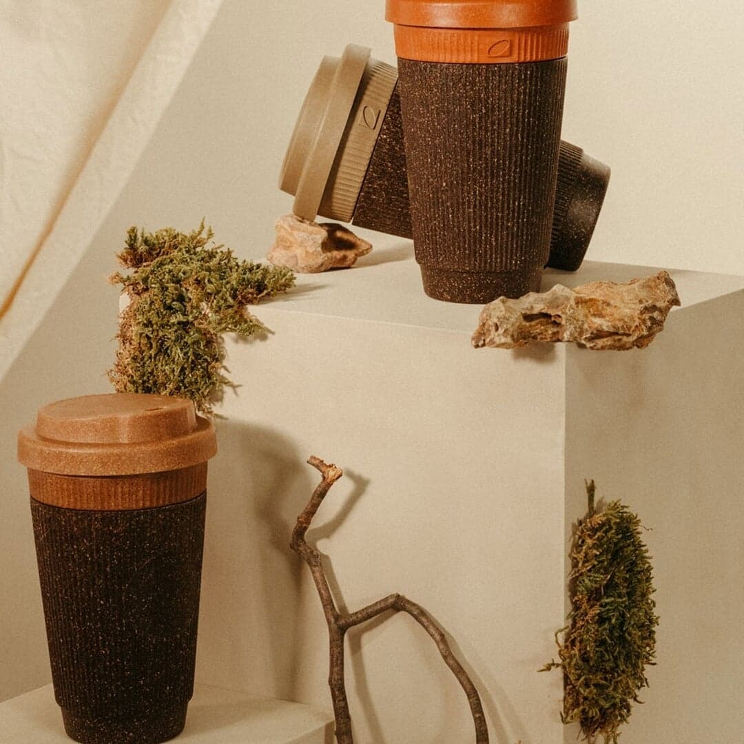
Kaffeeform makes durable products out of recycled coffee grounds, and Studio Bruch let the material logic set the graphics: a reduced coffee-bean shape shown in negative, standing for something remade from what was left over. Earthy colour and a contemporary type-and-form pairing keep it product-focused rather than eco-worthy. The concept is legible before any copy is read.