Paul Belford
Paul Belford Ltd is a London-based creative agency renowned for its intelligent, idea-driven approach to branding, packaging, design, and advertising. Founded by award-winning designer Paul Belford, the studio blends conceptual thinking with meticulous craft to create distinctive visual identities and campaigns. Known for its refined aesthetic and strategic clarity, the agency has collaborated with leading brands such as Nike, The Guardian, and Channel 4. With a portfolio spanning global and cultural sectors, Paul Belford Ltd continues to set a benchmark for design excellence and creative innovation in contemporary communications.
Their own site is set in Helvetica, Helvetica Neue
Cases
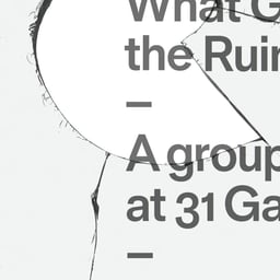
- 31 Gallery
- Poster Design for 31 Gallery Exhibition
- Adidas
- Poster Design for Adidas Predator Instinct Event

- Ataxia
- Advertising Campaign for Ataxia Charity

- Beanworks
- Branding and Packaging for an Artisan Coffee Company

Awards
Explore awards →Awarded work credited to Paul Belford. Coverage is partial; projects may be shared with other studios.
D&AD2023Wood 1Graphite 12 entries · 2 projects
Explore studios with D&AD awards →
2023
Calcio Storico
- Wood · Photography / Sports
Design Agency: Paul Belford Ltd
Royal Court Theatre
News & interviews
Clients
Tech Stack
Technologies detected on Paul Belford's website.
AWShosting
Google Analytics 4analytics