
The neo-grotesque that defined Swiss modernism — released as Neue Haas Grotesk and renamed Helvetica in 1960. View at Haas / Monotype →
Used by Order Design (2), Dinamo, Stink, SDL, Size, Works
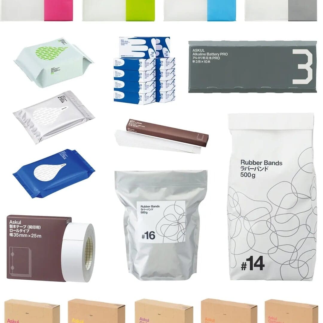
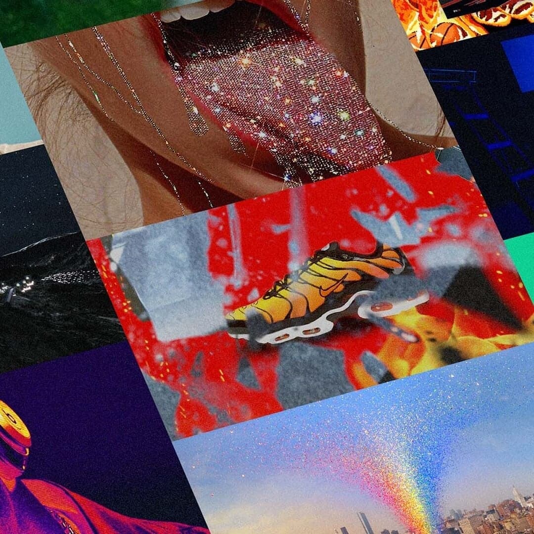
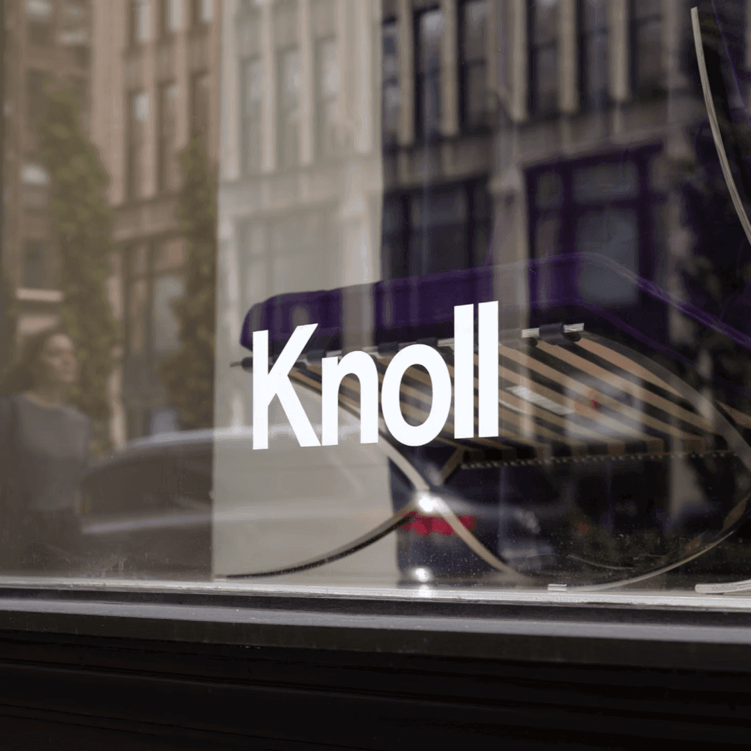
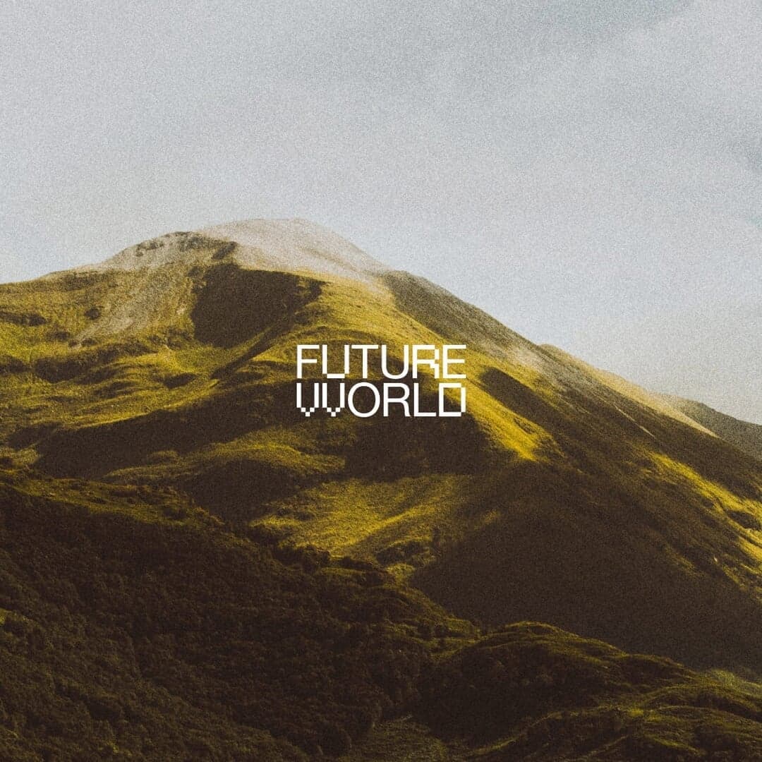
Set for Askul, Dinamo, Freeform, Heron Preston, Knoll, Le Puzz, Ostro, Stephen Ambrose, Stink Studios, Vignelli90
Cases set in Helvetica, as credited by the studios in their own writeups.
Lisa Cain reflects on Croydon's Brutalist architecture to argue for the growing relevance of neo-brutalism in packaging. The article highlights Han Gao's NICE CREAM concept and Canada's No Name grocery range as examples of direct, functional packaging that uses bold typography, limited colour and clear information to stand apart from softer wellness-oriented design.
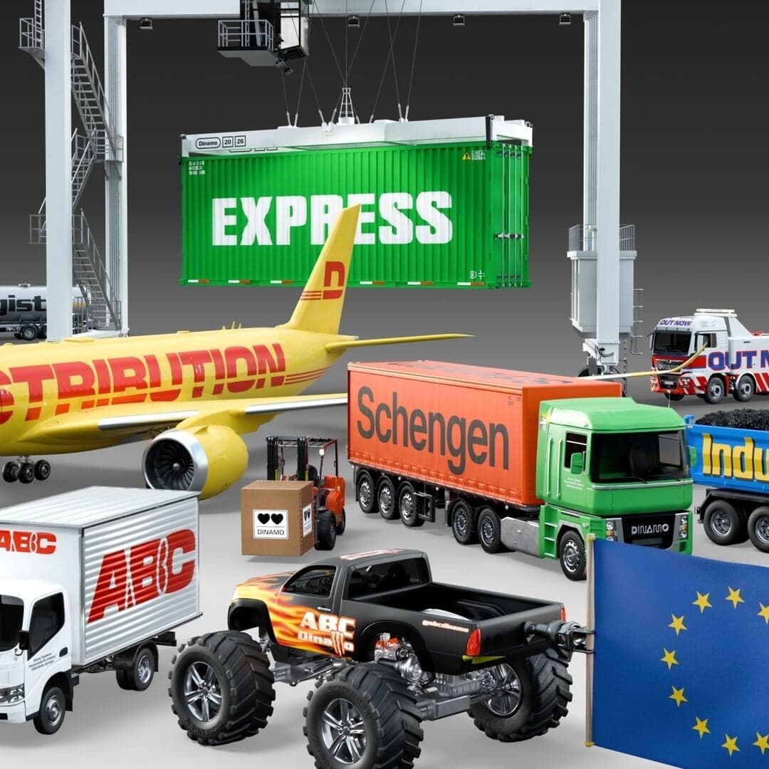
The Brand Identity features Dinamo’s latest type release, ABC Schengen, a six-year collaboration with Seb McLauchlan and Luke Charsley. The type system merges Helvetica and Eurostile influences into 108 styles inspired by the Eurozone’s industrial and logistical aesthetics. The project explores the tension between functional design and cultural identity, resulting in a versatile, variable type family spanning multiple scripts.
bleucoeur studio and Dysign collaborated on SÈVE, a conceptual botanical soap brand developed for The New Brief. The project reimagines soap as a collectible object, using tree-specific colours, bark-inspired patterns, and refined packaging. The design combines minimalism, material authenticity, and 3D-rendered imagery to convey a sense of permanence and craft.
Creative Boom’s 2026 roundup by Tom May highlights 15 typefaces that designers continue to use and admire, from timeless classics like Helvetica and Futura to newer, accessibility-driven fonts like Inclusive Sans. The article reflects ongoing trends toward functional, inclusive, and personality-rich type design, showing how both heritage and innovation coexist in contemporary typography.