

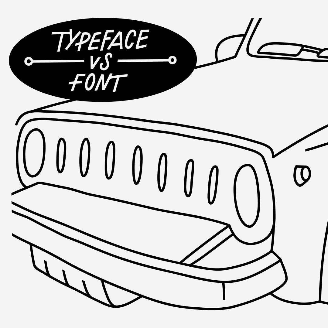
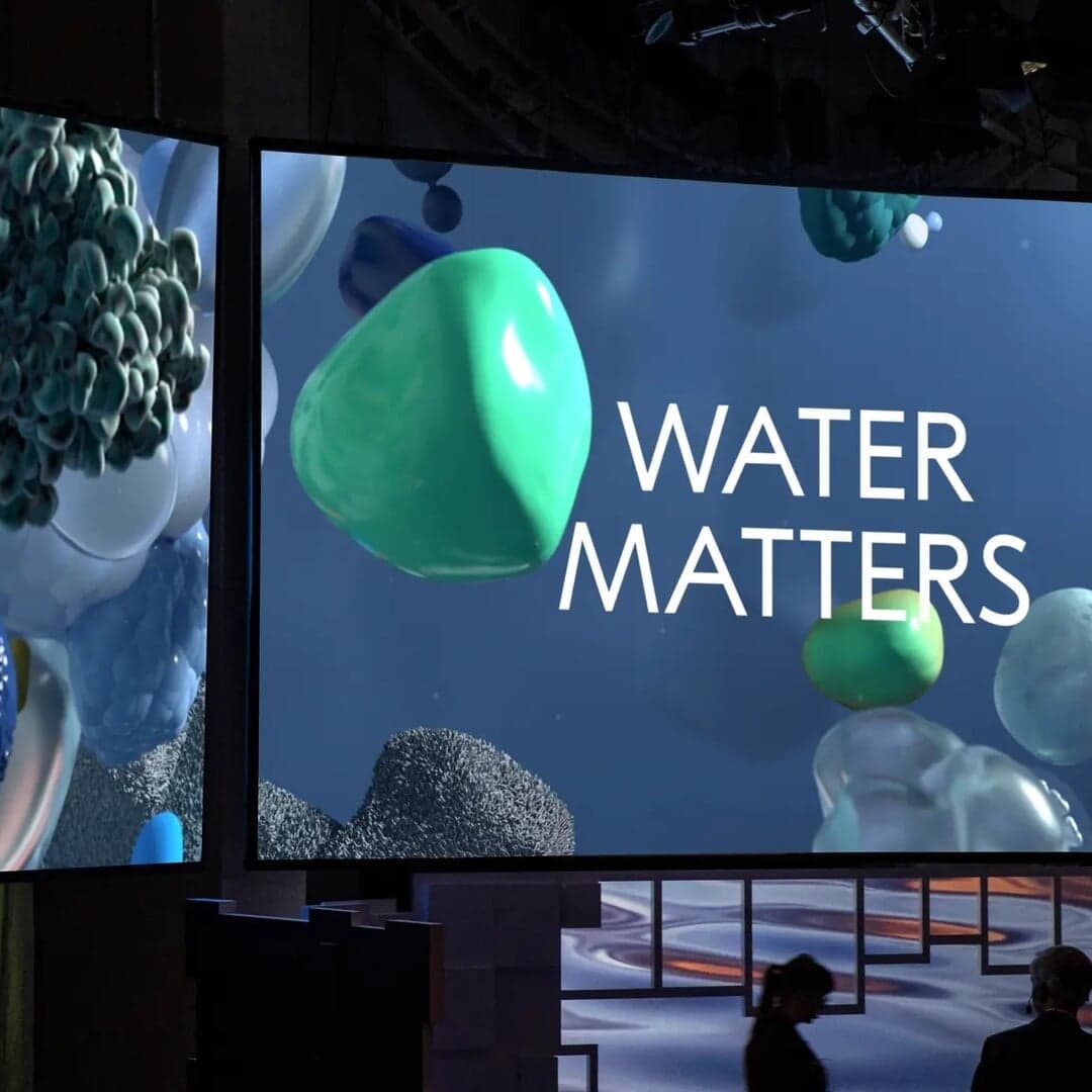
The archetypal Bauhaus-era geometric sans — circles, triangles and squares turned into an alphabet. View at Bauer Type Foundry →
Used by SDL (3), Contrast Foundry (2), Dinamo (2), Anagrama, Paul Belford, Mucho
Set for Acqua di Parma, Contrast Foundry, Dinamo, Essem Design, Fuse Flooring, Orionteatern, PayPal, Petrick, Spritmuseum, Stephen Ambrose
Cases set in Futura, as credited by the studios in their own writeups.
The Brand Identity features Lift Type’s new geometric sans serif typeface, Melun, designed by co-founder Romain Oudin. Inspired by nostalgic references from his childhood and classic typefaces like Kabel and Futura, Melun blends historical charm with modern versatility across three variants: Display, Normal, and High. The design reflects Oudin’s personal roots and aims to offer designers a flexible, expressive tool for diverse applications.
The Brand Identity interviews Kittl co-founder Tobias Saul about the platform’s evolution from Heritage Type Co. into a collaborative design tool tailored for graphic designers. The discussion covers Kittl’s new UI redesign, real-time collaboration features, and AI integration aimed at simplifying creative workflows. Saul shares insights into his background in typography and the company’s mission to make design tools more intuitive and accessible.
Designer Carla Palette has created a bold new identity for Sony Music Germany’s KIHARA division, blending music and film culture with a timeless, high-energy aesthetic. The refreshed brand features custom typography, a strong black-and-white palette, and a wordmark inspired by Sony’s Walkman heritage. Creative direction was led by Robert Jahn, with the identity designed to empower artists and maintain continuity with Sony’s visual system.