Contrast Foundry
Contrast Foundry is an independent type design studio based in the United States, specializing in the creation of contemporary, high-quality typefaces for commercial and custom use. The studio develops fonts that balance functional clarity with distinctive character, supporting designers, brands, and publishers worldwide. Contrast Foundry’s library includes a diverse range of serif, sans-serif, and display families crafted for digital and print applications. In addition to retail offerings, the studio provides bespoke type design and licensing for clients seeking unique typographic solutions that elevate their visual identity and communication.
Works with CoFo Sans (12), CoFo Plusha (5), CoFo Peshka (5), CoFo Kabeltouw (5), CoFo Robert Sans (4), Chimera (4), CoFo Raffiné (3), CoFo Chimera (3)
Their own site is set in CoFo Drifter, CoFo FlicFlac, CoFo Glassier, CoFo Gothic
Cases
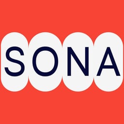
- Afisha Daily
- Logotype Redesign for Afisha Daily
- Alternativa Film
- Typeface Licensing for Alternativa Film
Awards
Explore awards →Awarded work credited to Contrast Foundry. Coverage is partial; projects may be shared with other studios.
ADC Annual Awards2026Silver Cube 1Bronze Cube 2Merit Honor 14 entries · 3 projects
Explore studios with ADC Annual Awards awards →
2026
Hamburgerfonts Type Specimen
- Silver Cube · Book Design / Limited Edition / Private Press / Special Format Books
- Bronze Cube · Typography / Lettering / Publication
Type Foundry: Contrast Foundry · Design Firm: The Office of Ordinary Things
News & interviews
Clients
Tech Stack
Technologies detected on Contrast Foundry's website.
Next.jsplatform
AWShosting