Dodo Pizza
Design work for Dodo Pizza, collected from the studios behind it.
- Design cases
- 6
- Studios
- 2
- Latest work added
- Oct 2026
- Campaign 4
- Advertising 1
- Brand Identity 1
Design cases by studio
The Clients (5)
- Advertising Campaign for Dodo Pizza's 3 Pizzas Combo
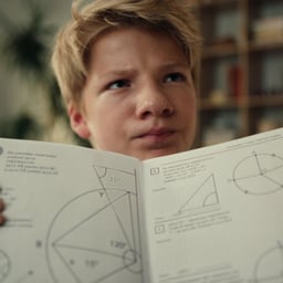
- The Clients created “Simple Mathematics” for Dodo Pizza to make the value of its 3 pizzas for 900 ₽ combo immediately clear and encourage more orders through the app among families with children. The campaign reframed the offer as a school maths lesson: in a film, a family works through geometry around delivered pizzas while equations are drawn over the footage; the same idea extended to radio, key visuals, banners, Telegram materials, and pizza-based study guides made with online school 100ballny Repetitor.
- Advertising Campaign for Dodo Pizza's Solo Lunch Combo
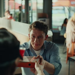
- The Clients created a summer advertising campaign for Dodo Pizza to increase in-pizzeria and takeaway orders of its affordable single-person combo: a 20 cm pizza and a drink from 250 ₽. Addressing the perception that pizza is for sharing, the campaign reframed the lunch break as a spontaneous hour-long mini-holiday. Execution included a live-action film following an office worker escaping to a Dodo terrace, a radio spot, and chalk messages addressed to office workers outside five Moscow business centres.
- Advertising Campaign for Dodo Pizza Halves
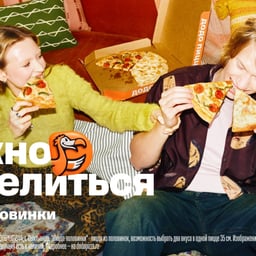
- The Clients created a bold campaign for Dodo Pizza that celebrated healthy self-interest in food. Centered around the idea that you don’t always have to share your pizza, the campaign included a humorous video, outdoor ads, and a split-channel radio spot highlighting the duality of relationships and pizza halves.
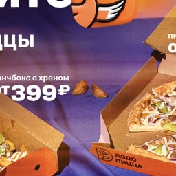
- Advertising Campaign for Dodo Pizza's Bold New Year Promotion
- The Clients created a daring New Year campaign for Dodo Pizza, centered around an unconventional pizza with horseradish. The project encouraged audiences to break traditions and embrace boldness through a playful video and outdoor advertising that celebrated trying something new.
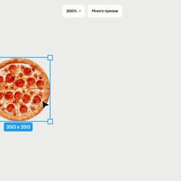
- Promotional Campaign for Dodo Pizza
- The Clients developed a creative video campaign for Dodo Pizza’s 'Mnogoprizov' promotion. Using a screenlife-style concept, the team crafted an honest and straightforward message that stood out amid the noisy advertising landscape by focusing on real benefits rather than flashy gimmicks.
Contrast Foundry (1)
- Logo Redesign for Dodo Pizza
- Contrast Foundry created a new bilingual logo for Dodo Pizza, balancing simplicity with a distinctive, flavorful identity. The design captures the brand’s approachable character while ensuring clarity across languages and markets.