Beauty is the category where the packaging is the product experience. A skincare brand is bought on a shelf or a product page, unboxed once, then lived with on a bathroom shelf for months — so the identity has to survive being looked at far longer than most brands ever are, at three very different sizes.
The fifteen projects below are grouped by the decision that holds each one together: commissioning letterforms, choosing a retail typeface and committing to it, designing the object, or betting the brand on colour and voice. Each links to the full case on D1S1 and to the studio’s own page.
How these were chosen
- A beauty, skincare, cosmetics, haircare or fragrance brand is the client.
- The studio publishes its own case page, and that page was read before the project was listed.
- The work shows a transferable decision — a reason for the choice, not just the result of it.
- Typeface credits appear only where the studio still names them on its live page today.
- No performance or sales claims are repeated here; where a studio publishes results, read them on the studio’s page and treat them as the studio’s own.
Bespoke letterforms as the luxury signal
At the top of the category, a licensed typeface is a liability: it is the same face the challenger brand two shelves down can buy this afternoon. These three commissioned letterforms instead — and each did it for a different reason.
La Prairie
Base Design revisited the Swiss skincare house’s logo, typography and watermark — the first such intervention in decades — with typography by Matthieu Cortat. The studio describes the changes as “subtle and radical” at once, which is the only tolerable register when the brand equity is the restraint itself. Worth studying for how little visibly changes while the whole thing resets.
Mad et Len
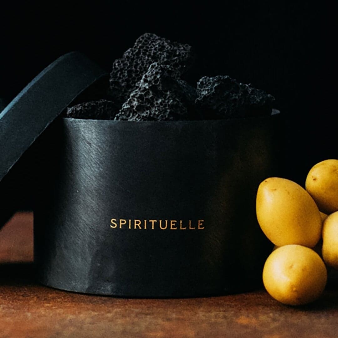
Atelier Dyakova drew a custom typeface with sharp, sculptural letterforms taken from local hand-painted signage and the raw black iron vessels the fragrances ship in — so the type and the object share a source. Typography design is credited to Tom Baber and James Griffin. The identity sits between apothecary and alchemist’s lab, and the letterforms are what stop it becoming a costume.
Arné Skincare
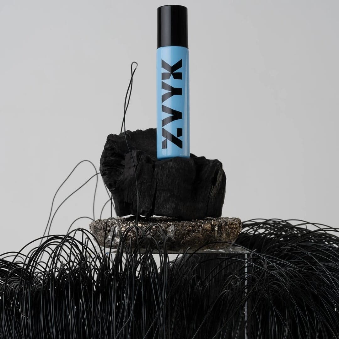
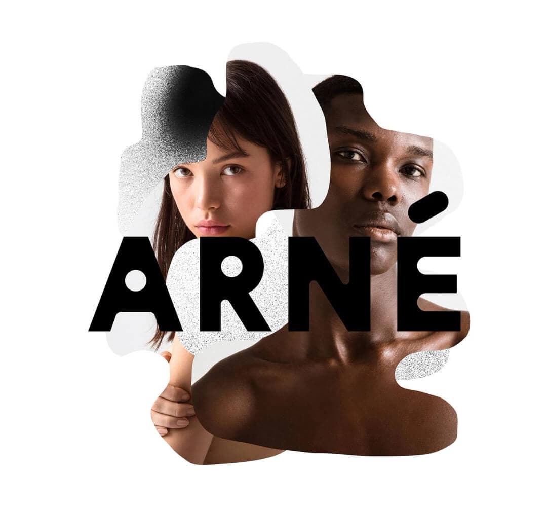
A Friend of Mine commissioned a custom logotype rather than a full family — the cheaper version of the same move, and usually the right one for a young brand. Around it, sketched charcoal textures stand in for pollution and organic shapes for wiping it away, so the product claim is carried by texture instead of copy. Minimal packaging keeps the unboxing as the proof point.

Named typography, committed to
The alternative is to pick a retail face and use it for everything — which only works if the face is specific enough to be recognisable and the commitment is total. All four of these still credit their typefaces publicly.
Liberty
Pentagram · Set in Akzidenz-Grotesk Extended
Pentagram built LBTY., Liberty’s gender-neutral fragrance range, on a logotype derived from the store’s own historic signage, then handed the decorative work to the bottle: an oversized cap that shows an archival Liberty print. Heritage is quoted structurally rather than printed onto the label. The extended grotesque keeps the graphics modern enough that the archive reads as a choice.
KraveBeauty
Universal Favourite · Set in Value Serif + Basis Grotesque
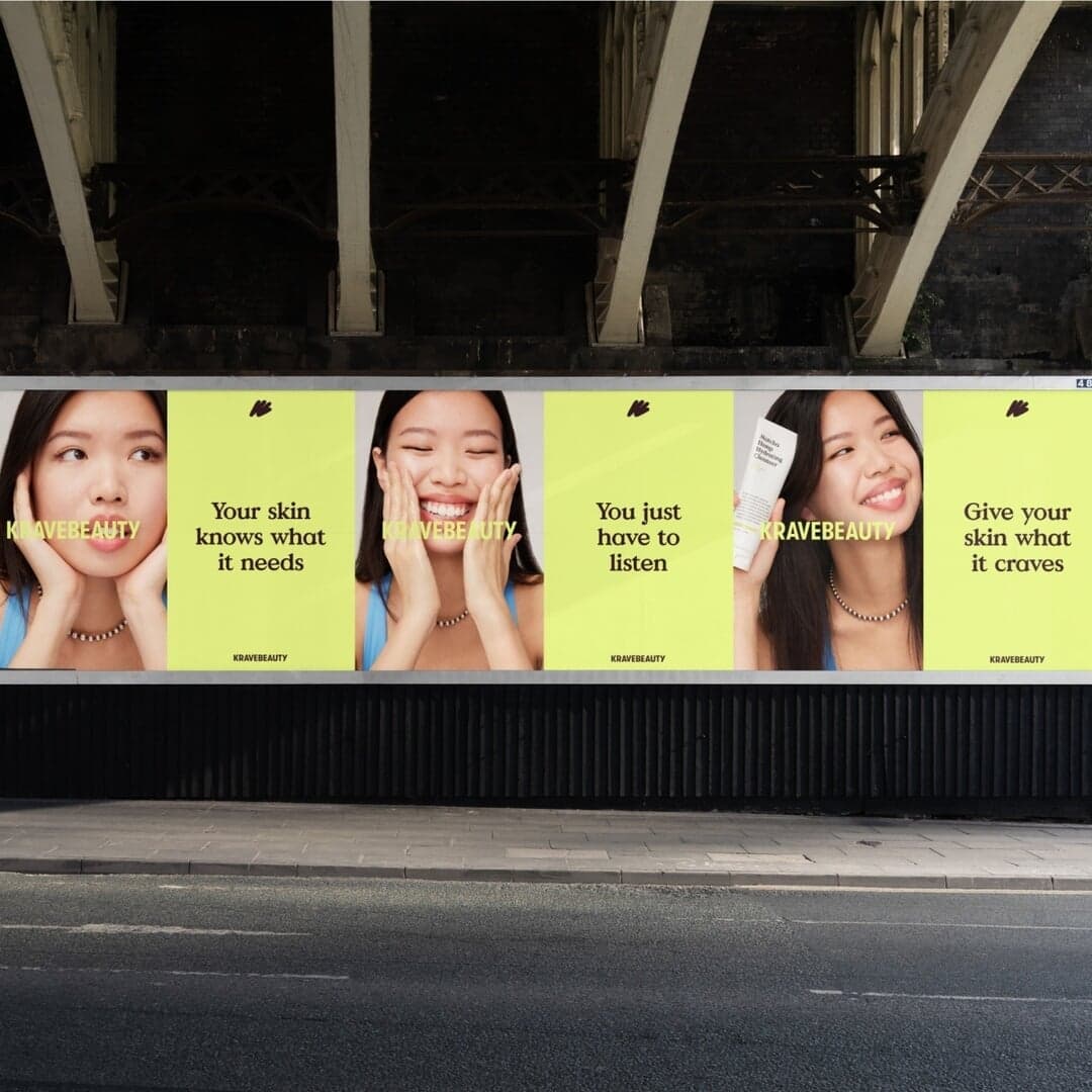
Universal Favourite rebuilt KraveBeauty around its sustainability position, which meant the verbal identity and the packaging had to change together — a refreshed voice, sustainable packs and a site that teaches rather than sells. The serif-and-grotesque pairing gives the brand an editorial register, which is what an educational tone needs. A clean example of typography chosen to match a content strategy.

Packaging as the product experience
These four designed the object first and the graphics around it. In beauty that ordering is defensible: refill systems, dispensers and unboxing are where the brand promise is either kept or broken.
Rollr
Mother Design · Set in Kalice
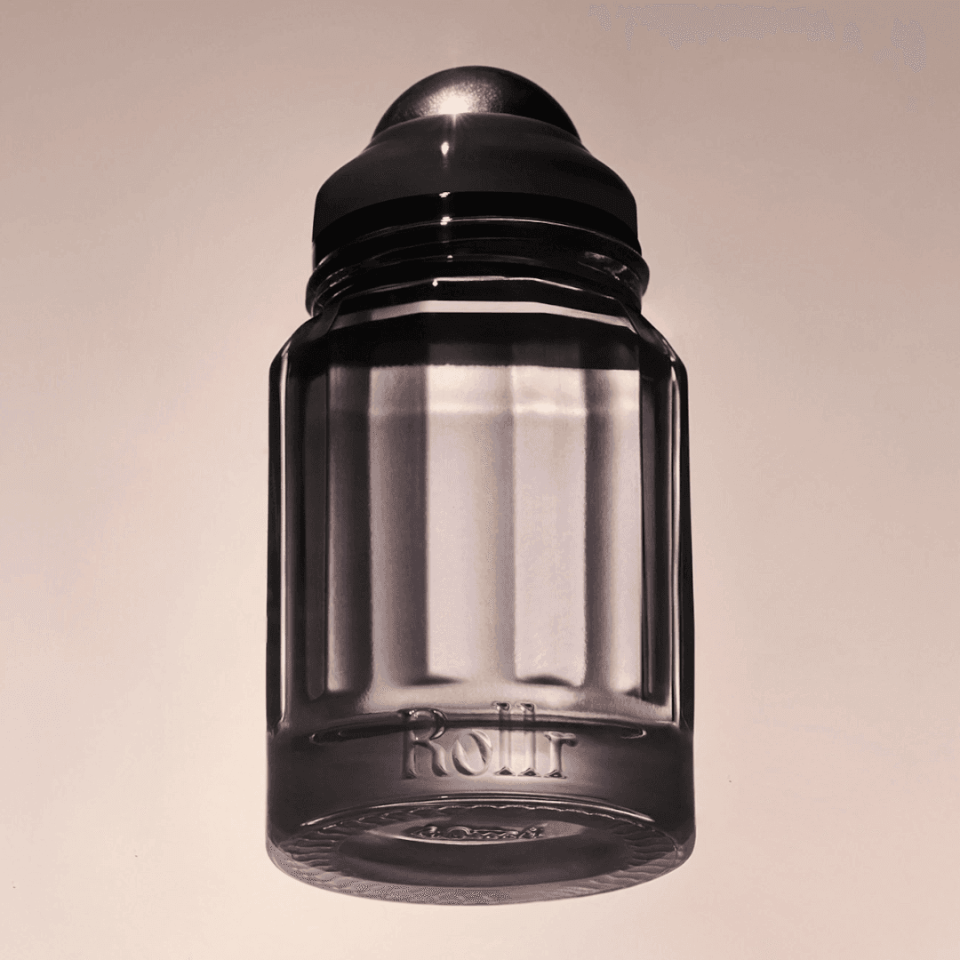
Mother Design took a refillable deodorant — a category defined by plastic sticks — and borrowed the codes of high-end perfumery: a sculpted glass bottle with a modular refill. The phrase the studio uses, “conscious hedonism”, is a useful brief in itself, because it refuses the trade-off between sustainability and pleasure. The identity is sensorial rather than clinical, which only works because the object earns it.
BYOMA
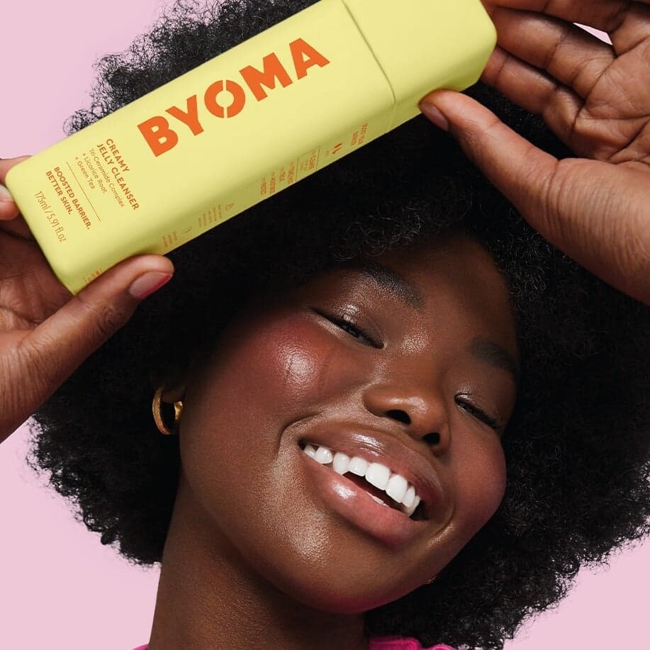
Pearlfisher paired skin-barrier science with a bright, joyful palette and refillable packs — a combination the category usually treats as mutually exclusive, since credibility is normally signalled by restraint. The result is built to be seen from across an aisle. A good reference for making a technical claim without adopting the clinical white-and-blue default.
Colour and brand character
The last group leads with personality. Each one picks a reference outside beauty and commits to it, which is the reliable way out of a category where every competitor has already optimised for “clean”.
Benefit
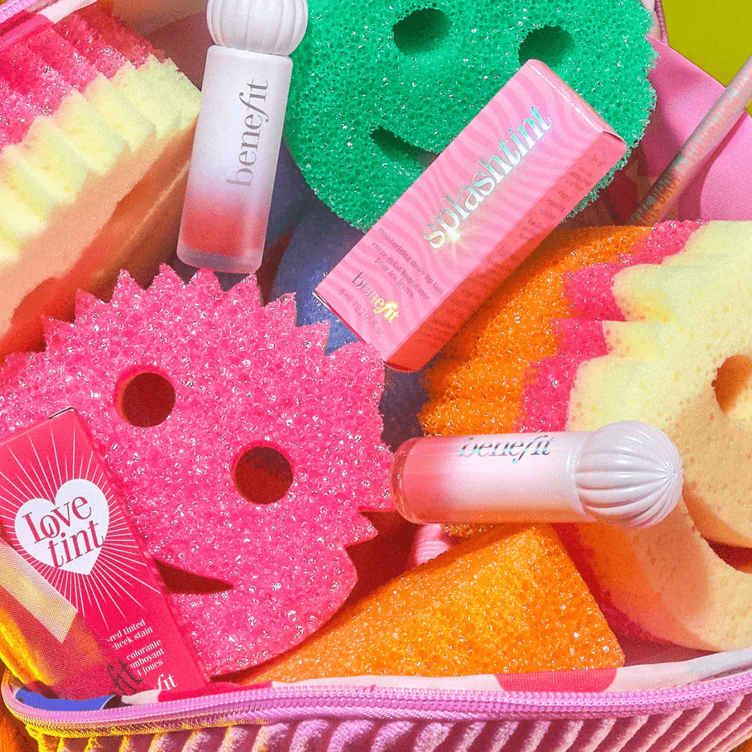
Wolff Olins restated Benefit’s purpose as “Ignite Joy” and reached for the Memphis Group — an explicitly irreverent, pattern-led reference — to hold the expertise and the fun in one system. The flexibility is the point: a voice and a kit rather than a locked layout. It is the largest-scale example here of personality being treated as the strategy, not the styling.
Youthforia
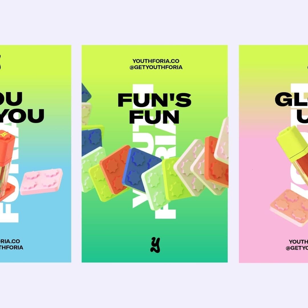
Universal Favourite built a Gen Z clean-beauty brand on late-90s internet aesthetics, with modular packaging and a digital experience that leans on the nostalgia without becoming a pastiche. The modularity matters: a visual language this loud needs a structural constraint or the range stops looking related. Self-expression as a product architecture.
Choosing between these approaches
Four different bets, each with a cost. What follows is editorial judgement, drawn from the projects above rather than from any measured outcome.
- Commission letterforms when the brand is the category leader
- La Prairie, Mad et Len and Arné show the range: a full typographic reset, a custom face drawn from the product’s own materials, or just a logotype. Bespoke type is the one asset a competitor cannot licence — but it is slow, needs a type designer credited and paid, and buys nothing if the rest of the system is generic.
- Licence and commit when speed and consistency matter more
- Liberty, KraveBeauty, Care to Beauty and ZVYK pick a face with enough character to be recognisable and then use it everywhere. Cheaper, faster, and far easier for an in-house team to run — at the price of a distinctiveness that depends on the pairing and the hierarchy rather than the letterforms themselves.
- Design the object when the format is the differentiator
- Rollr, BYOMA and Kester Black put the investment into glass, refills and die-cuts. This is the most defensible in a refill-driven category and the most photogenic at thumbnail size, but it moves the project onto tooling timelines and makes iteration expensive.
- Lead with colour and voice when you are the challenger
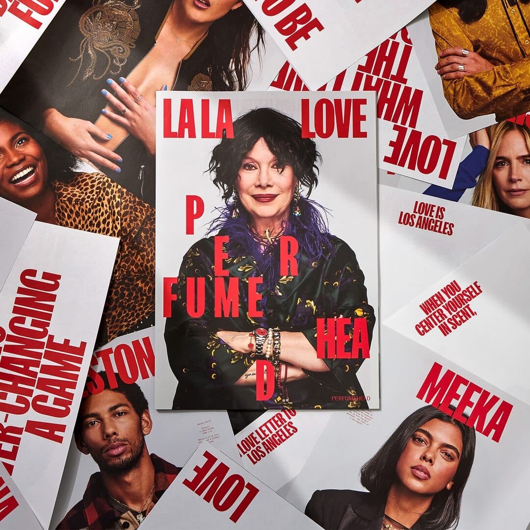
- Benefit, Youthforia and Perfumehead borrow a reference from outside beauty and commit. It is the fastest route to being noticed and the cheapest to apply — and the most exposed, because a personality bet that ages badly takes the whole system with it.
Curated by the D1S1 editors. Last reviewed . Every credit above comes from the studio’s own case page, linked on each entry.