
Brand New Conference
Nashville, USA17 Sept 2026 – 18 Sept 2026
Universal Favourite is a design studio based in Sydney, working with clients around the world. Its multidisciplinary work spans brand identity, packaging, digital design and writing.
Works with Maison Neue (2), Graphik, Ayer, Value Serif, Basis Grotesque, Colour Milled, Studio Pro, Founders Grotesk X-Condensed
Their own site is set in Banana Grotesk, Editorial New
Awarded work credited to Universal Favourite. Coverage is partial; projects may be shared with other studios.
Design Agency, Entrant Company: Universal Favourite
Designers and creative leads attributed to Universal Favourite in press coverage.
Technologies detected on Universal Favourite's website.
Entrant Company, Design Agency: Universal Favourite
Credited Studio: Universal Favourite
Credited Studio: Universal Favourite
Design Firm: Universal Favourite
Design Firm, Agency: Universal Favourite · Creative Director: Dari Israelstam - Executive Creative Director; Ali Ozden - Creative Director · Art Director: Ali Ozden; Lucy McGinley · Designers: Lucy McGinley · Copywriter: Cat Wall; Amy Scott · Illustrator: Mitch Eaton - 3D illustrator · Photographer: Tobias Rowles · Other Credits: Kristen Walsh - Client Service Director; Laura Brown - Senior Account Manager; Untangld - Brand Strategy; Chloe Wilson - Prop Stylist; Oriana Deluca - Wardrobe Stylist
Design Firm, Agency: Universal Favourite · Creative Director: Dari Israelstam - Executive Creative Director; Ali Ozden - Creative Director · Art Director: Sherry Wang; Ali Ozden · Designers: Sherry Wang · Copywriter: Amy Scott · Illustrator: Nice Shit Studio - Animation · Producer: Honeymill · Other Credits: Kristen Walsh - Client Service Director; Facundo Capece - Music and Sound; Lola Ritcher - Music and Sound
Design Firm, Agency: Universal Favourite · Creative Director: Dari Israelstam - Executive Creative Director; Ali Ozden - Creative Director · Designers: Joy Li · Copywriter: Cat Wall; TONE Agency · Other Credits: Kristen Walsh - Client Service Director; Aimy Guez - Account Director; Untangld - Brand Strategy
BP&O’s Emily Gosling reviews Universal Favourite’s branding for Butter Baby, a Jakarta-based dessert store built around a whimsical butter-alien mascot. The studio developed a full verbal and visual identity, including character design, packaging, motion, and interiors, using a bright yellow palette and playful typography. The article praises the project’s originality and conviction in creating a character-driven brand world.
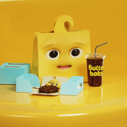
Universal Favourite created a whimsical, intergalactic brand identity for Jakarta dessert brand Butter Baby, transforming a butter-based alien character into a full narrative universe. The project spans 3D character design, packaging, store design, and a custom language system, all rooted in playful storytelling. Collaborations with Double Up Studio and Crosby Studios helped bring the cosmic Butterlandia world to life across digital and physical touchpoints.
Sydney-based studio Universal Favourite created a playful, story-driven brand identity for Jakarta dessert brand Butter Baby. The project builds a full fictional universe called Butterlandia, complete with characters, language, and immersive packaging and interiors. Collaborating with Crosby Studios, the team extended the concept into a physical retail space that merges fantasy and food culture.
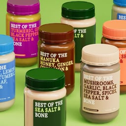
The article highlights Universal Favourite’s rebrand for Australian bone broth company Best of the Bone. The new identity embraces simplicity, aligning with the brand’s focus on natural ingredients and straightforward health benefits. The piece draws parallels to other minimalist packaging approaches like RXBAR.
The Brand Identity’s interview with Universal Favourite’s Creative Director Ali Ozden explores his approach to building brands through authentic, human experiences. Ozden discusses the studio’s award-winning work for The Dinner Ladies, the importance of client trust, and the evolving role of design in a global, AI-influenced landscape. He also reflects on his career path, leadership lessons, and the value of versatility in design.
Universal Favourite developed a Renaissance-inspired rebrand for Australian bathroom brand Saintly, formerly known as Fohm. The identity combines humour and luxury, featuring fresco-inspired illustrations, a sculptural logomark, and a refined typographic system using Romie and GT Pressura Mono. The project repositions Saintly’s cleansing foam dispenser as a divine yet playful bathroom essential.
Universal Favourite has completely rebranded the butt hygiene brand Saintly, formerly known as FOHM, with a Renaissance-inspired identity. The Sydney studio introduced a new name, tone of voice, and visual system featuring ornate typography and warm tones. Collaborating with Doris Dev, they also designed the Divine Dispenser product, aligning the brand’s playful and refined aesthetic.
This edition of The Edit highlights five international graphic-design projects spanning luxury fashion retail, museum branding, an arts-organisation annual report, a podcast identity and coffee packaging. Too Gallus repositions Scottish boutique Oliami for global luxury with a classic monogram, while other featured work uses inclusive cultural strategy, interwoven editorial patterns, patchwork geometry and a distinctive orange cord.
BP&O features Universal Favourite’s rebrand for Australian frozen meal delivery service The Dinner Ladies. The project refreshes the 17-year-old brand with a new heart motif, expressive illustrations by Jake Foreman, and a confident tone of voice developed with copywriter Cat Wall. The identity combines a warm, textural aesthetic with bold typography and a refined color palette to stand out in a crowded market.
Universal Favourite created a warm and approachable brand identity for WHEN, Australia’s first at-home egg count testing service. The design balances medical credibility with emotional warmth through a confident wordmark, organic iconography, and a soft color palette. The project includes packaging, an instruction booklet, and photography that together redefine the fertility category with empathy and clarity.
The article is part of The Brand Identity’s biweekly ‘The Edit’ series, highlighting five recent design projects. Featured works include Tangent’s flowing identity for The Turner Prize 2023, Want Studio’s Baroness Beatrice typeface, Universal Favourite’s rebrand for Wholesome, Human After All’s inclusive identity for Plume, and Curtis Rayment’s graphic system for RYSK Racing. Each project showcases distinct creative approaches across branding, type design, and visual storytelling.
The Brand Identity’s April 2024 edition of 'The Edit' spotlights five global design projects, including Lava’s dynamic identity for Dutch festival Smeerboel, Studio VEH’s gemstone-inspired rebrand for Lena Schleweis, and Universal Favourite’s fintech rebrand for x15ventures. It also features LG2’s vibrant festival identity for Les Francos de Montréal and Riptype Foundry’s new typeface, Office Regular. The roundup highlights trends in interactive tools, geometric typography, and expressive colour systems.
The article by The Brand Identity, written by Poppy Thaxter, curates eight branding and design projects that explore the evolving concept of health. It highlights how studios around the world approach physical, mental, and social well-being through thoughtful design across wellness, femtech, and mental health sectors.
BP&O features Universal Favourite’s branding for Australian online grocery brand Wholesome, which unites ethical and sustainable product categories under the concept of 'eco-health'. The identity uses a custom typeface called Gooper, a playful logo, hand-drawn iconography, and a bright pastel palette to convey optimism and approachability. The project includes a full visual and verbal identity, photography, and website design that balance character with clarity.
BP&O features Universal Favourite’s rebrand for Sydney-based Monkey Baa Theatre Co., a children’s theatre company. The new identity uses the slab-serif Sebenta and geometric Gellix typefaces, playful character illustrations, and a warm tone of voice developed with copywriter Cat Wall. The project aims to capture the imagination and emotional range of young audiences while refreshing the theatre’s visual and verbal presence.
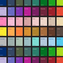
Universal Favourite rebranded Australian food colouring company Colour Mill with a vibrant, playful identity inspired by the creativity of the baking community. The project features a custom logomark and bespoke typeface, complemented by a flexible colour system and supporting typography. Collaborators contributed 3D visuals, copywriting, packaging, and photography to bring the brand to life.
BP&O features Universal Favourite’s branding for sexual wellness brand LBDO, highlighting its soft, inclusive visual identity built around the concept of ‘getting in sync’. The Sydney studio developed a calming palette, elegant typography, and fluid motion graphics to reflect intimacy and self-care. The result positions LBDO as a confident, design-led brand in the evolving sexual wellness space.
Sydney-based studio Universal Favourite created a vibrant, 90s-inspired identity for US beauty brand Youthforia. The design rejects minimalism in favour of playful maximalism, featuring energetic typography, clashing colours, and collectible packaging. The identity uses F37 Judge and GT America typefaces to balance expressive and functional elements.