A quietly idiosyncratic contemporary grotesque, born as a commission for Hotshoe photography magazine. View at Colophon Foundry →
Used by The Phoney Club (2), ESH (2), Socio, ZAK, Universal Favourite, Athletics
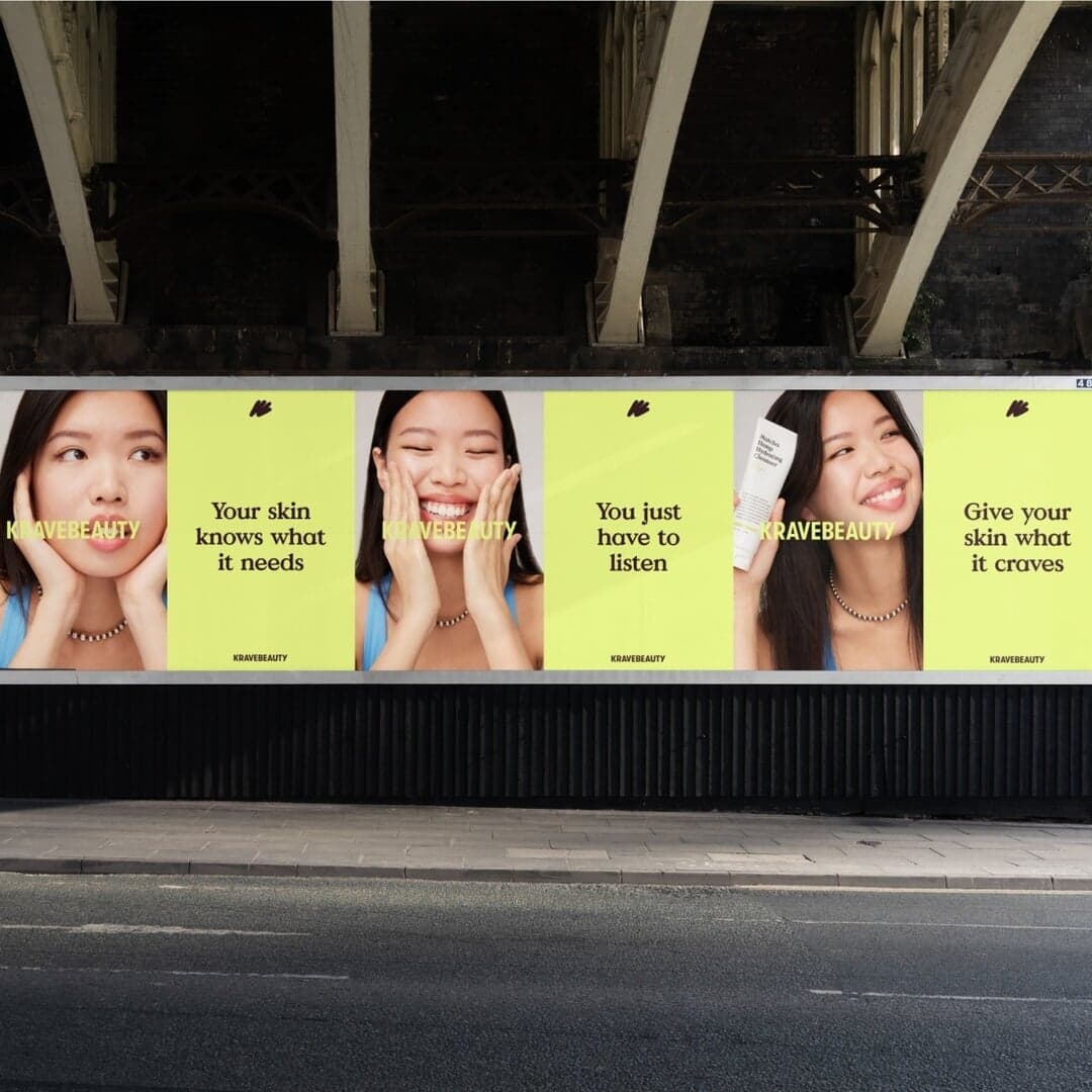
Set for FEST Amsterdam, Gula Dog Care, KraveBeauty, Ronan Space Systems, Sovremennik, Sovremennik Theatre, Tia, Wild Nutrition
Find design references using Basis Grotesque. Browse project images and studio credits, then follow each case to its source. Typeface names come from catalogued studio writeups; coverage is limited to projects with recorded credits.
Sign in free to browse more cases using this typeface.
Sign in freeLos Angeles-based studio FORNER developed a brand identity for Palomino, a Ventura venue that balances local warmth with refined sophistication. The design uses a trio of typefaces, a nature-inspired color palette, and tactile print finishes to express both community belonging and celebratory elegance. Through thoughtful typography, materials, and messaging, the identity captures Palomino’s dual role as a neighborhood gathering place and event destination.
Creative Boom’s article by Tom May surveys the design community to identify 50 typefaces expected to trend in 2026. The roundup highlights a mix of contemporary and classic fonts from leading foundries such as Grilli Type, Klim, ABC Dinamo, and Pangram Pangram. It reflects a broader trend toward revisiting familiar grotesques and serifs with modern refinements for digital and branding applications.
Vancouver-based studio ZAK created a brand identity for Canadian aerospace startup Ronan Space Systems that draws inspiration from ancient petroglyphs to bridge humanity’s past and future. The identity combines organic, imperfect forms with brutalist typography and weathered tones to challenge the sterile aesthetics typical of the space industry. The result is a flexible, human-centered system that reflects Ronan’s mission to build a lasting legacy beyond Earth.
Rabbithole, a Leeds and Glasgow-based design studio, has rebranded Hyde Park Picture House, the world’s only gaslit cinema. The new identity features a dynamic lozenge motif inspired by film projection cues, a vibrant technicolour palette, and a diverse typographic system using nine typefaces to represent different cinematic strands. The rebrand captures the cinema’s heritage and the vibrancy of film culture.