Brand Identity and Digital Experience for KraveBeauty
A flexible KB scribble shapes KraveBeauty’s identity
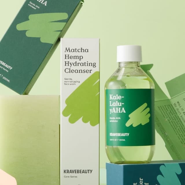
Universal Favourite refreshed KraveBeauty’s identity around the brand’s emphasis on simpler skincare and more considered consumption. A flexible KB scribble forms multiple graphic shapes, paired with Value Serif headlines, Basis Grotesque body text and hand-drawn icons. Packaging uses a tear strip to reveal disposal information and sustainability credentials. The Matcha Hemp Hydrating Cleanser carton omits the KB scribble because the studio says its inclusion would have affected recyclability. The system connects graphic expression with specific packaging decisions.
Set in Value Serif, Basis Grotesque
Featured in Beauty Branding: Visual Identity and Packaging Examples
Insights
- The KB scribble is flexible enough to become several graphic shapes.
- Tear strips reveal disposal instructions and product sustainability information.
- The studio identifies one cleanser carton where omitting the scribble supports its recyclability constraints.
Keep exploring
Related cases