Skincare packaging has to distinguish products that may be used together and repeatedly. This selection focuses on packaging decisions: category extensions, range navigation and physical form. It complements the broader Beauty Branding collection with a closer look at the pack.
Each project links to its D1S1 record and the studio’s own account. The grouping and practical comparisons are D1S1 editorial interpretation, not claims of commercial performance.
Illustration can explain a new category or give ingredients a visible role.
Opposite retains Sugar’s low-poly illustration language but changes both its subject and placement for sheet-mask packaging. Birds replace faces and illustrations sit as islands instead of filling the surface. The reference is a category extension that stays related to the parent range.
Opposite foregrounds botanical combinations through expressive illustrations on the packaging. The result offers a different route from the spare, laboratory-like conventions often used in skincare. Look at how an ingredient story can distinguish products while maintaining a recognisable family.
Colour is useful when it communicates a specific distinction rather than just variety.
Office uses an abstract kelp motif with mustard yellow and slate blue to separate day and night products. The visual distinction is tied to a routine rather than colour for its own sake. It is a reference for making a small range understandable without a complex coding system.
Wedge organises the range into colour-coded needs and uses a modular, periodic-table-inspired chart for names, benefits and ingredients. The repeatable structure is the important asset. Compare how a pack helps someone choose a product before considering its decorative details.
Shape and cultural references influence how a range is recognised and handled.
Wedge’s packaging system and form direction draw on late-1980s resort references, while keeping the launch family contemporary. The studio credits the founders with the wider brand vision. Study the consistency across packs as a packaging contribution, rather than attributing the whole brand to one collaborator.
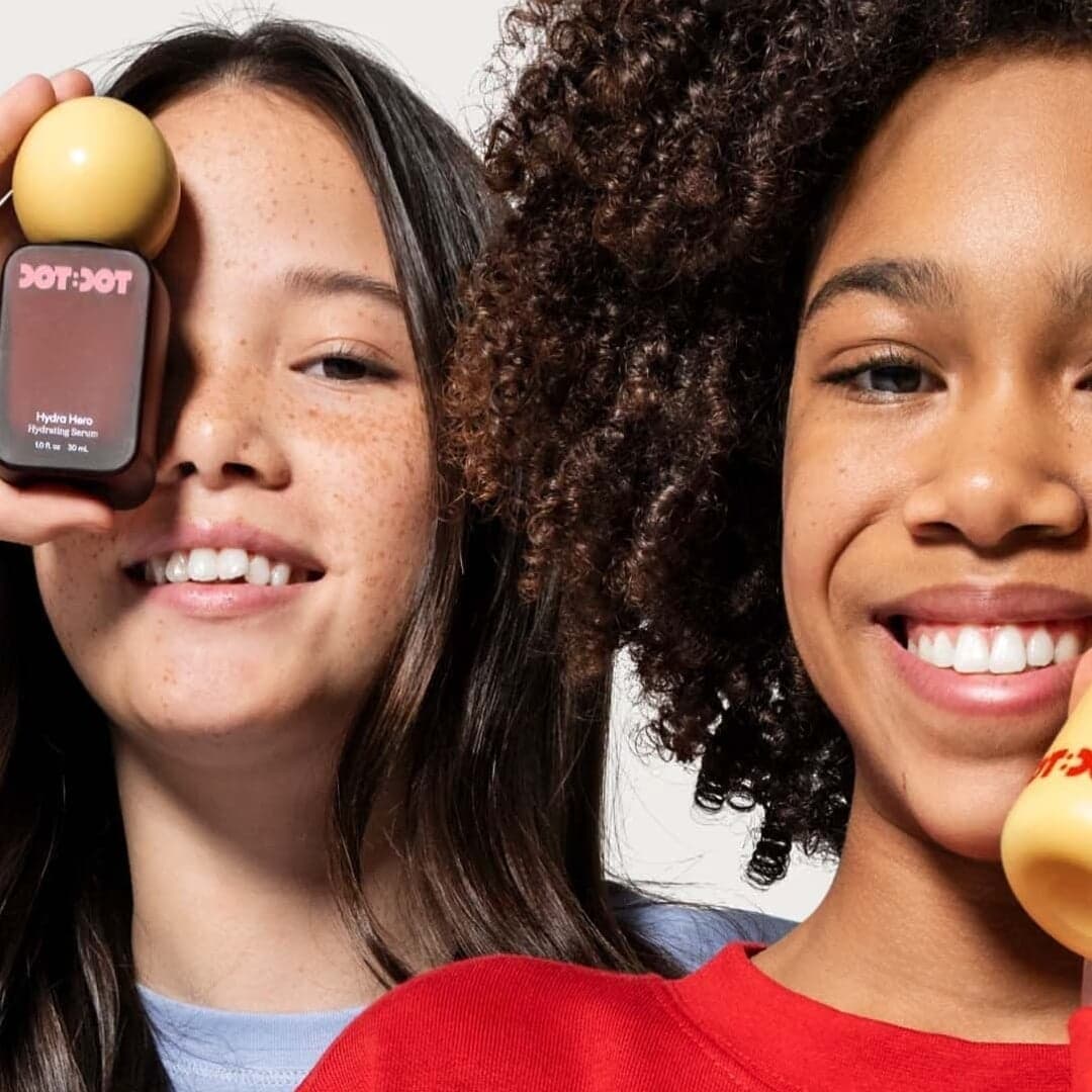
Date Of Birth develops a repeating dot motif and different sculptural pack forms for a tween-focused range. The studio describes shapes chosen for smaller hands, with colour blocking distinguishing products. This is a reference for connecting audience, handling and visual identity; it does not evaluate the products’ suitability or effects.
Use the brief and production constraints to choose a reference. These are editorial comparisons of the documented work.
Curated by the D1S1 editors. Last reviewed . Every credit above comes from the studio’s own case page, linked on each entry.