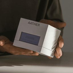
Socio is a design studio in London, founded by James Cramp and Nigel Bates. It works across brand strategy, visual identity, packaging and digital design, alongside its own type foundry.
Works with Akzidenz-Grotesk, Mooradian Sans, Basis Grotesque, Gestura
Awarded work credited to Socio. Coverage is partial; projects may be shared with other studios.
Branding Agency, Entrant Company, Design Agency: Socio Design
Designers and creative leads attributed to Socio in press coverage.
Technologies detected on Socio's website.

Design Agency: Socio
The article is an interview with Sociotype’s Creative & Editorial Director Nic Carter and Designer Alicia Mundy about the release of Sociotype Journal Issue Two. The publication continues to challenge the conventions of type specimens, featuring the typeface Rework and exploring the theme of 'makeshift.' The team discusses their creative process, design decisions, and the evolution from Issue One, highlighting the journal’s experimental editorial approach and production techniques.
The Brand Identity interviews Socio designer Alicia Mundy about her move from London to Copenhagen and her passion for editorial design. She discusses her journey into design, her experience working on Sociotype Journal Issue One, and the collaborative process behind creating a hybrid type specimen and magazine. The conversation also touches on her reflections about teamwork, communication, and life as a remote designer.
London-based consultancy DutchScot created a playful exterior and interior wayfinding system for North Greenwich's Design District, a creative-workspace cluster comprising 16 architecturally varied buildings. Building on an identity by Magpie Studio and Socio, the system uses Mabry, vibrant colours, building-specific icons and three-dimensional material models, produced with technical signage specialist Standard8.
BP&O features Seachange’s new branding and website for Auckland-based structural packaging studio Think Packaging. The identity and campaign celebrate the company’s obsession with cardboard through humorous, sculptural imagery and playful copywriting. The project balances irreverence with precision, using Sul Sans typography, Kraft-inspired colors, and interactive web design to express Think’s creative personality.
Sociotype, the type foundry from London-based studio Socio, launched its first issue of Sociotype Journal, an editorial project that reimagines the traditional type specimen as a rich magazine experience. The debut issue, themed 'The Gesture,' showcases the Gestura typeface through diverse stories and collaborations with writer Henrietta Thompson and type designers Diana Ovezea and Franziska Weitgruber. The publication blends tactile print design with thoughtful editorial content to engage readers in a more active exploration of typography.
The article introduces Sociotype, a new design-led type foundry created by London studio Socio. It explores the launch of the foundry, its first two typefaces Gestura and Rework, and the accompanying printed publication Sociotype Journal. Through interviews with the team, it highlights their collaborative process, design philosophy, and ambitions for future type releases and editorial projects.
London-based studio Socio created a radiant, fashion-inspired identity for Wild Nutrition’s supplement brand Natural Glow. The design features a glowing yellow palette, minimalist packaging with a circular die cut, and a refined typographic system using Basis Grotesque and Gestura. The result balances warmth, luxury, and functionality to position the product within the premium suncare market.
Socio created a refined brand identity for Dubai florist Fine Blooms, blending European and Arabian cultural influences. The identity features the English 1766 typeface, a bespoke rose logo inspired by Islamic geometry, and tactile print finishes. Collaborations with photographer Matthew Thompson and stylist Hattie Fox helped bring the brand’s luxurious and artistic vision to life.
Los Angeles studio Hype Type and London agency Socio rebranded Arizona shoe-care company Reshoevn8r to reconnect it with sneaker and street culture. The identity uses a stacked monospace Aperçu Mono wordmark, restrained monochrome color use, raw-material packaging, and candid street-style photography to foreground sneakers and enable future brand partnerships.
BP&O features Commission’s packaging design for Unfolded, a design and print festival hosted by Gmund Paper Factory in Germany. The project explores the interplay between robust exterior packaging and a delicate, micro-perforated invitation, reflecting the event’s focus on materiality and innovation in print. Richard Baird praises the work for its conceptual depth, tactile quality, and thoughtful use of color and structure.
BP&O features Socio Design’s refined brand identity for Tea & Glory, a London-based loose-leaf tea brand promoting slow living. The project includes packaging, signage, and a cohesive visual system using pastel tones, copper foiling, and Klim Type Foundry’s Domaine typefaces. The design balances contemporary luxury with craft, though the article notes a mismatch between the refined identity and a mural in the café’s basement.
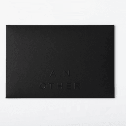
London-based Socio was commissioned to name A.N Other and create its strategy, brand identity, packaging and website. The identity uses a default, utility-led visual language intended to communicate high quality and value while connecting modern luxury with staple goods.
BP&O reviews Socio Design’s brand identity for fragrance brand A.N Other, highlighting its minimalist luxury aesthetic and environmentally mindful packaging. The project spans digital and physical touchpoints, including a bespoke typeface, website, and mail-order packaging designed for sustainability and tactile quality. Richard Baird praises the end-to-end design consideration and the brand’s focus on authenticity over artifice.
BP&O features Socio Design’s packaging for Chaos, a London-based luxury lifestyle brand founded by stylists Charlotte Stockdale and Katie Lyall. The packaging takes the form of book-like boxes using G.F Smith Colorplan papers and gold foil detailing, balancing modern and traditional cues to reflect the brand’s playful and anarchic luxury positioning. Richard Baird praises the concept’s material quality, structural ingenuity, and alignment with the brand’s identity.
Socio created a new brand identity for Los Angeles-based space accountancy firm Stevenson Systems. The rebrand centers on a precise, architectural aesthetic featuring an isometric 'S' marque, custom logotype, and a refined color palette of Amethyst and Real Grey. The project extended to a new website and photographic direction, reinforcing the firm's leadership in space accounting.
The Brand Identity interviews Mark Bloom, Design Director at London-based studio Socio, about the studio’s evolution, design philosophy, and notable projects such as the Hedeker identity and Capital Newspaper. Bloom discusses Socio’s reductive design approach, use of color and materials, and collaborations with illustrators like Damien Weighill. The conversation also touches on studio culture, London’s design scene, and the importance of maintaining a cohesive yet flexible brand identity system.
Socio rebranded Chinese fashion accessories brand Twice to support its expansion into international markets. The new identity centers around a 'wishbone' marque symbolizing special moments and feminine confidence, paired with a pastel and grey color palette for a refined, elegant look.