DutchScot is a London-based design studio known for creating intelligent and unexpected design solutions for ambitious brands and individuals. Founded by Alex Swatridge and Craig Scott, the studio blends strategic thinking with refined aesthetics across brand identity, print, and digital design. Their portfolio spans cultural institutions, lifestyle brands, and global organizations, including Tate, Channel 4, and Nike. DutchScot’s work has been recognized by D&AD and Design Week for its clarity, wit, and craftsmanship, positioning the studio as a leader in contemporary British design.
Technologies detected on DutchScot's website.
The article by The Brand Identity, written by Poppy Thaxter, highlights ten standout brand identities created for architecture practices around the world. It explores how each design captures the philosophy and vision of its respective studio, showcasing thoughtful and human-centered approaches to architectural branding. Featured projects include work by studios such as SPGD, Warriors Studio, and DutchScot.
BP&O features DutchScot’s brand identity for Sucre London and its downstairs bar Abajo. The project draws on Argentine cultural influences, combining bespoke typography, hand-drawn illustrations, and a color palette inspired by Andean fabrics. The identity balances restraint and ornamentation, reflecting the restaurant’s heritage and contemporary London setting.
BP&O features DutchScot’s brand identity for FitzJohn’s, a luxury over-60s apartment development in Hampstead. The design draws inspiration from the area’s creative heritage, using expressive typography, vibrant colors, and abstract compositions to evoke a modern yet nostalgic feel. Collaborations with illustrator Emily Robertson and photographer Carol Sachs add warmth and lifestyle appeal to the brand.
London-based studio DutchScot created a distinctive brand identity for Fitzjohn’s, a luxury apartment complex in Hampstead. Drawing inspiration from the building’s unique architecture and the area’s artistic heritage, the identity uses expressive typography, geometric compositions, and a rich color palette to convey both sophistication and eccentricity. The project balances approachability with luxury, reflecting the creative spirit of its location.
BP&O features DutchScot’s rebrand for Future Factory, a London-based lead generation agency for creative businesses. The identity uses motion graphics and a dynamic system of animated pipes and typography to convey energy, flow, and human connection. The article praises the balance between structure and liveliness in the design.
The article is part of The Brand Identity’s 'The Edit' series, highlighting five recent design projects from around the world. Featured works include PORTO ROCHA’s rebrand for Brazilian sports brand Olympikus, DutchScot’s publication for Centre Point, Kira Koroknai’s wine label for Glug Wine Club, Studio Brutus’ identity for DAYWATCH, and a cultural branding project by Susanna Foppoli and Carolina Magro for Royal District. Each project showcases distinctive visual strategies, from modular systems to hand-drawn illustrations.
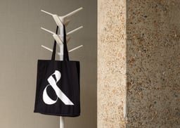
London-based design studio DutchScot developed a refined new identity for architecture and interior design practice Conran and Partners. The rebrand features a bespoke ampersand monogram combining the letters C and P, paired with a Styrene wordmark and a black-and-white palette inspired by the studio’s interiors. The result balances elegance and precision, reflecting the client’s architectural and lifestyle sensibilities.
DutchScot developed a dynamic and typographically balanced identity for London-based interior design studio Littlemore. The system uses Commercial Type’s Portrait typeface, geometric 'L' shapes, and a flexible color palette to reflect the studio’s balance between tradition and modernity. The result is a sophisticated yet contemporary visual identity that captures Littlemore’s creative ethos.
The Brand Identity interviews London-based design studio DutchScot about the creation of their new website, exploring their collaborative process, design philosophy, and how they adapted during lockdown. The founders discuss balancing creativity with practicality, the challenges of self-initiated work, and their commitment to variety and originality in design.
The Brand Identity’s 'The Edit' highlights five new design projects from studios around the world, including Zan Inc.’s tactile 70s-inspired identity for skincare brand Soft. Other featured works include DutchScot’s rebrand for Hoad & More, Ground and Hugmun’s collaboration for Tartan Zone Media, Vault49’s animated identity for So Satisfying, and ESH Gruppa’s refreshed identity for NET Festival. The article showcases diverse approaches to branding across industries from beauty to culture.