Jones Knowles Ritchie (JKR) is a global branding agency headquartered in London with offices in New York, Shanghai, and Singapore. Founded by Joe Jones, Andy Knowles, and Ian Ritchie, the studio is renowned for creating distinctive brand identities that drive cultural impact. JKR partners with leading companies including Unilever, AB InBev, and Kraft Heinz, delivering strategy, design, and packaging that transform brands into icons. Recognized by D&AD, Cannes Lions, and The One Show, JKR continues to shape the world’s most influential brands through bold creativity and strategic clarity.
Works with Wilberforce Sans, Better With, TCCC Unity
Awarded work credited to JKR. Coverage is partial; projects may be shared with other studios.
Entrant Company, Design Agency: Jones Knowles Ritchie
1 more open role across our studios — sign in free, then upgrade, to browse them all with apply links.
Sign in freeDesigners and creative leads attributed to JKR in press coverage.
Technologies detected on JKR's website.
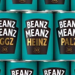
Entrant Company, Design Agency: Jones Knowles Ritchie
Also credited: Drama
Entrant Company, Design Agency: Jones Knowles Ritchie
Also credited: Drama
Entrant Company, Design Agency: Jones Knowles Ritchie
Also credited: Drama
Entrant Company, Design Agency: Jones Knowles Ritchie
Awarded Company: Jones Knowles Richie
Credited Studio: JKR
Also credited: Drama
Credited Studio: JKR
Credited Studio: Jones Knowles Ritchie
Credited Studio: JKR
Also credited: Pentagram
Credited Studio: Jones Knowles Ritchie
Agency: MassiveMusic · Agency: JKR
Brand New reviews Intuit's newly unveiled logo and identity, created by JKR in collaboration with Intuit's in-house team. The review is positively framed as “I’m Into It” and identifies a blue, lowercase wordmark and proprietary type as key aspects of the identity.
DIELINE promotes the business-development benefits of winning a DIELINE Award, including a physical New York exhibition, editorial exposure, placement in a digital annual, and long-term visibility in its project index. Winners also receive complimentary entry to the iF DESIGN AWARD 2027 and advance directly to its second jury round.
Creative Boom's September Booms & Shakes roundup reports positive growth in the UK design sector, citing a Design Council estimate of £136.7bn in value and growing activity beyond London. It highlights senior hires and promotions at agencies including Instrument, Pearlfisher, FutureBrand, Super Nice, Art&Graft, LERMA/ and SuperHeroes, with AI investment, strategy leadership and human creative expertise emerging as major themes.
Tropical Smoothie Cafe has worked with JKR on a rebrand centered on the new Palm T, a chunky symbol combining a palm canopy with the letter T. The flexible mark extends across cups, wrappers, and bags to give the fast-casual chain a sunnier, more contemporary lifestyle-brand identity.
Brand New reviews a new logo and identity for Tropical Smoothie Cafe created by JKR. The article presents the work as a before-and-after rebrand and identifies green, orange, proprietary type, and a tree icon as notable identity elements.
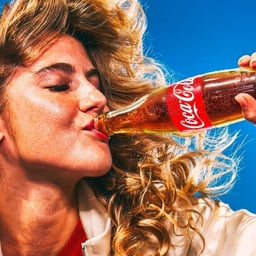
JKR has refreshed Coca-Cola’s global visual identity by consolidating and amplifying existing brand assets rather than introducing a radical redesign. The Dynamic Ribbon becomes the core connective device across packaging, app icons and variants, while Better With typography gives Coca-Cola Zero Sugar a more distinct expression. The system is designed to remain consistent while accommodating local photography, tone and activation across more than 200 markets.
Coca-Cola has launched a refreshed global identity designed to improve consistency across more than 200 markets. The system places renewed emphasis on the brand's 1969 ribbon device and includes updated Coca-Cola Zero Sugar packaging, a Brand Center, and a technology-powered Design Intelligence tool. The project was developed with a range of partners spanning identity, packaging, typography, photography, digital platforms, and governance.
JKR redesigned Sporting CP's identity for the Lisbon football club's 120th anniversary, drawing from enduring club symbols rather than radically disrupting its visual legacy. The new system simplifies the historic crest, foregrounds a white lion, and introduces Sporting Sans, a custom typeface created with Manchester-based foundry F37. The identity extends across print, digital, merchandise, fan-experience signage and motion.
The article 'The Best of the Lot' on Brand New, written by Armin, highlights top recent logo and identity redesigns reviewed on the site. It references notable projects such as KFC’s rebrand by JKR and Sam’s Club’s identity by Turner Duckworth. The post serves as a curated roundup of standout branding work featured on Brand New.
The article announces KFC’s global rebrand developed with JKR, harmonizing the brand’s six iconic assets and introducing a hidden drumstick in the logo. The refresh extends beyond visuals to include new menu items, beverages, and restaurant concepts launching first in the UK and Ireland.
UnderConsideration’s Brand New reviewed KFC’s new logo and brand identity designed by Jones Knowles Ritchie in collaboration with KFC’s in-house team. The redesign refines the Colonel’s portrait, simplifies the logo, and introduces a proprietary typeface while maintaining the brand’s iconic red and white palette. The update is positioned as an evolution rather than a radical change, reinforcing KFC’s heritage and visual consistency across touchpoints.
KFC has unveiled a global rebrand with creative agency JKR, expanding its iconic bucket into a full brand world dubbed the 'Bucketverse'. The overhaul includes a new 3D logo, custom typefaces, refreshed Colonel illustration, updated packaging, interiors, and digital experiences. Collaborations with illustrators and photographers worldwide bring a lively, experience-led identity that reimagines the fast-food giant for a new era.
Jones Knowles Ritchie has unveiled a global rebrand for KFC, centering its entire identity around the iconic bucket in what it calls the 'Bucketverse'. The project introduces a 3D logo, custom typefaces, refreshed Colonel illustration, and a unified design system spanning packaging, environments, and digital touchpoints. The rebrand aims to evolve KFC from a quick-service restaurant to a 'quick experience restaurant' while maintaining its heritage and recognisable assets.
UnderConsideration’s Brand New reviewed the new logo and packaging for Schweppes, designed by JKR in collaboration with Studio.One, Mischief, and the brand’s in-house team. The update refines the iconic beverage brand’s visual identity with a refreshed wordmark and packaging system. The article highlights the design evolution and its connection to Schweppes’ heritage.
JKR partnered with The Coca-Cola Company to deliver a comprehensive rebrand and packaging redesign for Schweppes, the world’s oldest soft drink brand. Drawing from over two centuries of archival materials, the new identity reintroduces historical serif typography, the iconic saffron sash, and the 1851 Great Exhibition crystal fountain illustration. The redesign unifies global markets and reinforces Schweppes’ premium heritage positioning.
Creative Boom reports on Schweppes’ major global rebrand led by JKR, Studio.One, and Mischief. The redesign revives the brand’s heritage with archival typography, saffron yellow, and the return of mascot Clive the Leopard. The new platform, 'With Time Comes Taste,' positions Schweppes as a premium, timeless beverage brand for modern audiences.
Creative Boom’s profile of design director Paul O’Brien traces his journey from struggling with imposter syndrome at a mismatched job to rediscovering confidence through freelance work and award-winning projects. After success with Taxi Studio’s Byron Burgers campaign and leadership roles at Elmwood, O’Brien now embraces freelance life with renewed purpose. The article explores how environment, not ability, often shapes creative confidence.
The article highlights Jones Knowles Ritchie's redesign for Schweppes, which embraces the brand’s 250-year heritage rather than reinventing it. The new packaging features a radiant yellow color, a diagonal stripe for movement, and a gold rendering of the 1851 Great Exhibition fountain, blending historical depth with modern elegance.
Credited Studio: Jones Knowles Ritchie
Also credited: Drama
Credited Studio: Jones Knowles Ritchie
Also credited: Drama
Credited Studio: Jones Knowles Ritchie
Also credited: Drama
Credited Studio: Jones Knowles Ritchie