DutchScot is a London design studio founded by Ross Goulden, Alex Swatridge and Jacob Vanderkar. The studio works across strategy, visual identity, packaging, editorial design, digital experiences and environments.
Works with Circular, Krayewski, Portrait, Madison Antiqua, Centra No.2, Rois, Styrene
Their own site is set in Caslon Doric
Awarded work credited to DutchScot. Coverage is partial; projects may be shared with other studios.
Entrant Company, Design Agency: DutchScot
People credited alongside DutchScot in published articles. These historical credits may include collaborators and do not represent the current team.
Technologies detected on DutchScot's website.
Entrant Company, Design Agency: DutchScot
Design Agency: Dutchscot
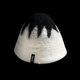
DutchScot created a bold identity for Fjord, a new floating sauna and cold-water plunge in Sausalito on San Francisco Bay. Rejecting soft wellness clichés, the studio developed an industrial, black-and-white system centred on a bespoke Playtype typeface and a wordmark that replaces the o in Fjord with a degree symbol. The identity extends across digital temperature-gauge interactions, signage, posters, merchandise, handmade soap gift tokens and moody photography by Alex Farnum.
DutchScot created a bold black-and-white identity for Fjord, a new floating sauna and cold-water plunge venue in Sausalito on San Francisco Bay. Rejecting soft wellness conventions, the system draws on the area's industrial history and uses a bespoke Playtype typeface whose Fjord wordmark replaces the “o” with a degree symbol. The identity extends across web interactions, signage, posters, merchandise, tactile soap gift tokens and moody photography by Alex Farnum.
DutchScot created the identity for Fjord, a new floating sauna and cold-water plunge experience in the Sausalito area of San Francisco Bay. The stark, industrial system uses bespoke Exit Fjord lettering with a degree-symbol “o”, neutral Saans typography, black, white and maroon, and abstract patterns that evoke water's transitions between cold density and hot steam.
Creative Boom’s 2026 feature by Katy Cowan highlights 16 standout business card designs from leading studios around the world. The article showcases tactile, material-rich examples from Pentagram, Bond, Hey Studio, and others, celebrating the resurgence of physical networking tools. Each project demonstrates how thoughtful design and print craft can elevate a simple card into a storytelling piece.
The article by The Brand Identity, written by Poppy Thaxter, showcases nine design projects that exemplify the power of print finishing techniques such as embossing, debossing, and foil stamping. It highlights how studios like Studio Sly, Hugmun, and DutchScot use tactile materials and craftsmanship to elevate packaging and identity design. The feature celebrates the artistry and technical precision of print production in contemporary branding.
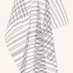
BP&O features DutchScot’s rebrand for Danish textile brand Tameko, known for its minimalist luxury aesthetic. The identity draws inspiration from typewriter art, using a bespoke version of Cast Foundry’s Xanti Typewriter typeface to create a tactile, typographic system that mirrors the brand’s material focus. Collaborations with copywriter Nick Asbury, photographer Irina Boersma, and stylist Merete Vyff reinforce the brand’s refined, textural sensibility.
The article by The Brand Identity, written by Poppy Thaxter, highlights ten standout brand identities created for architecture practices around the world. It explores how each design captures the philosophy and vision of its respective studio, showcasing thoughtful and human-centered approaches to architectural branding. Featured projects include work by studios such as SPGD, Warriors Studio, and DutchScot.
The Brand Identity rounds up 15 varied business-card designs from previously featured identity projects, including work by MAUD, Parker, DIA Studio, DutchScot and Heydays. The selection highlights the continued appeal of printed cards across restaurant, technology, wine, telecoms, retail and investment brands.
The article showcases six brand identities that use motion as a central design element, featuring work from Landor & Fitch, IYA Studio, DIA, Diplomatie Studio, Pol Solsona Studio, and DutchScot. Each project demonstrates how movement and kinetic systems enhance brand storytelling across industries from music festivals to tech platforms. The roundup highlights the growing importance of motion design in modern branding.
This roundup highlights seven playful identity projects that favour vibrant colour, expressive typography, illustration and nostalgia over restrained modernist minimalism. The selected work spans convenience-store packaging, hospitality, publishing, charity, toys and sustainable family retail, from studios including Meat Studio, How&How, Wedge and Pràctica.
BP&O features DutchScot’s brand identity for Sucre London and its downstairs bar Abajo. The project draws on Argentine cultural influences, combining bespoke typography, hand-drawn illustrations, and a color palette inspired by Andean fabrics. The identity balances restraint and ornamentation, reflecting the restaurant’s heritage and contemporary London setting.
BP&O features DutchScot’s brand identity for FitzJohn’s, a luxury over-60s apartment development in Hampstead. The design draws inspiration from the area’s creative heritage, using expressive typography, vibrant colors, and abstract compositions to evoke a modern yet nostalgic feel. Collaborations with illustrator Emily Robertson and photographer Carol Sachs add warmth and lifestyle appeal to the brand.
London-based studio DutchScot created a distinctive brand identity for Fitzjohn’s, a luxury apartment complex in Hampstead. Drawing inspiration from the building’s unique architecture and the area’s artistic heritage, the identity uses expressive typography, geometric compositions, and a rich color palette to convey both sophistication and eccentricity. The project balances approachability with luxury, reflecting the creative spirit of its location.
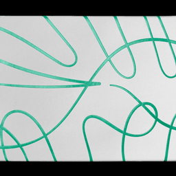
BP&O features DutchScot’s rebrand for Future Factory, a London-based lead generation agency for creative businesses. The identity uses motion graphics and a dynamic system of animated pipes and typography to convey energy, flow, and human connection. The article praises the balance between structure and liveliness in the design.
The article is part of The Brand Identity’s 'The Edit' series, highlighting five recent design projects from around the world. Featured works include PORTO ROCHA’s rebrand for Brazilian sports brand Olympikus, DutchScot’s publication for Centre Point, Kira Koroknai’s wine label for Glug Wine Club, Studio Brutus’ identity for DAYWATCH, and a cultural branding project by Susanna Foppoli and Carolina Magro for Royal District. Each project showcases distinctive visual strategies, from modular systems to hand-drawn illustrations.
London-based consultancy DutchScot created a playful exterior and interior wayfinding system for North Greenwich's Design District, a creative-workspace cluster comprising 16 architecturally varied buildings. Building on an identity by Magpie Studio and Socio, the system uses Mabry, vibrant colours, building-specific icons and three-dimensional material models, produced with technical signage specialist Standard8.
London-based design studio DutchScot developed a refined new identity for architecture and interior design practice Conran and Partners. The rebrand features a bespoke ampersand monogram combining the letters C and P, paired with a Styrene wordmark and a black-and-white palette inspired by the studio’s interiors. The result balances elegance and precision, reflecting the client’s architectural and lifestyle sensibilities.
DutchScot developed a dynamic and typographically balanced identity for London-based interior design studio Littlemore. The system uses Commercial Type’s Portrait typeface, geometric 'L' shapes, and a flexible color palette to reflect the studio’s balance between tradition and modernity. The result is a sophisticated yet contemporary visual identity that captures Littlemore’s creative ethos.