

D&AD Festival
London, UK19 May 2026 – 20 May 2026
How&How is an international, B Corp-certified branding agency with studios in London and Los Angeles. Founded by Cat How and Rog How, its team combines strategy, verbal and visual identity, digital design and development for organizations seeking ambitious ideas with social and environmental purpose.
Works with ES Replan Variform, Marist
Their own site is set in GT Pressura Mono, Helvetica, Mabry, Mabry Pro
Awarded work credited to How & How. Coverage is partial; projects may be shared with other studios.
Credited Studio: How&How
Designers and creative leads attributed to How & How in press coverage.
Technologies detected on How & How's website.
How&How has rebranded the SS Great Britain into the Bristol Dockyards, transforming the historic ship into a broader cultural destination. The new identity uses a bold pink inspired by Bristol’s Totterdown terraces, a collage-based visual system, and a confident tone of voice to reflect the city’s radical spirit. The rebrand aims to attract new audiences and reposition the Dockyards as a vibrant, modern experience.
It’s Nice That announced the 2026 Cannes edition of its Nicer Tuesdays event, hosted in partnership with Canva at the Creative Cabana during Cannes Lions. The lineup includes illustrator Sebastian Curi, branding leader Cat How of How&How, filmmaker Janvier Wete of Minute Shorts, and Canva’s executive creative director Cat van der Werff. Each speaker will share insights into their creative processes, spanning analogue illustration, identity design, short-form film, and in-house brand campaigns.
UnderConsideration’s Brand New features How&How’s new logo and identity for Ideogram, an AI-focused software company. The article highlights the rebrand, showing before-and-after comparisons and noting the use of a serif typeface and icon-based design. It is a brief review entry within the site’s 'Reviewed' category.
Creative Boom’s article by Tom May explores How&How’s branding for Snooz, a new ice cream brand designed for nighttime consumption. The studio created a dark, sleep-inspired identity that rejects typical bright, daytime ice cream aesthetics, using soft letterforms, moon motifs, and flash-on photography to convey a nocturnal mood.
How&How has rebranded US healthcare app Trellis with a new identity built around the concept of a 'living blueprint' for generational health. The flexible system uses a grid structure, fingerprint motifs, and natural photography to balance data precision with human warmth. The rebrand reflects a cultural shift toward personal agency and continuity in healthcare experiences.
The article, written by Ellis Tree for It’s Nice That’s Forward Thinking series, explores five emerging graphic design trends for 2026. It highlights a growing return to analogue and imperfect aesthetics, such as photocopied textures, scanning, and collage, as designers push back against hyper-digital polish. Examples include Charlotte Rohde’s Oficía Mono campaign, How&How’s branding for Big Cartel, and Louis Garella’s logo for Sonata Electronica.
Cat How of How&How argues that the perceived divide between branding and creative agencies is artificial. Using Uncommon’s JD Sports global rebrand as an example, she explains that brand and campaign work are inseparable expressions of the same strategic thinking. The article calls for the industry to move beyond outdated labels and focus on holistic creative problem-solving.
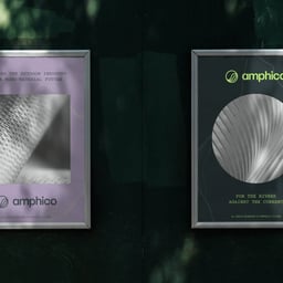
Creative Boom reports on How&How’s rebrand of Everbloom, a materials innovator turning organic waste into luxury fibres. The new identity rejects typical sustainability cues in favour of a refined, high-fashion aesthetic that positions Everbloom as a premium, future-facing brand. The project uses elegant typography, tactile digital textures, and restrained storytelling to communicate confidence and desirability.
Written by Cat How of How&How, this Creative Boom insight piece analyses Cracker Barrel’s controversial rebrand and the resulting $100 million loss in market value. It argues that the episode serves as a rare real-time demonstration of how brand equity, emotion, and cultural resonance directly affect financial performance. The article frames the event as a cautionary tale about the risks of disregarding cultural identity in brand evolution.
Creative Boom’s special report by Tom May gathers insights from seven UK studio leaders on how AI is influencing the creative process. While many see AI as a useful tool for accelerating research and ideation, they agree it hasn’t replaced human creativity or judgement. The consensus is that AI is being pragmatically integrated into workflows, enhancing efficiency without redefining the essence of creative work.
Written by Cat How of How&How, this opinion piece argues that so-called 'anti-branding' is not a rejection of branding but a strategic evolution of it. Using examples like Jolene’s child-drawn logo, Charli XCX’s Brat album, and Patagonia’s 'Don’t Buy This Jacket' campaign, How contends that these are calculated branding moves disguised as rebellion. The article dismantles the myth of authenticity in design, asserting that all visual identities are deliberate brand strategies.
The article gathers insights from leading creative directors and studio founders about their strategic priorities for 2026. Themes include efficiency through AI, the growing importance of strategy, blurred boundaries between disciplines, and the need for bold, distinctive creative work. Despite economic uncertainty, many studios express optimism and a focus on smarter, more collaborative approaches.
Creative Boom features How&How’s new brand identity for Jupi, an AI-powered decision-making platform founded by Nick Hernandez. The identity blends surrealism and simplicity, using metaphor-rich illustrations and motion to convey clarity and intelligence. The project avoids typical tech clichés, opting for a human-centered, poetic approach to AI branding.
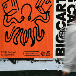
BP&O’s Emily Gosling reviews How & How’s rebrand for ecommerce platform Big Cartel. The new identity replaces the old chevron logo with a hand-drawn glyph and introduces expressive typography using ES Replan Variform and Marist. The visual system balances maker energy with structure, supported by Eilidh Reid’s illustrations and a flexible color palette.
How&How has rebranded Big Cartel with a bold, tactile identity that celebrates the platform’s indie roots and creative community. The new design, led by creative director Chris Clayton, uses hand-rendered textures, expressive typography, and a variable logomark to embody the brand’s 'Goodbye Caution' ethos. Collaborating with type foundries Extraset and Dinamo, the studio crafted a distinctive, personality-driven system that repositions Big Cartel as a launchpad for modern entrepreneurs.
The Brand Identity’s biweekly roundup ‘The Edit’ spotlights five new design projects from studios including How&How, Opal, Shore Creative, and BAS ID. Featured work ranges from Big Cartel’s bold rebrand to a refined book design for Arhaus, a French restaurant identity by Shore Creative, a vivid art publication by Victor Verhelst, and a geometric identity for Stockholm’s Marievik district. The article highlights diverse aesthetics from maximalist to minimalist, showcasing global design talent.
BP&O’s feature by Emily Gosling explores How&How’s rebrand for London street food pioneer Yum Bun. The new identity, built around the concept 'Bounce and Rise', introduces a playful logo inspired by Japanese Hanko stamps, a cheerful mascot, and a warm, sunrise-hued palette. The project balances fun and maturity, using motion and typography to express Yum Bun’s optimistic, high-quality street food ethos.
In this edition of Creative Career Conundrums, Alex Bec, cofounder of It’s Nice That, offers advice to an international design graduate struggling to find sponsorship in the UK. He suggests targeting larger studios with established sponsorship systems and considering freelance work as a way to build relationships that could lead to full-time opportunities. The article also highlights the current challenges in the UK creative job market and points readers to resources and job listings on If You Could Jobs and Creative Lives in Progress.