Design work for Big Cartel, collected from the studios behind it.
Designers and creative leads credited on Big Cartel projects in press coverage.
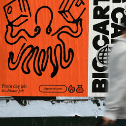
How&How has rebranded Big Cartel with a bold, tactile identity that celebrates the platform’s indie roots and creative community. The new design, led by creative director Chris Clayton, uses hand-rendered textures, expressive typography, and a variable logomark to embody the brand’s 'Goodbye Caution' ethos. Collaborating with type foundries Extraset and Dinamo, the studio crafted a distinctive, personality-driven system that repositions Big Cartel as a launchpad for modern entrepreneurs.
The Brand Identity’s biweekly roundup ‘The Edit’ spotlights five new design projects from studios including How&How, Opal, Shore Creative, and BAS ID. Featured work ranges from Big Cartel’s bold rebrand to a refined book design for Arhaus, a French restaurant identity by Shore Creative, a vivid art publication by Victor Verhelst, and a geometric identity for Stockholm’s Marievik district. The article highlights diverse aesthetics from maximalist to minimalist, showcasing global design talent.
How&How has rebranded e-commerce platform Big Cartel with a scrappy, sketch-inspired identity that celebrates creative entrepreneurs. The new look features rough illustrations, risograph textures, and a custom wordmark developed with Extraset. The rebrand positions Big Cartel as a champion of individuality and indie creativity in the online marketplace.