← Back to Fonts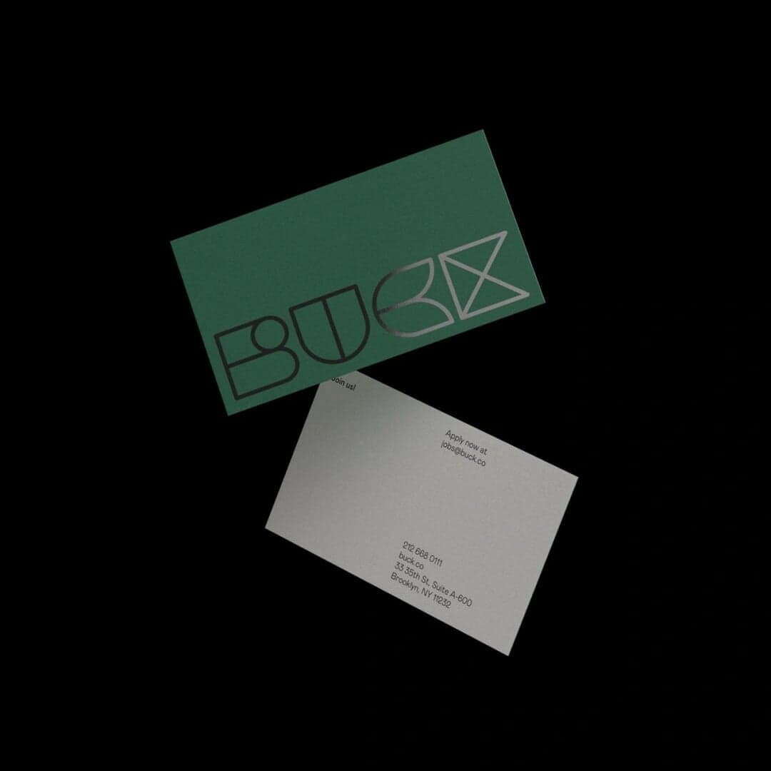
Mabry — 1 case
Used by Buck
Set for Buck
Cases set in Mabry, as credited by the studios in their own writeups.
Mabry in the news
- New Logo & Branding for Murray's Cheese by Base Design
BP&O · May 21, 2024
BP&O’s article by Angelica Frey explores Base Design’s rebrand of Murray’s Cheese, a long-established New York cheesemonger expanding into digital retail. The new identity replaces the classic script logo with Colophon’s Brick Pro and introduces a refreshed color palette, multiple typefaces, and hand-drawn illustrations by Christine Van Wassenhove. The project balances heritage and modernity, translating the brand’s in-store warmth into a crafted e-commerce experience.
- SEESAW: Innovative Presentation Design Agency
SEESAW · Jan 30, 2024
SEESAW features the website for demoday, a presentation design agency. The listing highlights the agency’s focus and the typefaces used in its site design, DM Sans and Mabry.
SEESAWdemodaydigital - The Edit: five projects including Pentagram’s identity system for the Shakespeare Theatre Company
The Brand Identity · Jan 11, 2023
The Brand Identity’s 'The Edit' highlights five global design projects, including Pentagram’s rebrand for the Shakespeare Theatre Company. Other featured works include EVERLAND’s artistic packaging for Danish juice brand Rebæl, a student-focused identity for Romania’s DIPLOMA Show, Grávita’s natural branding for The Beemine Lab, and a refined identity for New York coaching studio Sanctuary. Each project showcases distinct visual languages and typographic choices reflecting contemporary branding trends.
- New Branding & Packaging for Eadem by Lotta Nieminen
BP&O · Dec 20, 2022
BP&O features Lotta Nieminen Studio’s branding and packaging design for Eadem, a beauty brand created for women of colour. The identity uses a bold logotype, contrasting typefaces, and a vibrant palette to express dualities of strength and softness, reflecting the brand’s inclusive mission. The design challenges conventional beauty minimalism with expressive typography and authentic photography.
Lotta Nieminen StudioEadembranding - Parker creates organic identity for sustainable furniture brand Keeps
The Brand Identity · Jul 18, 2022
Seattle creative studio Parker developed a typographically led identity for Keeps, an American sustainable furniture brand. The system centres on the bespoke Keeps Sans typeface, supported by Editorial New and Mabry, and uses organic image containers, vivid orange accents and recycled paper stocks to connect the brand with natural materials and responsible production.
- New Branding for Sitko Pizza Co. by Werklig
BP&O · Jun 14, 2022
BP&O’s Richard Baird reviews Werklig’s brand identity for Finnish sourdough pizza company Sitko Pizza Co. The project combines subcultural influences, punk energy, and the founder’s graffiti background to create a bold, artful identity expressed through packaging, motion, and web design. The result is a dynamic and imaginative system that merges food culture with underground creativity.