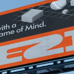
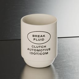
Parker is a Seattle, United States studio focused on brand development for business and industry. From early-stage builds to mature rebrands, they work side by side with teams that make tangible things and run them well. Their roster ranges wide—Google and Keeps on one end, Girlfriend Collective, Firsthand Supply, and 760 Skin on another—along with Clutch Automotive, Feldman Architecture, Loftium, Grape Juice, Gwella, Habits, and Holcomb. Parker’s approach is direct: small senior teams, tight research, fast prototypes, and identity systems that hold up in the real world, from packaging lines to shop floors and digital products. They’re at their best when the brief is complex and the outcome needs to earn its keep—naming a new venture, shaping a product line, or aligning a growing company around a single story and a set of usable tools. Rooted in Seattle’s builder culture, Parker favors plain language, solid craft, and measurable impact, leaving clients with brands that staff can run, customers can recognize, and companies can grow without the drama.
Technologies detected on Parker's website.
Creative Boom’s feature by Katy Cowan explores the key font trends expected in 2025, drawing insights from designers across several studios. The article highlights a return of serif typefaces, a pushback against minimalist sans serifs, and the continued rise of variable and expressive fonts. It also notes a growing interest in neo-retro and DIY-inspired typography as brands seek individuality and emotional connection.
The article highlights seven contemporary brand identities within the transport sector, showcasing how design studios like Parker, Studio South, and Mirage are shaping the visual language of mobility. Each project—from electric scooters to delivery services—demonstrates how clarity, sustainability, and innovation define modern transport branding.
Seattle-based studio Parker created a refined yet characterful brand identity for homeware brand Holcomb. The design features a custom wordmark based on Lausanne, paired with GT Super, and supported by technical illustrations silk-screened on kraft paper. The identity balances utilitarian restraint with a playful cursive 'H' symbol that captures the spirit of cooking.
The article by The Brand Identity, written by Poppy Thaxter, showcases ten standout brand identities for furniture and homeware companies. It highlights how each design balances aesthetic appeal and brand storytelling, featuring studios such as Clase, Cossette, Decade, MISKA STUDIO, and others. The piece celebrates the importance of distinctive visual identities in a competitive furniture market.
Seattle-based studio Parker developed a warm, human-centered rebrand for the Myers & Briggs Foundation, reflecting its mission to help people understand themselves and others. The identity uses Commercial Type’s Graphik, a flexible color system inspired by the 16 personality types, and welcoming photography by Ben Lindbloom. The result is a balanced, approachable brand that bridges the foundation’s history and future.
BP&O features Parker Studio’s branding for Clutch Automotive, a Texas-based chain of modern auto shops that blend traditional garage culture with contemporary design. The identity includes a custom script logotype, Plaak typography, and metallic color accents, balancing heritage and modernity. Collaborative packaging with Katz Coffee extends the brand’s industrial yet approachable aesthetic.
Seattle-based studio Parker created a new brand identity for Clutch Automotive, blending the nostalgic charm of traditional auto shops with a modern sensibility. The identity features a hand-rendered script logotype and the Plaak typeface, achieving a balance between mechanical precision and approachable warmth. The design reflects Clutch’s mission to modernize while preserving the local, independent spirit of automotive repair culture.
Seattle-based studio Parker developed a refined and minimalist brand identity for global crypto investment brand Prismatic. The design emphasizes clarity and trust through a muted color palette, custom typography, and a prismatic distortion motif. Creative Director Tyler Eide led the project, with 3D work by Sebastian Camens.
The Brand Identity interviewed Two°Creative founder Ryan McGill about The Green Dot campaign, an open brief inviting designers to redesign the recycling symbol to better reflect its meaning. McGill discussed the campaign’s origins, lessons from previous projects, and the positive response from the design community. The initiative aimed to raise awareness about recycling confusion and promote design’s role in sustainability.
Seattle-based studio Parker rebranded cosmetics company Firsthand Supply with an identity that balances industrial precision and human warmth. The project features custom typography, sustainable packaging, and a hand-drawn logo reflecting the brand’s humanitarian ethos. The design uses recycled materials, monochrome tones, and pastel accents to modernize the brand while maintaining its approachable character.