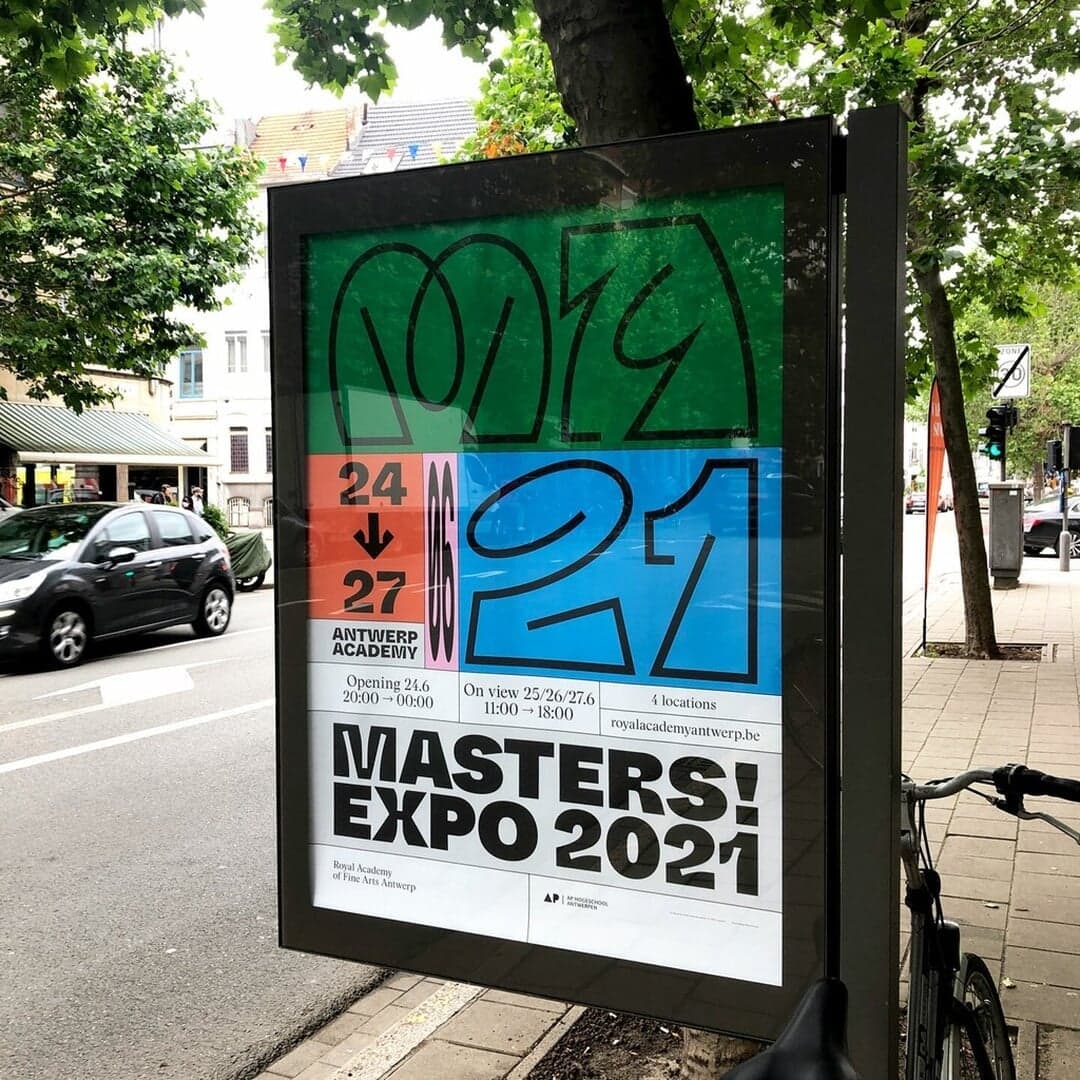
A contemporary grotesque full of idiosyncrasies; the Inktrap cut turns functional ink traps into a display feature. View at Dinamo →
Used by Twice, Vanderbrand, Parker, Buck, Collins
Set for Dinamo (4), 760 Skin, ABC Dinamo, Bauchet de La Bouvrie, Crane, Edenshaw, Palm NFT
Find design references using ABC Whyte. Browse project images and studio credits, then follow each case to its source. Typeface names come from catalogued studio writeups; coverage is limited to projects with recorded credits.
The Brand Identity’s article, written by Poppy Thaxter, explores how studios like FAY, DesignStudio, and Dinamo Typefaces are using generative tools and variable fonts to create flexible, dynamic brand systems. Through case studies with clients such as Lobe, Wu Tsai Institute, and Ubisoft+, the piece highlights how technology empowers clients to co-create assets while maintaining brand consistency. The discussion, part of The Shift series with Frontify, underscores the balance between creative freedom and systematic control in modern branding.
The Brand Identity’s 'The Edit' highlights five new branding projects from global studios, including Sasyk Mihal’s rave-inspired identity for Page Break, Parker’s Palm Springs–infused skincare brand 760 Skin, Sylvan Hillebrand’s bold work for ARTIZSOUL, U.I.WD.’s sentimental rebrand for fashion house MIXED, and MEK’s science-driven identity for impact investment firm Understorey. Each project showcases distinct visual strategies, from expressive typography to nature-inspired palettes.
SEESAW features the website for Plain, a support platform for product-focused companies. The listing highlights its clean digital design and use of Inter, ABC Whyte, and Fragment Mono typefaces. The project is positioned within the SaaS and productivity space.
Singapore-based designer Jay Liu created a variable visual identity for META Performance, a boutique gym focused on personalised body and lifestyle transformations. The system uses the morphing variable typeface Orelo as its central wordmark, supported by Whyte Inktrap, a monochrome palette and neon-magenta accents across print, digital and environmental applications. Jonathan Paul created an accompanying film in which the wordmark expands and contracts to evoke breathing during exercise.