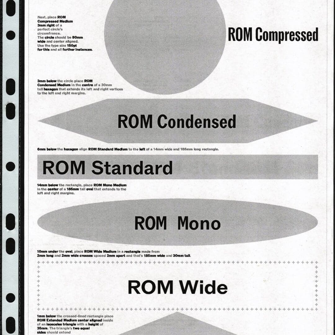
Swiss type foundry founded by Johannes Breyer and Fabian Harb, working between Basel and Berlin — home of the ABC library. Visit Dinamo →
Dinamo typefaces credited by studios in their case writeups.
Trondheim creative agency Skogen developed a new identity for GridScout, a Norwegian power-line sensor company whose devices detect risks including vibration, moisture, woodpecker damage and pole tilt. Rather than using familiar technology-brand cues, the system draws on scouting culture through a woodpecker-and-pin logo, merit-badge graphics, workwear and nature references, ABC ROM typography, and an olive-and-cream palette with high-vis alerts.
Experimental technology-focused studio HEX rebranded AI infrastructure company Composio with an electric visual identity intended to make its invisible agent infrastructure feel tangible. The system uses high-saturation beams, gradients, technical illustration, modular icons, isometric patterns and motion to communicate agentic learning, orchestration and rapid energy flow, while ABC Diatype and JetBrains Mono provide typographic structure.
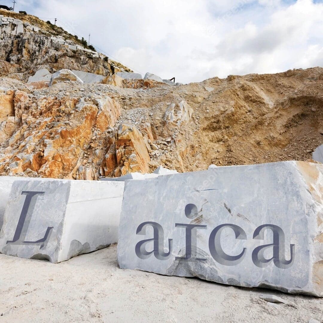
Emily Gosling reviews 20(Something)'s rebrand for Open Point, a civic software platform formed by merging Social Pinpoint and Consultation Manager. The identity combines a chiselled, Roman-inspired typographic approach, deep greens and purples, and a flexible open-point logo that works in both flat and animated 3D applications. The article praises its museum-like gravitas and warmth as an unexpected but effective fit for civic technology.
Bristol studio Wild People rebranded sustainable garden-room company Little Green Rooms around the platform "Headspace Found", shifting attention from construction specifications to the restorative space the rooms provide. The identity combines nature-informed, seasonal colours and dappled-light imagery with technical typography, bespoke icons, advertising, and digital work.