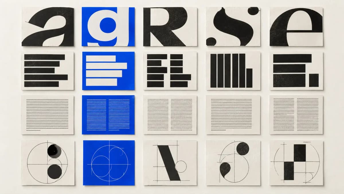
Cover: AI-generated editorial illustration, not authentic specimens of the named typefaces.
A typeface name tells you little about the job it does. The same family can provide a quiet reading voice, a large campaign headline or the starting point for a custom brand font. These twenty projects let you compare those uses through credits published by the studios and foundries themselves.
The selection covers Aeonik, Druk, ABC Diatype and Söhne, with five examples of each. Follow the source beside each project for the original work, or open the individual D1S1 guides for a closer reading. Custom adaptations are identified separately from standard retail use.
Download the reference dataset (JSON). Sources checked on 10 October 2026; the projects span different years. This is a selected reference collection, not a popularity ranking.
Aeonik: five documented uses
Aeonik appears here in a customized wordmark, book typography and body copy, as well as the basis for a commissioned text face. Its role changes with the surrounding identity system.
JIDU — Oker
A commissioned text face based on Aeonik balances the custom display typography. View the original project.
Quantive — Focus Lab
Aeonik provides a customized logotype. View the original project.
Cateb — Mucho
Aeonik is identified as the primary typeface in the brand identity. View the original project.
BKT Mobiliario Urbano — Anagrama
Aeonik supports the book layout across different typographic hierarchies. View the original project.
The Depths She Will Reach — Decimal Studios
Aeonik body text accompanies GT Super display typography. View the original project.
Druk: five documented uses
These examples put Druk in festival identities, campaign typography, books and studio branding. The credits also document pairings with Lyon and GT Zirkon.
Tribeca Festival — Pentagram
Druk is a central element of the festival’s dynamic identity. View the original project.
NYU Skirball Center — Pentagram
Druk and Druk Wide appear in the Fall 2024 campaign. View the original project.
Princeton University Press — Pentagram
Druk and Lyon are credited as the book’s primary typefaces. View the original project.
Snog Productions — Aline
Druk and GT Zirkon are credited together; Druk frames project imagery. View the original project.
Upstate Studios — Alter
The studio credits Commercial Type’s Druk in the project typography. View the original project.
ABC Diatype: five documented uses
Diatype spans all-purpose identity typography and bespoke customizations. On and GOAT are foundry-documented adaptations; they should not be read as examples of the unmodified retail family.
On — Dinamo
Dinamo documents a bespoke customization of Diatype. View the original project.
GOAT — Dinamo
Dinamo documents customized Diatype for the platform. View the original project.
WHEN Fertility — Universal Favourite
ABC Diatype spans the wordmark and body copy. View the original project.
Up Norway — Snøhetta
Diatype and Arizona provide contrasting voices for the travel brand. View the original project.
Comédias do Minho — André Cruz
ABC Diatype appears among several credited families in the printed programme. View the original project.
Söhne: five documented uses
Söhne appears as a primary brand voice and as one member of a broader typographic palette. Rivian is a documented adaptation of the family.
Rivian — Pentagram
The brand typeface is adapted from Söhne, rather than simply an unchanged retail font. View the original project.
Isomorphic Labs — Pentagram
Söhne is credited as the brand’s typeface. View the original project.
MIND — Pentagram
Söhne appears in the wordmark and wider brand typography. View the original project.
Herman Miller — Order Design
Söhne serves as the primary typographic voice. View the original project.
Porto Design Biennale — Andrew Howard
Söhne appears in the credited type selection alongside Baste A and Coranto. View the original project.
What changes from one project to another
A retail family and a custom adaptation are different references. JIDU, On, GOAT and Rivian document commissioned changes. Use them to understand what was adapted; do not assume their finished letterforms are included in a standard font download.
A pairing has a job. Decimal assigns GT Super to display text and Aeonik to body copy. Snøhetta describes Diatype and Arizona as two voices for Up Norway. These credits are more useful than an unexplained list of fonts because they connect a choice to a role.
One family can support a broad hierarchy. WHEN Fertility credits ABC Diatype from wordmark to body copy. BKT’s book uses Aeonik across different hierarchies. Compare weight, scale and spacing before deciding that another family is necessary.
Credits do not measure outcomes. None of these examples establishes that a font improved sales, recognition or usability. To choose for your own project, test realistic text, languages, numerals and screen sizes, then confirm the required licence with the foundry.
How to use the collection
Compare the role of the typeface before comparing its appearance. Ask whether it carries body copy, supplies display typography, works alongside a contrasting family or has been altered for the brand. A documented pairing shows that two families were used together; it is not a recommendation for every project.
For commissioning and licensing, consult the foundry directly. These examples do not establish what licence a particular team purchased, and the dataset contains no font files or project imagery.
Sources and method
We selected the five examples already discussed in each of D1S1’s four editorial typeface guides. On 10 October 2026, all twenty source pages returned successfully, and their page text explicitly named the relevant family. We reviewed the surrounding text to connect each credit to the project, preserving distinctions such as customized derivatives.
The sample was chosen editorially. It does not measure typeface popularity, adoption over time or market share. A project can use additional families, and the presence of a credit does not establish a release year or licensing arrangement. Source pages may change after the review date.
The downloadable JSON records the project, credited studio, font family, source URL, a short note and the check date. It allows readers to inspect the same reference set without copying project images.
Suggested citation: D1S1 Design Spotlight, “Four Typefaces, Twenty Documented Projects,” 10 October 2026. Cite the original studio or foundry page when discussing a specific project.