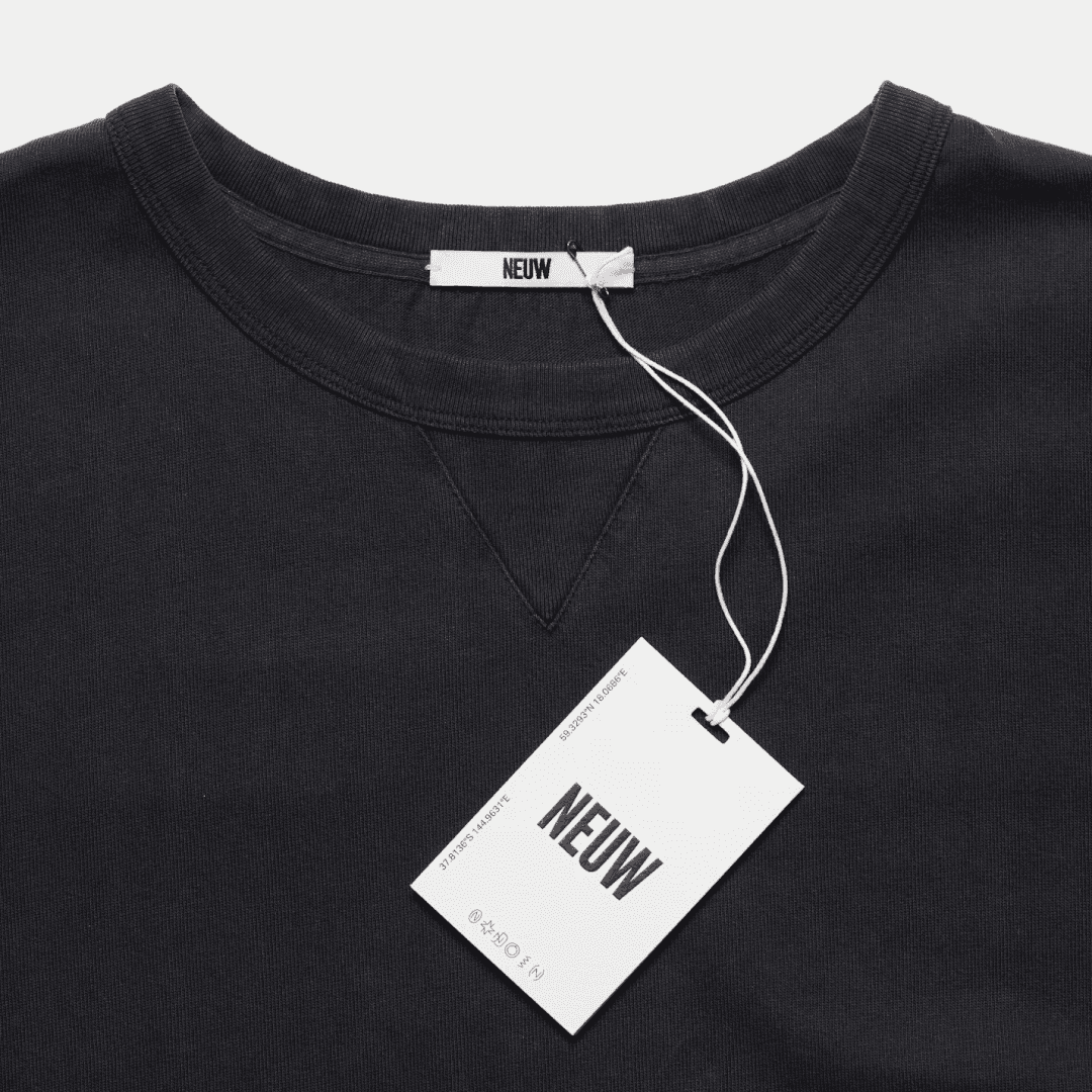
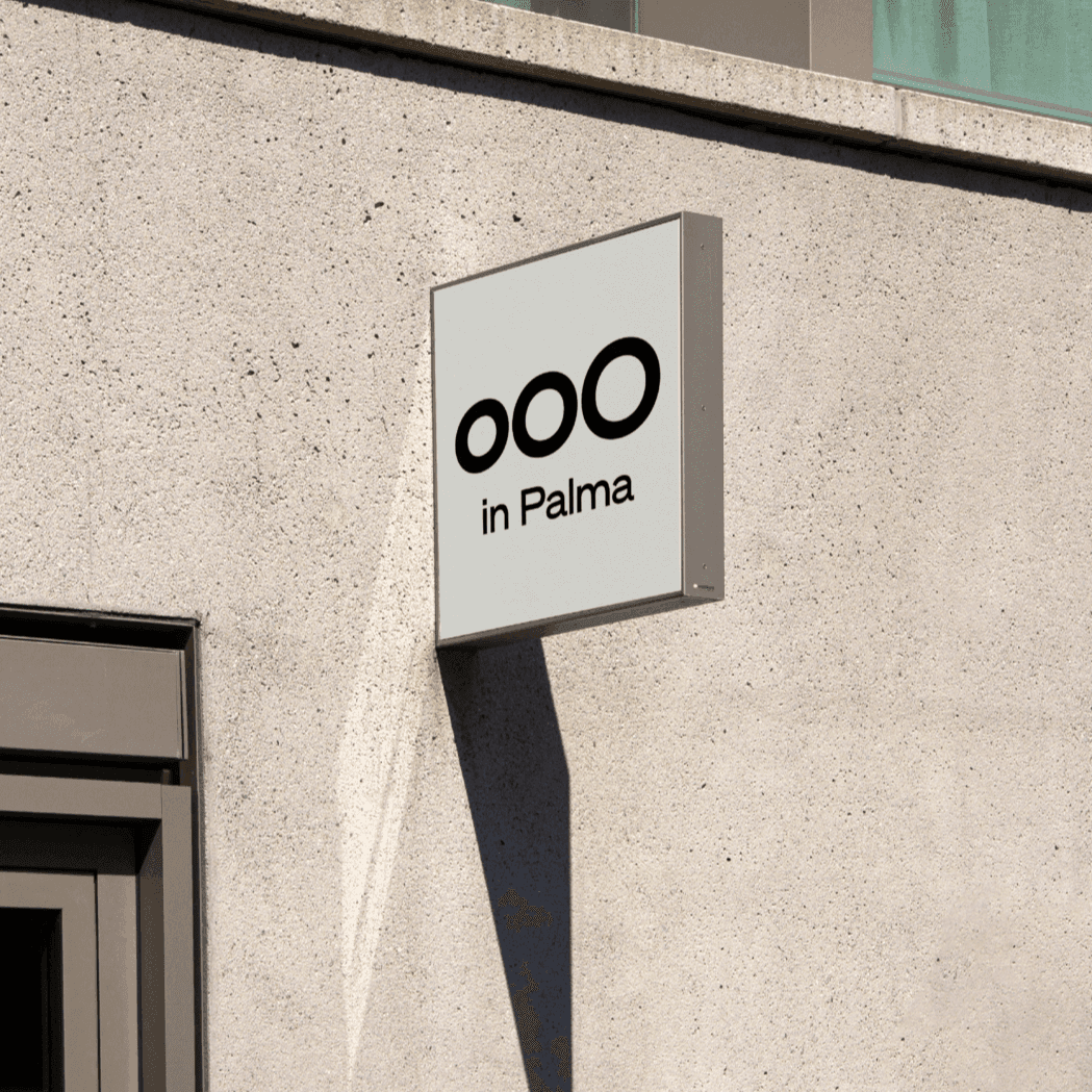
The memory of Akzidenz-Grotesk framed through the reality of Helvetica — a grotesque with the analogue warmth of the NYC Subway’s Standard signage. View at Klim Type Foundry →
Used by Ateljé Altmann (5), Pentagram (3), André Cruz (2), Order Design (2), newkid, Koto
Set for Porto Design Biennale (2), Art Makers, Ateljé Altmann, Butter Baby, Comédias do Minho, Erika Stahlman, Forum för levande historia, Herman Miller, Isomorphic Labs, Klim Type Foundry
Cases set in Söhne, as credited by the studios in their own writeups.
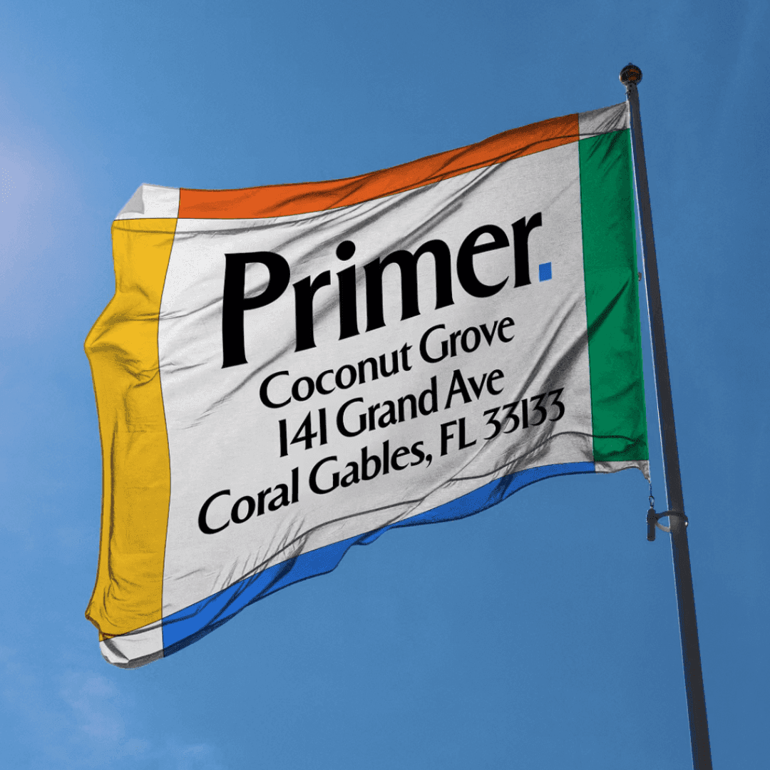
Visual Identity For Porto Design Biennale 2023 Edition
DIOME has refined its supplement packaging system under the direction of Victoire Colliou, introducing a richer brown palette and a more structured, minimalist design. The update unifies the brand’s two products, Rested and Grounded, through consistent typography and restrained visual language. The redesign reflects DIOME’s science-led yet lifestyle-conscious positioning, evolving from its earlier collaboration with ACNE Art Department.
Creative studio Koto has rebranded Mews, a Netherlands-based hospitality software platform, with a bold and distinctive identity that challenges the visual conventions of enterprise tech. The new system centers on hot pink, strong typography, and a confident tone of voice to make the brand more visible and human. The project demonstrates how B2B design can be both credible and expressive.
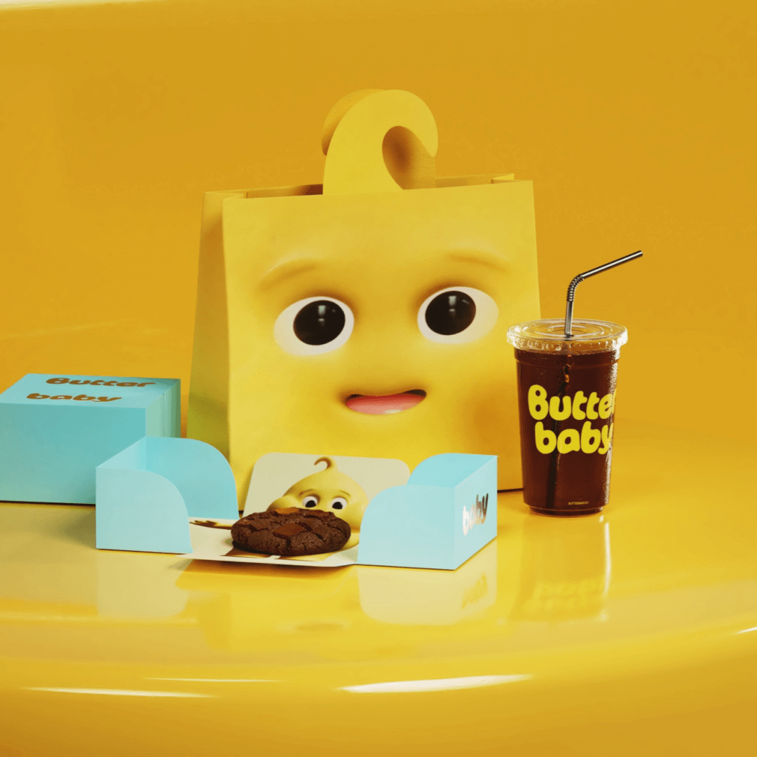
BP&O’s Emily Gosling reviews Universal Favourite’s branding for Butter Baby, a Jakarta-based dessert store built around a whimsical butter-alien mascot. The studio developed a full verbal and visual identity, including character design, packaging, motion, and interiors, using a bright yellow palette and playful typography. The article praises the project’s originality and conviction in creating a character-driven brand world.
Universal Favourite created a whimsical, intergalactic brand identity for Jakarta dessert brand Butter Baby, transforming a butter-based alien character into a full narrative universe. The project spans 3D character design, packaging, store design, and a custom language system, all rooted in playful storytelling. Collaborations with Double Up Studio and Crosby Studios helped bring the cosmic Butterlandia world to life across digital and physical touchpoints.
Söhne is Kris Sowersby’s reconstruction of a memory rather than a revival of a drawing: Akzidenz-Grotesk as it is remembered through Helvetica, filtered through the analogue warmth of Standard on the New York subway. That indirect lineage is why it reads as familiar and specific at once — it looks like the grotesque everyone already knows, but none of the details match.
It has consequently become a default for institutions that need to sound authoritative without sounding corporate. In the projects below it is the primary voice for a furniture company with a century of history, a research lab, a cybersecurity platform and a design biennale — four clients with nothing in common except the need to be taken seriously.
It is also, unusually, a family designers commission modifications of rather than replace. Pentagram’s Rivian face is adapted from Söhne with Klim’s involvement, which is a meaningful signal about the drawing: there is enough structure to build on and enough neutrality to leave room.
Each of these was checked against the studio’s own case page, which still credits Söhne today. Where a studio explains its reasoning, the wording is theirs.
Pentagram · Source for a bespoke brand typeface
Pentagram began with custom display numerals for the vehicle dashboard — a zero referencing the elongated oval of Rivian’s headlights — then extended them into a full alphabet adapted from Söhne, working alongside Rivian and Klim. Curves, counters and apertures were opened up and the flare on terminals reduced for a more streamlined look. Note what this is not: the brand does not simply licence Söhne, it ships a derivative of it.
Pentagram · Primary brand typeface
Pentagram states the reasoning directly: Söhne’s elegant strokes, rounded curvatures and slight narrowness mirror the blocks of the visual identity. The identity is built on dynamic 3D cubes and a modular grid, so a face whose proportions echo the geometry keeps the two layers from arguing. Custom numerals and pictograms extend it without breaking the system.
Pentagram · Wordmark and brand typography
Pentagram sets MIND’s wordmark and brand typography in Söhne, describing it simply as straightforward — which is the correct register for a data-security company whose identity already carries motion, brainwave-derived linework and a set of custom icons. The typography’s job here is to be the calm element. A useful counter-example to the idea that every identity needs an expressive face.
Order Design · Primary voice, across a reserved-to-expressive range
Order uses Söhne as the primary voice of the brand, arguing that it captures the defining characteristics of Herman Miller’s past while opening new areas of expression. The system is explicitly scaled: reserved applications dial the brand down, expressive ones dial it up, and the same family covers both. For a company with a century of modernist equity, that range is the requirement — a face that could only shout would be unusable across half the catalogue.
Andrew Howard · Text face in a three-family setting
Studio Andrew Howard credits Baste A, Söhne and Coranto for the 2023 biennale’s bilingual programme, where a compact typographic layout has to carry two languages through a visual archive built around the droplet. Söhne is the neutral member of the trio, which is what makes a compact bilingual setting legible at all. Evidence that its usefulness scales down to dense print, not only up to brand display.
Recorded co-use only: each pair is named together on one studio’s page for one project. Treat it as evidence that the combination has been shipped, not as a recommendation.
Editorial recommendations, not credits: these are our own suggestions, chosen to explain a difference rather than to list similar names. Each links to the cases set in it, so the claim is checkable.