Primer
Design work for Primer, collected from the studios behind it.
- Design case
- 1
- Studio
- 1
- Latest work added
- May 2026
- Brand Identity 1
Design cases by studio
newkid (1)
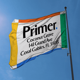
- Brand Identity and Website Redesign for Primer
- Newkid led a complete rebrand and digital overhaul for Primer, a network of teacher-led K–8 schools expanding nationally. The project included brand strategy, a modular identity system, website design, and a launch film that positioned Primer as a forward-facing alternative to typical ed-tech narratives while honoring timeless educational values.
Designers behind the work
Designers and creative leads credited on Primer projects in press coverage.