An uncompromisingly bold display sans spanning ultra-condensed to wide — built for headlines and nothing else. View at Commercial Type →
Used by Ony (5), Pentagram (3), Seachange, Aline, Alter, Porto Rocha
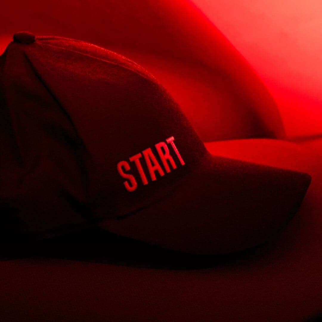
Set for Bank Otkritie, Flacon, Flacon Magazine, Melissa, Museum AZ, NYU Skirball Center, Princeton University Press, Snog Productions, START, Supertrash
Cases set in Druk, as credited by the studios in their own writeups.
Creative Boom’s 2025 font roundup highlights 50 typefaces expected to shape the year’s visual landscape. The article, written by Katy Cowan, gathers community input to showcase a mix of reimagined classics and innovative new designs, reflecting trends like elegant serifs, expressive sans serifs, and versatile variable fonts. It features work from notable designers and foundries including Fred Smeijers, Margot Lévêque, Pangram Pangram, and Oh No Type Co.
The Collected Works created a cross-channel campaign system for the 50th anniversary of The North Face parka, spanning motion content, digital and in-store assets, and a limited-edition zine. Drawing on vintage The North Face catalogues, the work combines historic visual references with contemporary typography tailored to the campaign's featured athletes, activist and stylist.
Melbourne studio AKLR created a utilitarian, typography-led identity for Sense Constructions, reflecting the company’s confident and practical ethos. Using Druk Wide, Everett, and LTC Remington, the design draws from construction-site stencils and signage. The monochrome palette and repetition-based messaging reinforce the brand’s precision and professionalism across digital and physical touchpoints.
Druk is not a workhorse and does not pretend to be one. Berton Hasebe drew it as a display family spanning ultra-condensed to wide, with almost no space between letters and none at all to spare inside them — it exists to be set enormous and to fill the frame edge to edge.
That single-mindedness is why it recurs in arts and culture branding. A festival, a season or a publisher needs a headline that can behave as an image: something that survives being cropped by a poster edge, stacked four lines deep, or dropped onto a Times Square screen. Druk does that at a size where a text grotesque would simply look large.
The trade-off is that it delegates everything else. In every project below Druk is paired with a second family for anything longer than a title, and the identity’s personality comes from what it is paired with, the colour behind it, and how much of the frame it is allowed to occupy. Used at paragraph length it is unreadable; used timidly it is pointless.
Each of these was checked against the studio’s own case page, which still credits Druk today. Where a studio explains its reasoning, the wording is theirs.
Pentagram · Brand typeface and the identity itself
Pentagram kept the existing logo and let typography carry the festival’s idea of amplifying creative voices — type that shifts in scale, weight and position in space. Druk has been the brand face since the 2021 rebrand and remains the core element of the dynamic system. Because the face is so dense, changing only its size reads as a change in volume, which is the whole conceit.
Pentagram · Display, across two widths
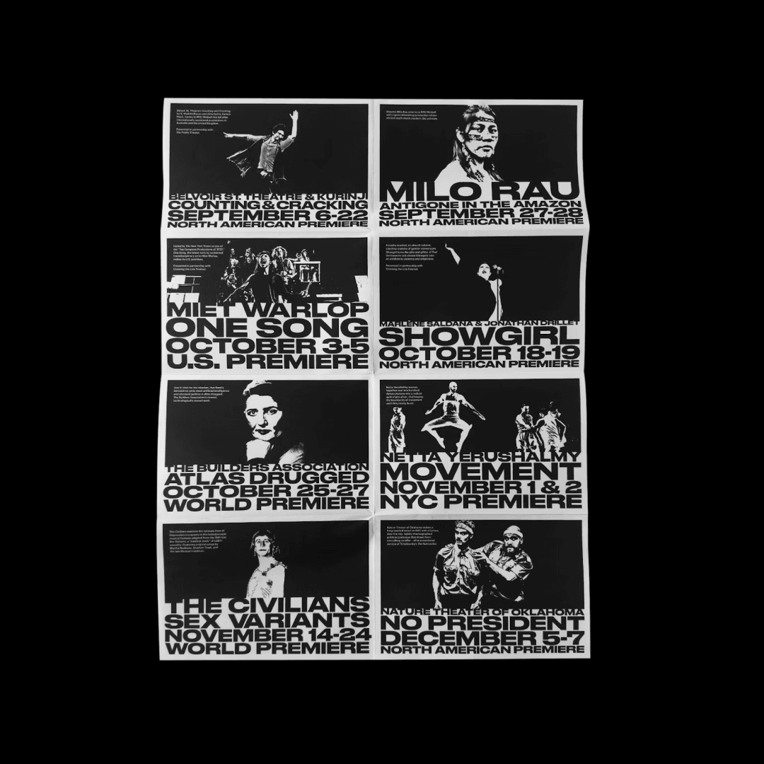
The Fall 2024 season campaign is set in Druk and Druk Wide, combined with stark black-and-white iconography — what Pentagram calls “titanic typography”. Using two widths of one family rather than two families keeps the campaign unmistakably one thing while giving the layouts somewhere to go. On a campus dense with competing posters, the density of the face is the differentiator.
Pentagram · Chapter openers against a text serif
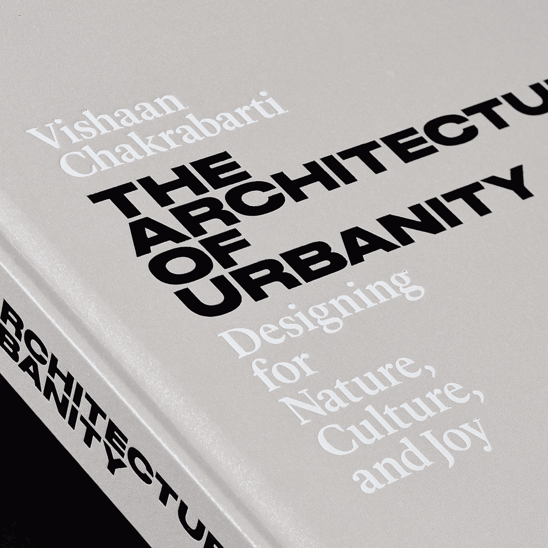
For Vishaan Chakrabarti’s The Architecture of Urbanity, Pentagram carried over the typographic identity of his studio PAU: Druk and Lyon, both Commercial Type. Druk drives the expressive chapter openers while Lyon carries dense information alongside rich imagery. Silver metallic finishes on cover and endpapers give the display type a surface to sit against — a reminder that at this weight, ink coverage is a material decision.
Aline · Project titles over photography
Aline picked Druk and GT Zirkon as primary and secondary, describing the aim as a duo that “captures attention without distracting from the stunning photography”. Druk sets project titles, where — in the studio’s words — it frames the images while holding its own; GT Zirkon does the functional work. Against a single vibrant red, the black letterforms behave like a graphic element rather than a caption.
Alter · Environmental and wayfinding type
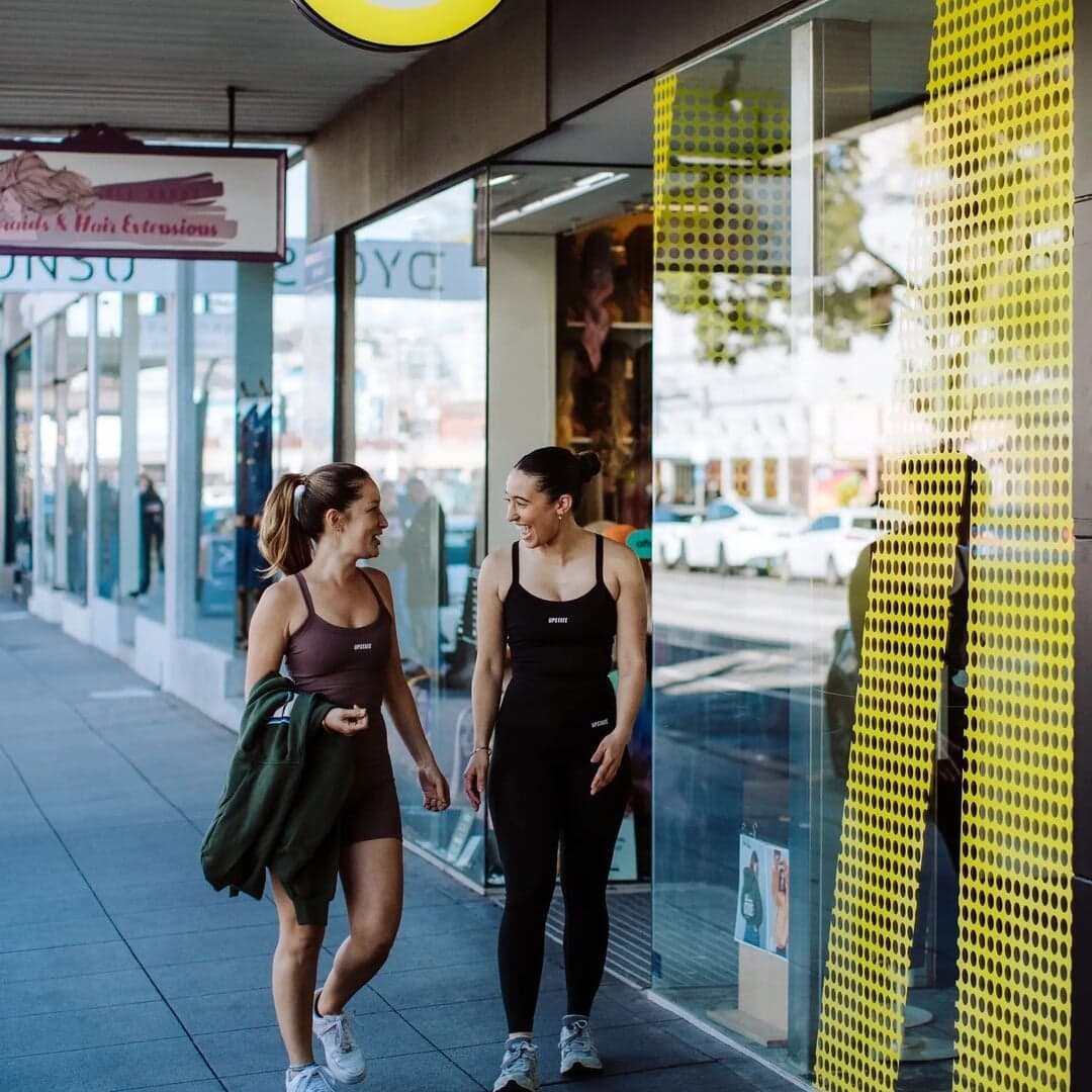
Alter credits Druk as the typography for this Pilates, yoga and boxing studio group, applied across signage and wayfinding as well as print. Set against the brand’s signature yellow, neon accents and exposed brick, condensed type at wall scale does what architecture asks of it: readable from across a room, quiet enough not to fight the building. The clearest example here of Druk outside arts and culture.
Recorded co-use only: each pair is named together on one studio’s page for one project. Treat it as evidence that the combination has been shipped, not as a recommendation.
Editorial recommendations, not credits: these are our own suggestions, chosen to explain a difference rather than to list similar names. Each links to the cases set in it, so the claim is checkable.