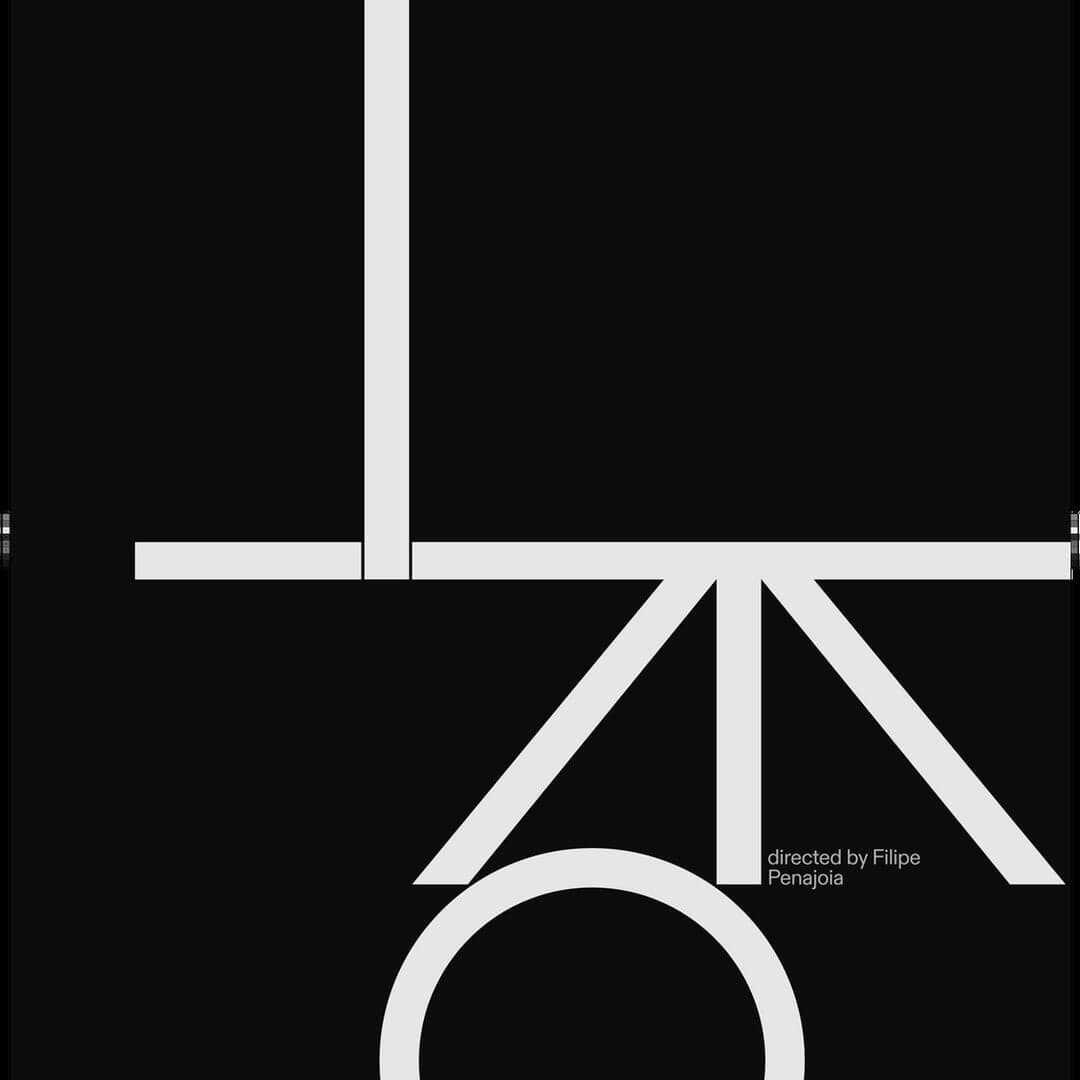
A warm yet sharp grotesque built for text and reading on screen, named after Berthold’s Diatype phototypesetting machine. View at Dinamo →
Used by André Cruz (2), Snøhetta (2), Caserne, Motto, Together, Universal Favourite
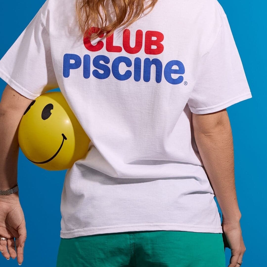
Set for Dinamo (9), Club Piscine, Coder, Comédias do Minho, Cresta, GOAT, Institute of Contemporary Art (ICA) London, Istituto Svizzero, June Art Fair, Modulize
Cases set in ABC Diatype, as credited by the studios in their own writeups.
Sign in free to browse more cases using this typeface.
Sign in freeBerlin-based Sonder Studio created the strategy, visual identity and verbal identity for VERITAS, the redevelopment of Wittenberge's former sewing-machine factory into a district for hotels, restaurants, offices and events. Drawing on the site's historic clock tower, the identity uses a circular clock-face logo, a custom Ulrich Sans wordmark, functional typography and a palette rooted in the town's industrial and architectural context.
BP&O’s Emily Gosling reviews Auge Design’s brand identity for Strangers, a new confectionery brand from Valgosa. The Milan-based studio developed the strategy, naming, and packaging, using generative design and gradients to express complex flavour profiles. The result is a sophisticated, moody identity that challenges confectionery norms with a mature, experimental aesthetic.
Clay Global developed the brand identity and app experience for Eden, an AI-powered real estate platform that translates users’ feelings and visual preferences into personalized property recommendations. The design combines classical and contemporary aesthetics, balancing emotional warmth with digital clarity. Through thoughtful typography, illustration, and interaction design, the brand aims to make home searching more intuitive and human-centered.
SYLVAIN led a comprehensive rebrand of Etsy, preserving its iconic orange and community-driven spirit while evolving its identity for a modern digital landscape. Collaborating with Upstatement and Etsy’s internal teams, the project introduced a square-based system, refined wordmark, and motion behaviors rooted in craft and curiosity. The result is a cohesive, flexible identity that bridges brand and product experience.
ABC Diatype takes its name from Berthold’s Diatype phototypesetting machine, and its shapes from the Swiss neo-grotesque tradition that machine set. Dinamo describes it as warm yet sharp and built for reading on screen, which understates how unusual that combination is: most faces in this genre buy neutrality by giving up warmth.
What distinguishes it in practice is not the retail family but what studios do with it. More than any other typeface in this catalogue, Diatype appears as the starting point for a commissioned cut — On, GOAT, REKKI and Istituto Svizzero all licensed a customisation of it rather than adopting it as shipped. Dinamo sells that path openly, and it has become the family’s defining use case: a brand gets ownable letterforms without paying for an alphabet drawn from nothing.
The retail version behaves accordingly. It is competent everywhere and dominant nowhere, which makes it an excellent base under a strong colour system or a distinctive mark, and a weak choice if the typography itself has to be the idea.
Each of these was checked against the studio’s own case page, which still credits ABC Diatype today. Where a studio explains its reasoning, the wording is theirs.
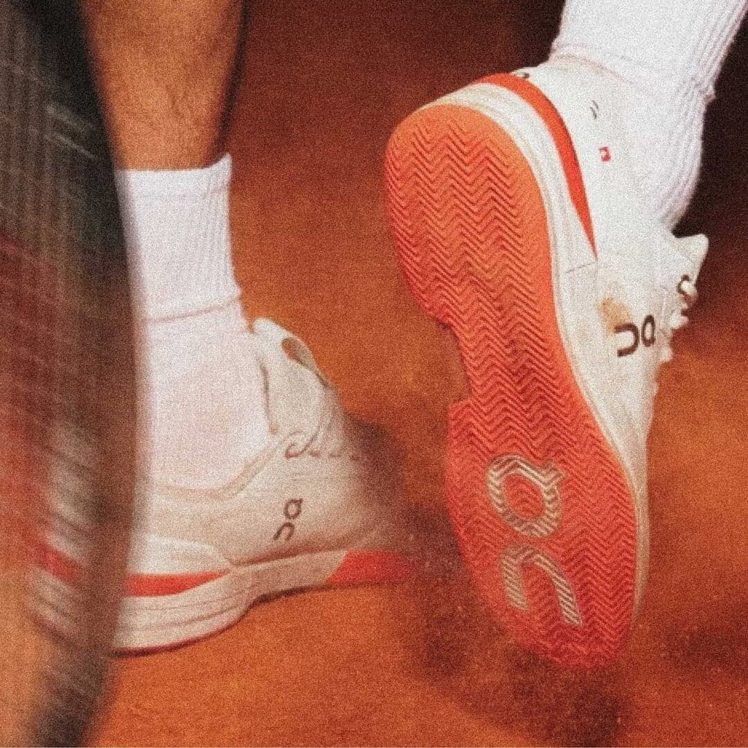
Dinamo · Bespoke customisation (On Diatype)
Dinamo rounded Diatype’s circular characters to true geometric circles and simplified its punctuation so the type echoes On’s stacked O-and-N logo. Dinamo notes that On chose Diatype for its clean functionality and Swiss design roots, and the package was extended to Black weights plus Mono and Semi Mono cuts. A contextual alternate even substitutes the logo when a designer types “[logo]” — customisation as production tooling, not just as styling.
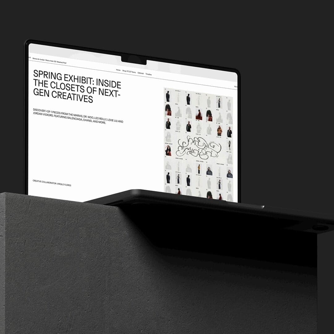
Dinamo · Bespoke customisation (GOAT Diatype)
The opposite adjustment from On: Dinamo streamlined Diatype’s reduced forms further still — straightening the R’s leg, shortening the Q’s tail — to create what it calls a blunt, edgy tone suited to detail-oriented fashion labels. Screen optimisation and variable axes were part of the brief for a marketplace whose product photography has to do the talking. Two brands, one source family, opposite results.
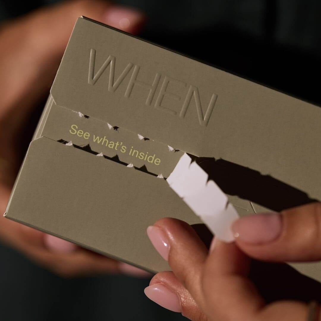
Universal Favourite · Single face, wordmark to body copy
Universal Favourite states it plainly: WHEN’s typeface is ABC Diatype, used for everything from wordmark to body copy, chosen for its modernity and scientific edge. Against a palette of lemon and neutrals, that single-face discipline is what makes an at-home fertility test read as calm rather than clinical. A good demonstration of Diatype carrying a whole identity when the colour is doing the differentiating.
Snøhetta · The informative voice of a two-voice system
Snøhetta gave the travel curator two deliberate typographic voices: Diatype as the informative and formal one, ABC Arizona as the emotional and impactful one. Both are Dinamo, which keeps the pair coherent while the split does the work. Against dynamic colour and vivid illustration, Diatype is what stops the emotional layer from becoming the whole brand.
André Cruz · Structure inside deliberate typographic chaos
André Cruz replaced CMYK with four direct colours for this Portuguese cultural programme, producing quasi-psychedelic imagery — and set it with a deliberately unruly stack of families in which ABC Diatype appears alongside ABC Gravity, Söhne and a dozen others. Here Diatype is the stable element the disruption is measured against. Evidence that the family’s neutrality is a feature in maximalist work, not only in restrained work.
Recorded co-use only: each pair is named together on one studio’s page for one project. Treat it as evidence that the combination has been shipped, not as a recommendation.
Editorial recommendations, not credits: these are our own suggestions, chosen to explain a difference rather than to list similar names. Each links to the cases set in it, so the claim is checkable.