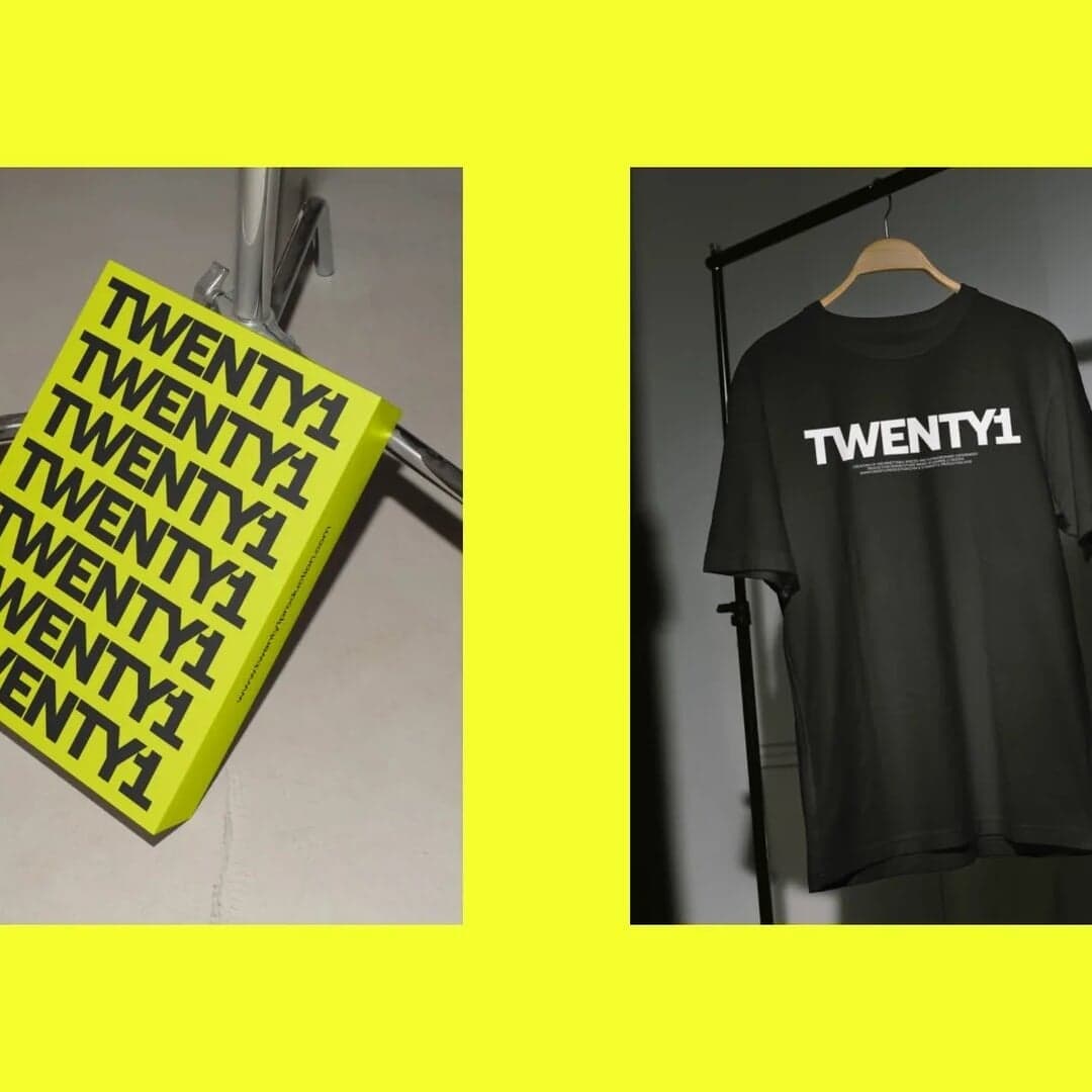
A neo-grotesque with a geometric skeleton — a versatile workhorse that became a branding staple. View at CoType Foundry →
Used by Focus Lab (2), Hello Comrade, Vanderbrand, Size, Anagrama, Oker
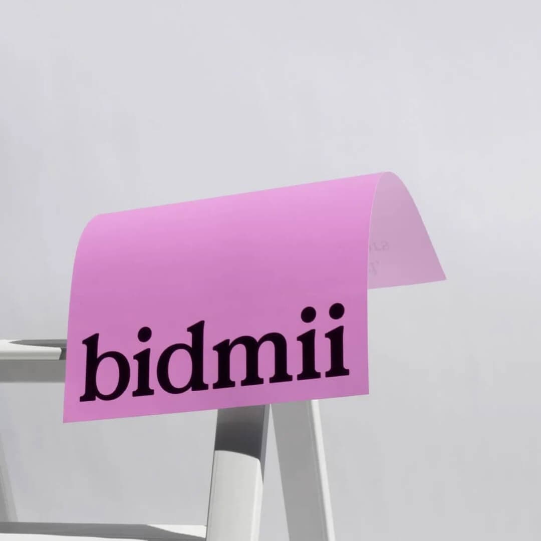
Set for ASAPP, Bidmii, BKT Mobiliario Urbano, Cateb, Hiro Systems, JIDU, Night & Day, Quantive, Sileon, The Depths She Will Reach
Cases set in Aeonik, as credited by the studios in their own writeups.

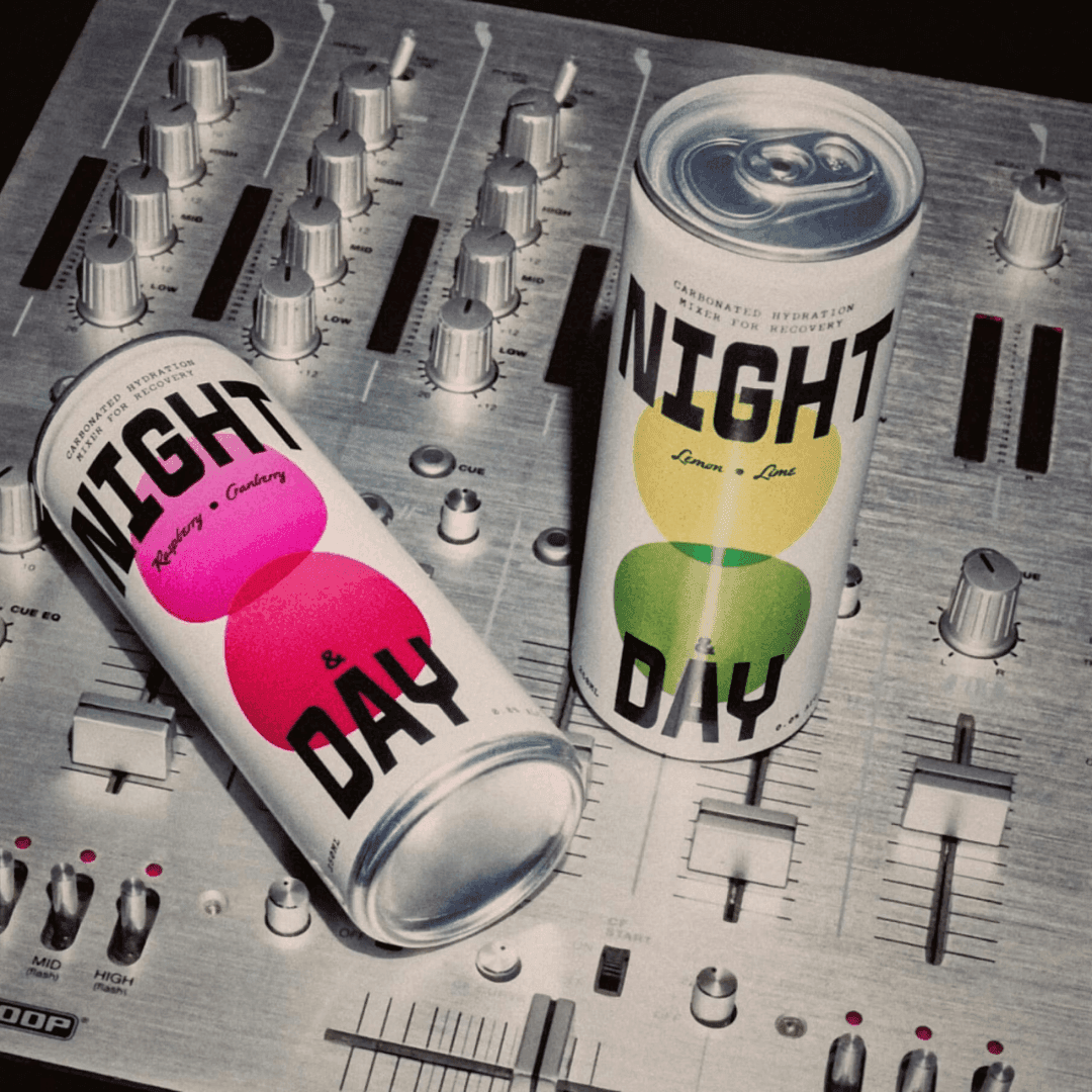
Amsterdam-based studio Hello Comrade created the brand identity and packaging for Night & Day, a functional mixer that bridges nightlife and wellness culture. The design uses a modular monochrome system with bold typography and geometric motifs referencing the overlap of night and day. Photography by Maciek Miloch situates the brand in music and nightlife contexts while maintaining clarity and adaptability for retail and fitness environments.
Studio Kiln rebranded esports-rooted agency Fellowkids with a Y2K-inspired identity centered on a 3D character called the Fellowkid. The project blends playful fandom culture with professional credibility, using vibrant colors, custom typography, and a collectible vinyl toy to embody the agency’s ethos. The rebrand positions Fellowkids as a confident, fan-driven creative force across sports and entertainment.
The Brand Identity features Oliver Grace’s brand identity for KOA Kids, a sugar-free vitamin brand designed to appeal to both parents and children. The Melbourne and Sydney-based studio developed a playful yet credible system using vibrant natural colours, customisable packaging, and a family-oriented strategy. Collaborations with AlphaWhale and Loft Social helped extend the joyful, compliant brand across digital and social channels.
CoType describes Aeonik as a “neo-grotesque with a geometric skeleton”, and that hyphenated identity is exactly why it turns up in so many identity systems. The skeleton is circular and rational enough to feel engineered, while the terminals are cut strictly perpendicular rather than on an angle — so it holds a grid the way a geometric sans does, without the wide, decorative bowls that make Futura-descendants awkward at text sizes.
In practice that makes it a rare thing: a face a studio can use for the logotype, the headline and the interface, and still end up with something that reads as designed rather than defaulted. The catalogue bears that out — the projects below use it as a bespoke base, as the single brand face, as a logotype, as a layout instrument and as body copy under a display serif. Very few families here appear in five such different roles.
Its weakness is the flip side of the same trait. Aeonik is agreeable, and agreeable faces are widely licensed. On its own it will not make a technology brand look unlike the technology brand next to it; the differentiation has to come from the colour, the imagery or a customisation, which is precisely what two of the five projects below paid for.
Each of these was checked against the studio’s own case page, which still credits Aeonik today. Where a studio explains its reasoning, the wording is theirs.
Oker · Base for a commissioned text face
Studio Oker drew an extended display typeface to match JIDU’s wordmark, then commissioned CoType to develop a companion text face based on Aeonik so the system had something that could carry interfaces and long copy. The display face supplies the character; the Aeonik derivative supplies the range. That split is the single most common reason a studio reaches for this family — it takes customisation well precisely because it is not eccentric.
Focus Lab · Logotype and workhorse
Focus Lab set the Quantive logotype in Aeonik with subtle customised details, then used the same family throughout — the studio calls it “a workhorse font whose rigid shape feels bold and timeless”. Because the logotype echoes the body face, the brand needs no second voice, which is what lets a confident green and a near-empty layout do the identity work. It is the cleanest demonstration here of Aeonik’s tolerance for being the only typeface in the room.
Mucho · Primary brand typeface
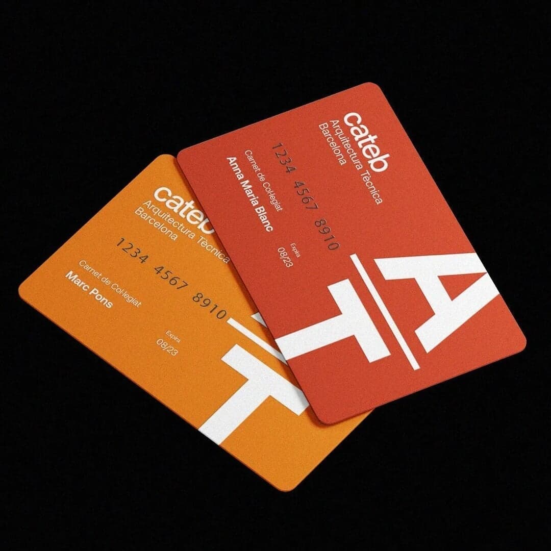
Mucho renamed Barcelona’s institute of technical architecture from CAATEEB to Cateb and built a new symbol out of Catalan visual poetry. Aeonik is the primary face, and its job is contemporaneity: it keeps an institution founded on technical rigour from reading as municipal. Set against an organic palette and nature photography, the mechanical terminals stop the warmth tipping into softness.
Anagrama · Layout instrument alongside the brand face
For BKT’s fifteen-year retrospective, Anagrama kept the company’s own Brix Sans for brand details and brought in Aeonik — in the studio’s words, “a geometric sans serif typeface that balances the layout with direct and clean arrangements”. It is applied across hierarchies purely by weight, against transparency and layered visuals. A useful case of a licensed face hired as a structural tool rather than as the voice.
Decimal Studios · Body copy under a display serif
Decimal set this web-based long read with GT Super for display and Aeonik for body copy — the studio’s stated aim was to balance “the elegance of freediving” against the subject’s physical strength. Over full-bleed underwater footage, the sans has to stay readable at small sizes on a moving background, which is where the perpendicular terminals and even colour earn their keep. The serif carries the emotion; Aeonik carries the reading.
Recorded co-use only: each pair is named together on one studio’s page for one project. Treat it as evidence that the combination has been shipped, not as a recommendation.
Editorial recommendations, not credits: these are our own suggestions, chosen to explain a difference rather than to list similar names. Each links to the cases set in it, so the claim is checkable.