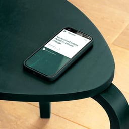
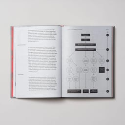
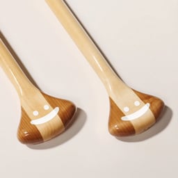
Studio Oker is a Scandinavian design studio based in Stavanger, Norway, founded in 2018. The studio partners with ambitious companies worldwide to craft strategic and distinctive brand identities. Combining Nordic clarity with global perspective, Oker specializes in brand strategy, design systems, and visual communication that drive meaningful growth. As a strategic design partner, the team brings a thoughtful, collaborative approach to every project, helping clients define and express their essence across platforms. Studio Oker continues to shape brands that balance creativity, precision, and purpose in an increasingly connected world.
Technologies detected on Oker's website.
The article explores how the color purple is used across various brand identity projects to convey innovation, sophistication, and technological advancement. Featuring work from studios such as Snøhetta, Moving Brands, and Studio Oker, it highlights the emotional and aesthetic power of purple in contemporary design. The piece serves as a curated showcase of branding projects that exemplify the hue’s versatility and impact.
The article is a colour-focused editorial from The Brand Identity exploring how purple is used effectively in branding and identity design. It highlights multiple studios and projects that showcase the hue’s emotional and technological associations, from Ragged Edge’s Bayzat to Studio Oker’s JIDU. The piece positions purple as a versatile and sophisticated choice for innovation-led brands.
Studio Oker designed a fluid, nature-inspired brand identity for Canoe, a new Norwegian design studio. Drawing from the symbolism of exploration and water, the identity features a custom wordmark, deep blue and white palette, and minimalist illustrations by Waldemar Stepien. The result captures Canoe’s spirit of adaptability and creative discovery.
The article by The Brand Identity highlights eight design studios that have transformed envelopes into expressive brand touchpoints. It showcases how print and paper applications remain relevant through creative use of materials, typography, and layout. Each featured project demonstrates how an everyday object can become a memorable brand keepsake.
The article highlights seven contemporary brand identities within the transport sector, showcasing how design studios like Parker, Studio South, and Mirage are shaping the visual language of mobility. Each project—from electric scooters to delivery services—demonstrates how clarity, sustainability, and innovation define modern transport branding.
The Brand Identity’s article, written by Poppy Thaxter, highlights eight distinctive brand identities created for music and performance festivals around the world. The roundup showcases how studios like Moscow Mule, Never Now, and Studio Oker capture the energy and atmosphere of live events through bold typography, color, and design systems.
The article showcases Studio Oker’s brand identity for European geodata company Field, which merges natural and technological influences. The identity features a geometric logo inspired by geospatial data layers, FK Grotesk typography, and animations reflecting organic growth and progress. The design uses a calm, nature-inspired color palette and extends across digital and physical applications.
Studio Oker created a futuristic brand identity for JIDU, an AI-powered electric vehicle venture by Geely and Baidu. The design centers on a pixel motif symbolizing data and autonomy, complemented by a metallic violet accent and custom typefaces developed with Displaay and CoType Foundry. The result reflects JIDU’s high-tech, forward-looking ethos through geometric precision and technological sophistication.
Studio Oker developed a sleek and systematic brand identity and website for Norwegian label printer Norsk Etikett. The design draws inspiration from the printing process, using a grid-based system, minimalist color palette, and typefaces Neue Haas Grotesk and Bw Gradual to reflect precision and craftsmanship. The result positions Norsk Etikett as a specialist in their field with a clean, utilitarian aesthetic.
The Brand Identity features Studio Oker’s refreshed brand identity for UX design studio Okse, inspired by the Norwegian landscape of Jæren and the symbolism of the bull. The identity combines typographic sharpness with warm, witty illustrations by Jay Cover and a sunshine yellow palette, reflecting Okse’s personable and down-to-earth approach to UX design.
Studio Oker has rebranded Norwegian furniture maker Hamran with an identity centered on a bespoke serif typeface created in collaboration with The Pyte Foundry. The design reflects Hamran’s craftsmanship and focus on durability, using elegant layouts and photography to highlight their wooden interiors.