Kiln is a London, United Kingdom studio shaping brands, narratives and digital experiences that move—built with the pace of broadcast, the craft of editorial and the rigor of product. From Channel 4 and ITV to Vinted, Omelet and Fellowkids, Kiln works across media, entertainment and tech, helping ambitious teams turn ideas into identities that live fluently on screens and in the world. Projects often begin with a story and end as systems: motion-led brands that scale, content frameworks that guide teams, and interfaces that feel immediate and alive. Collaboration sits at the heart of the practice; Kiln embeds with clients, stress-tests concepts in the wild and refines until the work sings without explanation. The result is crisp, characterful design that travels—from on-air packages to social, from campaign toolkits to product. What makes Kiln distinctive is a restless, multidisciplinary approach: strategy shaped by making, design informed by narrative, and a studio cadence tuned to ship work that audiences notice and teams can own.
Technologies detected on Kiln's website.
ITV has introduced an evolved brand identity created with Studio Kiln, simplifying its design system and elevating Spark Yellow as the lead colour. The new visual device, called 'the apex', connects the ITV logo with content across all platforms, creating a cohesive and dynamic masterbrand. The refresh reflects ITV's shift toward clarity, consistency, and confidence in a crowded entertainment landscape.
Studio Kiln has refreshed Vinted’s brand identity, evolving its visual system while retaining the beloved handwritten logo. The update refines the Calypso green palette, introduces a custom VC Honey typeface, and adds motion and tactile photography to reflect Vinted’s community-driven, sustainable ethos. The result is a flexible, global toolkit that balances clarity and character for the second-hand fashion platform.
Creative Boom profiles Studio Kiln, a Cornwall-based design studio founded by Nathan Smith and Charlie Hocking in 2022. The article explores how the duo built a thriving creative practice outside London, emphasizing community, collaboration, and a multidisciplinary approach across branding, motion, and digital design. Their identity project for the Royal Television Society x Channel 4 marked a defining moment for the studio’s growth and philosophy of 'Lifeful Design'.
Studio Kiln has unveiled a brand refresh for global creative studio Mayda, inspired by the concept of exploring beyond the horizon. The new identity features a distinctive ‘Y’ logo element symbolizing a dynamic portal, paired with WELTKERN’s Everett typefaces and a palette of technological greys and neon tones. The flexible system balances minimalism with futuristic intrigue, designed to adapt across digital and physical touchpoints.
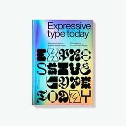
Creative Boom’s feature on Counter-Print’s new book *Expressive Type Today* explores how expressive typography can cut through visual overload. Co-founder Jon Dowling discusses the book’s origins, its featured studios, and the evolving role of type as an emotional and narrative medium. The article highlights standout projects by Studio Kiln and Ingrid Picanyol Studio, emphasizing experimentation and cultural storytelling in modern type design.
Creative Boom features Studio Kiln’s new brand identity for Brooklyn-based agency Mayda, inspired by the mythical island of the same name. The design centers on a dynamic 'Y' symbol and horizon motif to evoke exploration and forward movement. The identity uses Everett typefaces, neon gradients, and motion to create a futuristic, immersive brand system.
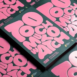
BP&O’s feature by Thomas Barnett explores Studio Kiln’s vibrant and motion-driven identity for the 2024 RTS Cambridge Convention, themed ‘Too Much To Watch’. Commissioned by Channel 4’s in-house agency 4creative, the project uses inflatable balloon-like typography, a versatile eight-colour palette, and expressive motion graphics to capture the energy and overload of modern television culture. The identity extends across digital and print applications, including an embossed and spot-UV printed programme.
The Brand Identity interviews Studio Kiln founders Charlie Hocking and Nathan Smith about their first year running a creative studio in Cornwall. They discuss the challenges of establishing a design business outside London, the launch of their new website, and their ambitions for future growth and collaboration. The conversation highlights their focus on balancing brand, motion, and digital work while maintaining a strong connection to their coastal environment.
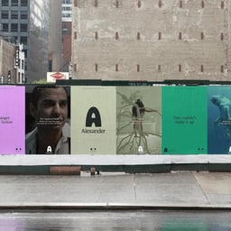
Studio Kiln developed a playful yet mature brand identity for storytelling app Alexander, blending editorial typography with a warm, character-driven visual system. The identity features a personified 'A' named Alex, created in collaboration with illustrators Amelia Leuzzi and Bonnie Eichelberger, and uses Bianco Serif and Grotesque No.9 typefaces to balance heritage and modernity.
Studio Kiln launched a Kickstarter campaign for their first animated short film, 'Waterbeing,' an eight-minute story exploring self-acceptance through swimming. The Penryn-based studio collaborated with illustrator Glenn Young, producer Harvey Hayman, and animator Miguel Rodrigues to create a minimalist, high-contrast visual style. The project reflects founder Charlie Hocking’s personal journey toward slowing down and finding balance in creativity.
Studio Kiln created a bold and vertical brand identity for Off The Wall Aerial, a UK-based dance company known for aerial performances. The design uses stacked typography, variable typefaces GT Ultra and Pitch, and a vibrant color palette to reflect the studio’s bravery and elegance. The identity system emphasizes verticality and movement, mirroring the company’s aerial artistry.
The article showcases Studio Kiln’s vibrant brand identity for London-based music booking agency Pure Represents. The design draws inspiration from the live music experience, using arch-like stage shapes, expressive typography, and a contrasting colour palette to capture the connection between artist and audience.