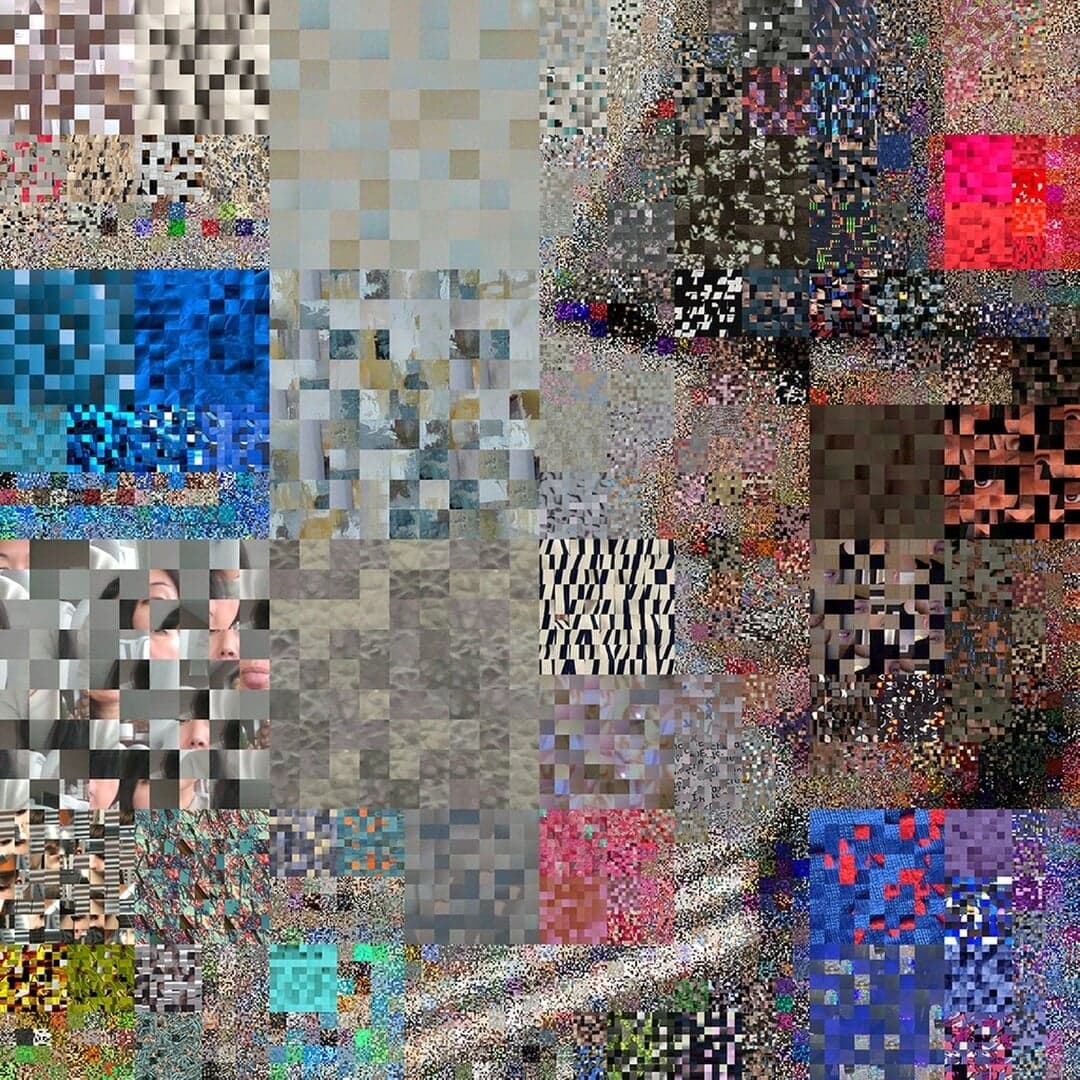
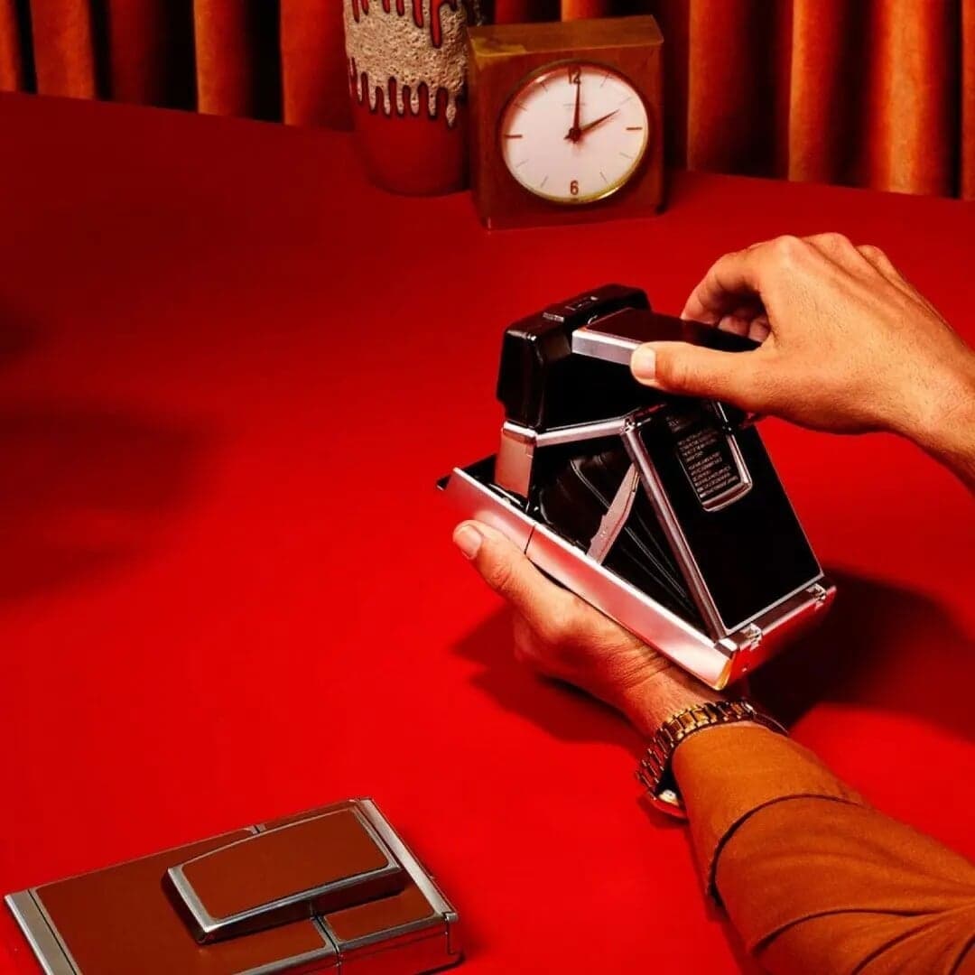
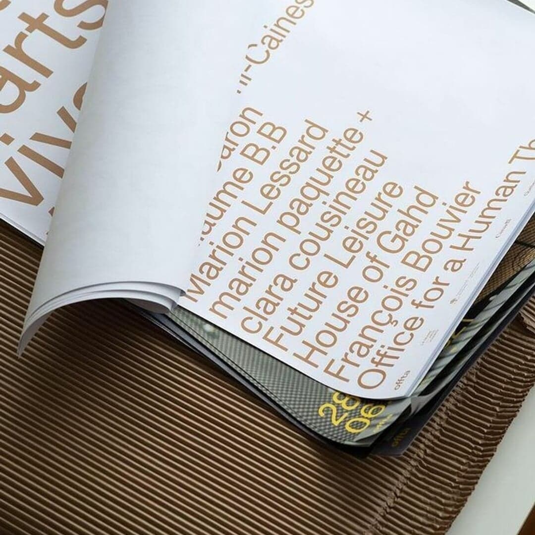
Honest, unrefined and idiosyncratic shapes with a raw, pleasingly unpolished feel — begun by Kasper-Florio in St. Gallen. View at Dinamo →
Used by Order Design (2), Landscape, Love + Money, Universal Favourite, Decimal Studios, Campbell Hay
Set for Dinamo (3), Beacon Capital Partners, Crux, Elkin Editions, Future Super, Hightype, Joopiter, Karst, Learning Well, Lumafield
Find design references using ABC Monument Grotesk. Browse project images and studio credits, then follow each case to its source. Typeface names come from catalogued studio writeups; coverage is limited to projects with recorded credits.
Sign in free to browse more cases using this typeface.
Sign in freeLeeds and Glasgow-based studio Rabbithole created the fifth annual identity for the Leeds International Festival of Ideas, introducing playful 3D 'squidgem' characters to represent collective creativity. The new design continues the festival’s recognizable pink palette and typography while evolving its visual language through motion and character animation. The collaboration with digital artist Joseph Töreki reinforces the festival’s balance between intellectual programming and accessible, engaging design.
Studioenok rebranded Shenzhen-based jewellery brand Random Anxiety, transforming its street-culture aesthetic into a structured, mathematical identity system. The new design employs a strict grid algorithm, monochrome palette, and Monument Grotesk typeface to convey tension and control. The result is a modular, disciplined visual language that reflects the brand’s evolution toward contemporary sophistication.
The Brand Identity features the second issue of FEW Magazine, a collaborative editorial project celebrating the Finnish Somali diaspora. Designed by Marina Veziko, Tino Nyman, Tytti Halonen, and Matilda Diletta under the editorial direction of Ujuni Ahmed, the issue merges Somali cultural aesthetics with contemporary design. The project employs expressive typography, gold and silver accents, and a variable logo inspired by Somali scripts to challenge stereotypes and foster cultural understanding.
Reykjavík-based agency Aton has unveiled a dynamic rebrand led by Creative Director Siggi Odds, featuring a custom typeface called Nota designed by Hólmfríður Benediktsdóttir. The identity uses expressive counterforms and adaptable wordmarks incorporating 3D imagery to reflect the agency’s collaborative and playful spirit. Supporting typefaces from Smuss Type Kiosk and Dinamo balance the boldness of the new design.