Vrints-Kolsteren is an Antwerp-based design studio founded by Vincent Vrints and Naomi Kolsteren. The studio operates at the intersection of visual communication, typography, and art direction, creating considered design systems and editorially driven identities. Its practice is defined by a collaborative approach and a focus on clear, distinctive visual language for cultural and commercial contexts. Vincent Vrints and Naomi Kolsteren lead the studio’s work, combining conceptual thinking with precise graphic execution. No clients or awards are identified in the available website content.
Their own site is set in Basel Grotesk
Technologies detected on Vrints-Kolsteren's website.
The Brand Identity features Antwerp-based studio Vrints-Kolsteren’s new visual identity for Brussels art centre iMAL. The rebrand uses geometric symbols and a flexible colour system to represent each department, creating a dynamic and scalable design language that reinforces iMAL’s pioneering role in digital culture.
Antwerp-based studio Vrints-Kolsteren designed a new visual identity for Fine Art and Friends, an arts institution in Mol. The identity centers on a bespoke sans serif typeface that balances brutal and friendly qualities, using a neutral black and off-white palette to contrast the vibrant colors of the Academy of Arts Mol.
Antwerp-based studio Vrints-Kolsteren has redesigned the influential Belgian contemporary art magazine HART, bringing a new sense of consistency and structure to its typography and layout. The refreshed design emphasizes content and features a bold masthead with a changing quote on each issue’s cover. The studio will continue to oversee the magazine’s art direction going forward.
The Brand Identity interviews Antwerp-based studio Vrints-Kolsteren about their new independent publishing platform, Vrints-Kolsteren Editions, and its first release, Kado. The publication explores the Japanese art of Ikebana through tactile printing, custom typography, and experimental materials. The project reflects the studio’s desire for creative autonomy and hands-on involvement in every stage of production.
Antwerp-based design studio Vrints-Kolsteren created a flexible identity for Atelier 03, a collective that activates public spaces through light, sound, and installation art. The grid-based system reflects strokes of light in darkness, adapting to various applications while maintaining a functional framework.
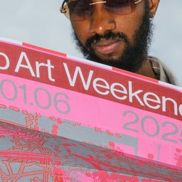
The Brand Identity highlights Vrints-Kolsteren’s refreshed visual identity for Antwerp Art Weekend 2019. The update continues the studio’s evolving design since 2016, marking the event’s fifth anniversary with a pink, green, and silver palette. The project reinforces the studio’s ongoing collaboration with the non-profit art organization Antwerp Art.
Antwerp-based studio Vrints-Kolsteren created a new visual identity for the Academie voor Beeldende Kunsten in Mol, Belgium. The project features a custom geometric typeface and a bold color palette to attract new students to the art school.
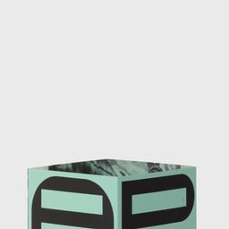
The article highlights Vrints-Kolsteren’s identity design for Mol Kiest Kunst, an art exhibition in Mol, Belgium. The visual identity centers on a custom typeface inspired by the bicycle route connecting four exhibition venues, created in collaboration with designer Christophe Synak.
The Brand Identity features Antwerp-based studio Vrints-Kolsteren’s visual identity for Italian online retailer Okkaido. The design emphasizes durability and recognisability, aligning with the brand’s minimal and functional approach to fashion accessories.
Belgian studio Vrints-Kolsteren created a new identity for the Academy of Fine Arts Antwerp and the Royal Conservatoire Antwerp, both part of Artesis Plantijn. The design uses a simple, dynamic grid system where the institutions’ names consistently appear in the bottom left corner.
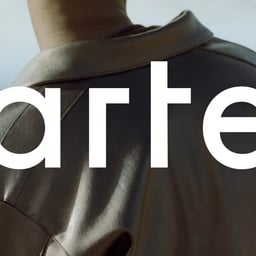
The Brand Identity interviews Antwerp-based studio Vrints-Kolsteren, led by Vincent Vrints and Naomi Kolsteren, about their approach to design, collaboration, and notable projects. They discuss early work for Sint-Lucas Antwerp, the provocative Borg 2016 identity, and branding for Antwerp Art and fashion label Arte. Their philosophy centers on modernist principles, minimalism, and collaboration across disciplines.