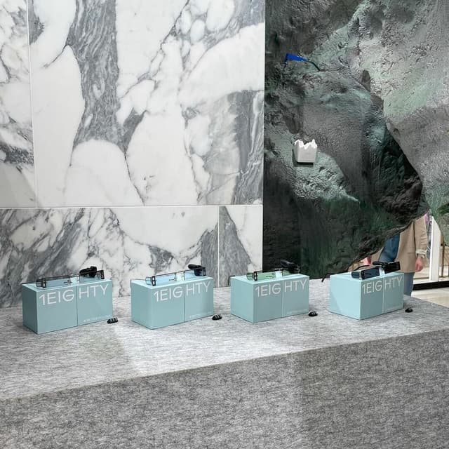
Typeface Design for Monument Grotesk
Monument Grotesk is a contemporary reinterpretation of 19th-century letterforms originally found in Palmer & Rey’s 1884 specimen book. Developed by Swiss studio Kasper-Florio and released through Dinamo, the typeface features compact proportions, sharp terminals, and a raw, unrefined character. It offers multiple weights and styles, including Mono and Semi-Mono variants, making it versatile for modern applications.
Set in ABC Monument Grotesk
News
- SPGD designs subtle identity system for Field Office Architecture — the-brandidentity.com
- Rabbithole Reinvents LIFI Identity While Preserving Festival Recognition — the-brandidentity.com
- Order crafts bold typographic identity for Elkin Editions — the-brandidentity.com
- Love + Money Repositions Karst Around Flow and Friction — the-brandidentity.com
- One foot in the future: Landscape’s identity for RATIO echoes its innovative, ambitious spirit — the-brandidentity.com
- Klutch Studio’s fluid identity for AFK shows how a system can functionally flex across a brand — the-brandidentity.com
- From five to one: Bielke&Yang deliver a look that encapsulates the formation of IT company Evidi — the-brandidentity.com
- LEÓN ROMERO adds a technical yet human touch to the brand for Barcelona Design Week’s 18th edition — the-brandidentity.com
- Campbell Hay’s identity for The Sans explores the past and present of the modernist office building — the-brandidentity.com
- Maison Sagans Sous La M%C3%AAme %C3%A9toile Menu For Bar Le Syndicat Unites 90s Hip Hop And Cosmic Calamities