Campbell Hay
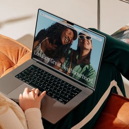
Campbell Hay is a London-based branding and design studio founded by Charles Hay and Elly Campbell-Hay. The team of strategists, designers, and producers creates distinctive brand identities and experiences that combine intelligence, clarity, and beauty. Led by Design Director Wai Ming Ng, the studio’s expertise spans cultural programming, digital experience, editorial design, and packaging. Their work has been featured by Creative Boom, Victionary, and Counterprint Books. Campbell Hay partners with innovators and entrepreneurs to craft brands that are both strategically grounded and visually engaging, earning recognition for their thoughtful and refined creative approach.
https://www.campbellhay.com/
London, United Kingdom
29 Cases
Known for:campbell haylondonbrand identitygraphic designrebrandtypography
Cases
See all cases
Sign in free to see all 29 cases from Campbell Hay.
Sign in free
News & interviews
- Campbell Hay Revamps Islington Square Brand for Wider Appeal
The Brand Identity · Jan 21, 2025
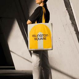
Campbell Hay rebranded Islington Square, a mixed-use development in London, to reflect its evolution from a residential sales focus to a vibrant retail and leisure destination. Drawing inspiration from the site's Edwardian arches, the studio created a flexible identity centered on an arch motif, supported by bespoke typography and adaptable 3D visuals. The result is an approachable, dynamic brand that connects the physical architecture with the area's diverse offerings.
- Campbell Hay Redesigns Islington Square Brand for Broader Appeal
Creative Boom · Jan 14, 2025
Campbell Hay has created a new place brand for Islington Square, repositioning it from a residential-led development to a vibrant retail and cultural destination in London. The rebrand features bold motion graphics, dynamic 3D arches inspired by the site's Edwardian architecture, and an inviting tone of voice to attract visitors. The project reflects Campbell Hay’s long-term collaboration with the client and its evolution into a lifestyle-focused brand.
- Give me colour: From punchy plums to vivacious violets, these projects exemplify purple’s prowess
The Brand Identity · Dec 5, 2024
The article explores how the color purple is used across various brand identity projects to convey innovation, sophistication, and technological advancement. Featuring work from studios such as Snøhetta, Moving Brands, and Studio Oker, it highlights the emotional and aesthetic power of purple in contemporary design. The piece serves as a curated showcase of branding projects that exemplify the hue’s versatility and impact.
- "Exploring Purple's Impact in Brand Identity Through Design Projects"
The Brand Identity · Dec 5, 2024
The article is a colour-focused editorial from The Brand Identity exploring how purple is used effectively in branding and identity design. It highlights multiple studios and projects that showcase the hue’s emotional and technological associations, from Ragged Edge’s Bayzat to Studio Oker’s JIDU. The piece positions purple as a versatile and sophisticated choice for innovation-led brands.
- A masterful duo of colour and copy define Campbell Hay’s considered identity for Basha-Franklin
The Brand Identity · Jul 17, 2024
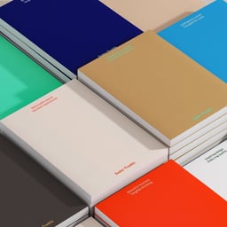
Campbell Hay developed a refreshed brand identity for architecture and interior design studio Basha-Franklin, focusing on a balance between vibrancy and restraint. The project combines expressive colour, concise copy, and a dual-typeface system to reflect the studio’s warm, immersive approach. The result is a flexible identity that adapts across digital and physical touchpoints.
- 8 identities for buildings and developments, with work from Vanderbrand, Campbell Hay and more
The Brand Identity · Jun 29, 2023
The article showcases eight branding projects for architectural developments and buildings, featuring work from studios including Vanderbrand, Campbell Hay, Studio8585, High Tide, Mubien, Houston Group, and Studio Brave. Each identity reflects the architectural and cultural context of its respective development, from retail centers to residential towers, emphasizing modernist influences, typographic experimentation, and material sensitivity.
- Campbell Hay’s identity for The Sans explores the past and present of the modernist office building
The Brand Identity · Sep 9, 2022
London-based studio Campbell Hay developed a flexible brand identity for The Sans, a refurbished modernist office building originally built in 1962. Drawing inspiration from the building’s architecture and materials, the identity features a custom grid, bespoke lettering, and a minimal palette derived from the structure’s exterior. The project balances modernist principles with contemporary design sensibilities, using Monument Grotesk to echo the building’s raw yet refined aesthetic.
- Campbell Hay revitalise London’s Islington Design District with an elegant, supportive identity
The Brand Identity · Sep 27, 2021
Campbell Hay developed a refined new identity for Islington Design District ahead of the 2021 London Design Festival. The rebrand uses elegant line-based forms, Neue Haas Grotesk and Panama typefaces, and a distinctive purple palette to celebrate creativity and reconnection within the district. The project positions Islington as a leading creative hub while maintaining flexibility for future iterations.
- The Designers: Campbell Hay’s Wai Ming Ng on working in different cities, photography, and more
The Brand Identity · Oct 9, 2020 · Interview
This interview from The Brand Identity’s 'The Designers' series features Wai Ming Ng, Design Lead at London-based studio Campbell Hay. Ng discusses his international career across The Netherlands, Hong Kong, and London, his approach to design and photography, and his experiences working within Campbell Hay’s collaborative environment. The conversation explores his design ethos, influences, and reflections on working during lockdown.
- The Edit: five new projects including Tweag by Brand Brothers
The Brand Identity · Jul 23, 2020
The Brand Identity’s 'The Edit' highlights five new design projects from studios around the world, including Brand Brothers’ rebrand for Tweag, Bright Bright Great’s identity for KIWI Arts Group, Slanted’s Los Angeles issue, Campbell Hay’s rebrand of International Quarter London, and papa tom’s identity for WOLLIN. Each project showcases distinct visual systems, from modular tech-inspired forms to playful material-driven branding.
Brand BrothersBright Bright GreatSlanted PublishersTweagKIWI Arts Groupbranding
- Campbell Hay's identity for Batera brings the spirit of San Sebastián to London's Borough Market
The Brand Identity · Jul 9, 2020
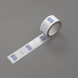
The Brand Identity features Campbell Hay’s branding for Batera, a pintxos bar at London’s Borough Market inspired by the convivial spirit of San Sebastián. The studio developed the name, visual identity, and interior design, using warm materials and a condensed logotype to evoke togetherness. Typography, illustration, and bespoke signage reinforce the lively Basque atmosphere.
Tech Stack
Technologies detected on Campbell Hay's website.
Netlifyhosting
Google Tag Manageranalytics