https://portorocha.com/


OFFF Barcelona
Barcelona, Spain6 May 2027 – 8 May 2027
Announced lineupPorto Rocha
PORTO ROCHA is a global strategy and design agency with offices in New York and London. The studio builds brand strategy, identities and digital and experiential systems for cultural and commercial organizations, with work for MoMA PS1, Nike, MASP, Sundance Film Festival, Robinhood and Twitch.
 New York, United States / London, United Kingdom
 54 Cases
Works with Helvetica Now (3), Netflix Sans (3), Saans (2), Google Sans (2), Oatmeal Pro, Plain, SilvanaText Regular, PAC Display
Their own site is set in FK olympikus
Awarded work credited to Porto Rocha. Coverage is partial; projects may be shared with other studios.
Design Agency, Entrant Company: PORTO ROCHA

Designers and creative leads attributed to Porto Rocha in press coverage.
Technologies detected on Porto Rocha's website.
Entrant Company, Design Agency: PORTO ROCHA
Entrant Company, Design Agency: PORTO ROCHA
Entrant Company, Design Agency: PORTO ROCHA
Design Agency: PORTO ROCHA
Design Agency: PORTO ROCHA
Credited Studio: PORTO ROCHA
Design Firm: PORTO ROCHA
Agency: Porto Rocha · In-House Agency, Client: Robinhood
Porto Rocha created Tinder’s first rebrand in nearly a decade, updating the dating app’s visual and verbal identity for a new generation, particularly Gen Z women. The system introduces an all-caps wordmark, sharpened flame, new serif-led typography, expanded red-to-pink palette with blue and green hues, swipe-reveal interactions, and mixed-media imagery. Its voice is framed through a fictional dating-columnist persona, T, balancing wit, experience and empathy.
Creative Boom’s 2026 roundup highlights 15 design studios that the creative community most admires, based on its annual State of Creativity survey. The article features a mix of established and emerging studios such as OK-RM, Zak Group, Porto Rocha, Hey Studio, and Accept & Proceed, showcasing their distinctive approaches and recent projects across branding, culture, and design innovation.
At November’s Nicer Tuesdays event in London, Brooklyn-based studio Porto Rocha, led by founders Leo Porto and Felipe Rocha, shared their mission to challenge industry standards and expand representation in design. The duo discussed their key projects and the studio’s growth from New York to London, emphasizing inclusivity and global ambition.
BP&O’s feature by Emily Gosling explores Porto Rocha’s rebrand for Kunsthalle Basel, developed under new director Mohamed Almusibli. The identity centers on a flexible KB monogram, custom typography, and a dynamic system that balances institutional gravitas with openness and experimentation. The project includes motion design, a new website, and a variable color system reflecting the museum’s evolving curatorial approach.
It’s Nice That announces the November 2025 edition of its Nicer Tuesdays event in London, featuring talks from Porto Rocha, Jennie Baptiste, Boomranng Studio, and Alice Isaac. The lineup spans design, photography, and collage, with discussions on identity, culture, and creative process. The event will be held at EartH Hackney with music by Epidemic Sound and sponsorship from El Rayo and Lovecorn.
The article explores the collaboration between design studio PORTO ROCHA and the Museu de Arte de São Paulo (MASP) on the museum’s rebrand, facilitated by Frontify. It highlights how shared cultural understanding, trust, and open dialogue guided the sensitive modernization of a national institution’s identity. The project retained MASP’s iconic red while introducing a refined logo, new symbol, and flexible visual system aligned with the museum’s expansion.
In this POV column for It’s Nice That, Felipe Rocha, co-founder of Porto Rocha, reflects on his experiences as a Brazilian designer leading a New York studio and the pressures of fitting into the mold of a 'design founder.' He discusses issues of belonging, confidence, and inclusion within the creative industry, calling for broader acceptance of diverse voices and leadership styles. The piece highlights how cultural and linguistic differences shape perceptions of professionalism and authority in design.
Creative Boom’s 2025 roundup highlights 25 studios shaping the global design landscape. From Porto Rocha’s socially conscious branding to DixonBaxi’s strategic systems and Hey Studio’s joyful minimalism, the list celebrates studios that combine creativity with purpose. The article underscores a shift toward collaboration, diversity, and design leadership across continents.
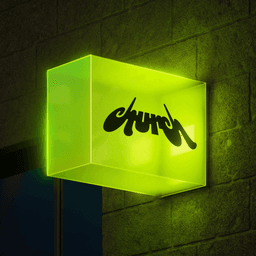
BP&O features Porto Rocha’s bold and conceptually rich brand identity for LA-based post-production studio Church. The identity draws on cathedral architecture and shifting perspectives to reflect the art of film editing, with a dynamic logo, motion system, and disciplined typography. The project showcases Porto Rocha’s ability to merge technical precision with emotional resonance in a visually distinctive way.
In this Creative Boom insight piece, Bentzion Goldman, senior designer at Mother Design, reflects on branding trends from 2024 and forecasts what’s next for 2025. He identifies a shift from 'dopamine design' and AI saturation toward tactile, world-building, and playful branding approaches. The article highlights examples from studios like Koto, Porto Rocha, and Little Troop that embody these emerging directions.
In this Creative Boom feature, Bentzion Goldman, senior designer at Mother Design, reflects on branding trends from 2024 and predicts what’s next for 2025. He identifies a shift from 'dopamine design' and silliness toward tactile, immersive, and playful brand experiences. The article highlights examples from studios like Koto, Porto Rocha, and Little Troop that embody these evolving approaches.
The article celebrates the success of POV Budapest, a new design conference organized by CM.SUPPLY and COMET. Featuring talks from leading studios like Pentagram, Koto, Ragged Edge, and Dinamo, the event drew an international audience and fostered community and creative exchange. The Brand Identity, as strategic media partner, highlights the event’s polished debut and plans for a larger 2025 edition.
Creative Boom reports on Porto Rocha’s design for Brazilian Homo, a bold new LGBTQIA+ magazine celebrating queer culture in Brazil. The New York-based studio created five vibrant covers and an intentionally unstructured layout using Radim Pesko’s Union typeface. The project merges design innovation with social impact, supporting LGBTQIA+ causes through its sold-out first edition and merchandise.
Elizabeth Goodspeed explores the complexities of credit in design through the case of Athletic Greens’ AG1 identity, originally rebranded by Creech and later evolved by The New Company. The article examines how subtle design updates can blur the line between a rebrand and a refresh, raising questions about authorship and recognition in the creative industry.
Creative Boom reports on Porto Rocha’s global refresh for W Hotels, which redefines the brand’s luxury positioning as 'Luxury, Liberated'. The new identity balances bold expression with subtle sophistication, featuring a custom typeface, vibrant yet refined color palette, and tactile materials. The rebrand aims to modernize W Hotels’ image across its global portfolio while maintaining its iconic 'W' symbol.
Creative Boom’s 'Hotlist 2025' highlights 25 of the most admired design studios worldwide, as voted by industry peers. The article celebrates leading agencies such as Pentagram, PORTO ROCHA, Ragged Edge, and &Walsh for their innovative branding and design work across sectors from tech to fashion. It aims to inspire creatives by showcasing studios that are shaping contemporary design culture.
The Brand Identity interviews PORTO ROCHA founders Leo Porto and Felipe Rocha ahead of their talk at POV Budapest, coinciding with the studio’s fifth anniversary. They reflect on the studio’s growth, challenges, and values while preparing to share insights from their journey as Latin and queer immigrants in the design industry. The conversation touches on their evolving practice, global expansion, and upcoming presentation featuring a new studio reel with music by Deekapz.
BP&O features Porto Rocha’s branding for Lunge, a New York-based luxury pet product brand founded by Nicholas Schröder. The identity emphasizes sleekness and urban dynamism through a forward-leaning logo, editorial photography inspired by 1980s and Y2K fashion, and motion graphics by Estudi-Image. The project positions Lunge as a design-forward alternative in the growing premium pet market.