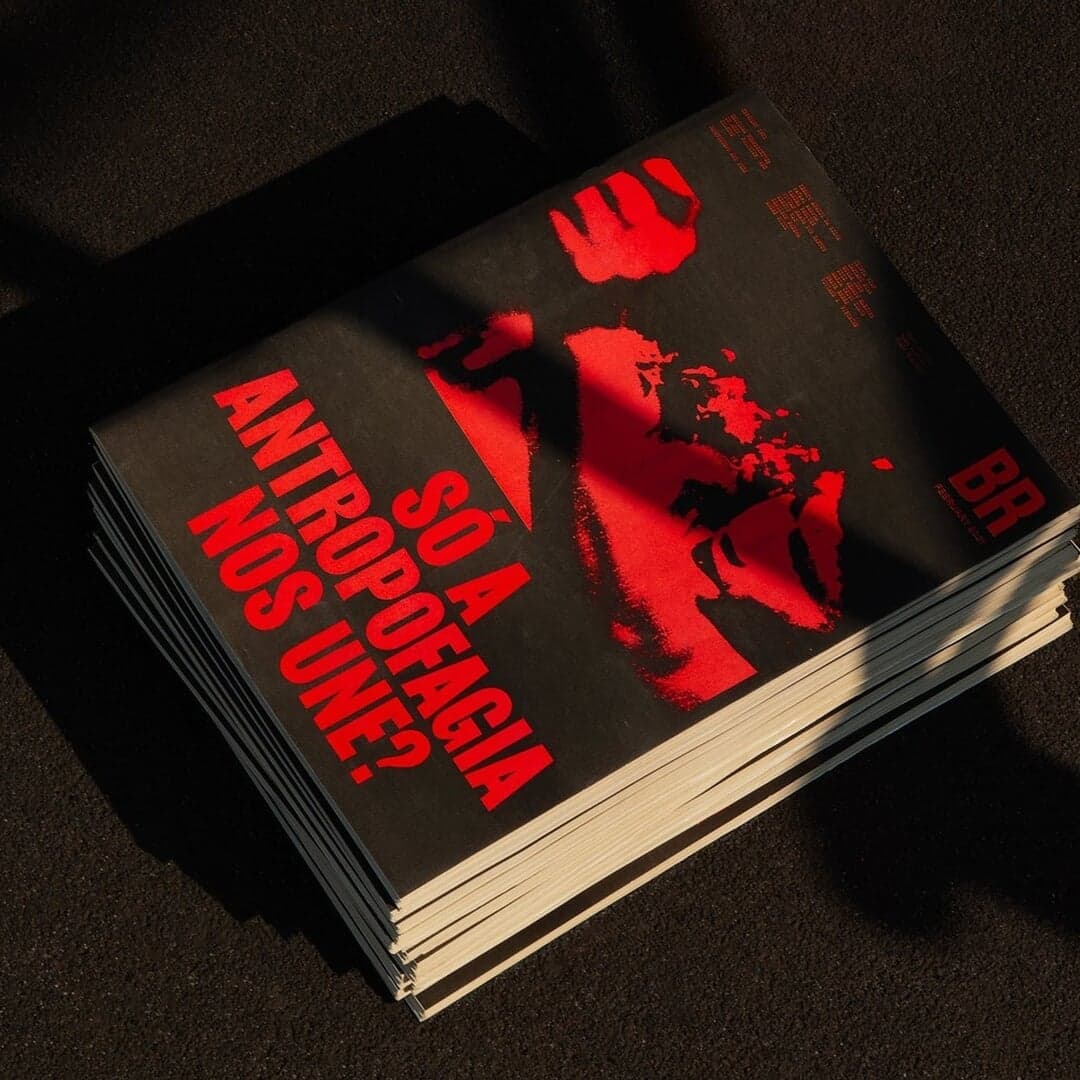
Used by Porto Rocha (2), Caserne, Faena, Blackburn, OMSE, Focus Lab
Set for Carmel, Customer.io, Ellis Butchers, Estrid, Lunge, Raycash, Tech Icons, VEEPS
Cases set in Saans, as credited by the studios in their own writeups.
London design studio Office of Overview created the identity for Human, Zandland's factual storytelling brand focused on first-hand, emotionally direct accounts. The system uses Jeffersonian transcription marks to visualize speech, alongside a bold wordmark, human-shaped asterisk symbol, Saans typography, RGB-inspired colour and restrained motion.
Under After created a new brand identity for Reasoning Project, a venture firm founded by Michelangelo Pagliara and Juhana Peltomaa. The identity balances human warmth with technological credibility through a hand-drawn 'R', refined typography, and motion-led art direction. The design emphasizes restraint, timelessness, and the idea of reasoning as the new scarcity in the AI era.
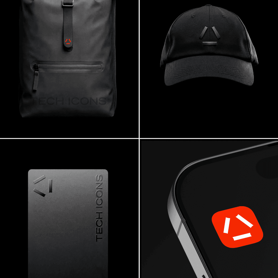
Montreal-based studio Caserne designed the brand identity for Tech Icons, a London-based intelligence platform, treating it more like a gallery than a typical tech media site. The minimalist system uses white as a structural foundation, restrained red accents, and editorial typography to convey clarity and trust. The design balances aesthetic restraint with functional clarity for a busy professional audience.
Brass Hands developed a brand identity for Helix-DB, a graph-vector database, by visualizing its AI infrastructure as industrial machinery. The design uses a restrained palette of oxidised metal tones, the Saans typeface, and system-driven graphics inspired by manufacturing manuals and data storage formats. The result is a cohesive identity that bridges digital and physical applications, emphasizing structure, precision, and materiality.