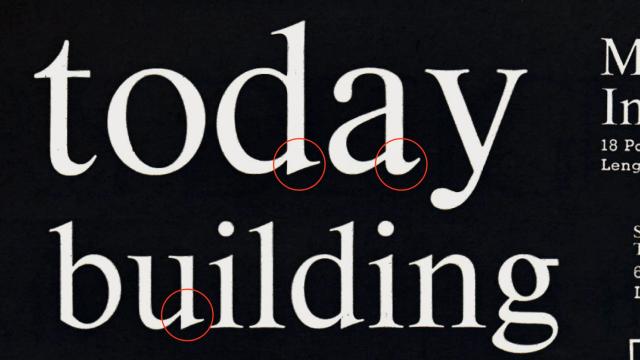
Typeface Design for Displaay Type Foundry
Built for a foundry that needed a typeface that wouldn't upstage its own catalog
Saans is a neutral sans-serif developed by Displaay for internal use, intended to complement the studio's retail library without competing with it. Its character sits within territory the studio describes as universal and understated—comparable to Swiss typefaces in its default, unassertive quality. The design was shaped by the studio's interest in no-style aesthetic graphic design.
Set in Saans
Insights
- The typeface was initiated to satisfy an internal need rather than as a retail product, making it a self-commissioned tool.
- The studio explicitly cited no-style aesthetic graphic design as the ideological context for the typeface's neutrality.
- Displaay reframes descriptors often read as weaknesses—ordinary, pedestrian, boring—as intentional and consistent design properties.
Related articles
Keep exploring
Related cases


