Typeface Design for Displaay Type Foundry’s Serrif Collection
A serif built to match a sans
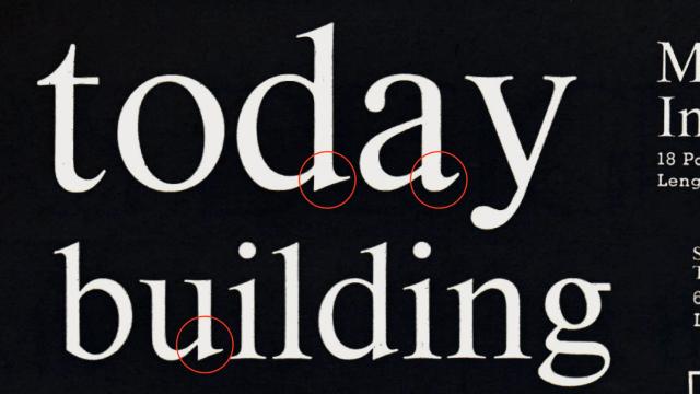
Serrif is a neutral serif typeface by Displaay designed as a companion to their sans-serif family Saans, sharing its construction logic and principles. The design targets readability at smaller sizes and in longer text while remaining functional at display scales. Its vertical stress axis, reduced contrast, and thicker serifs draw from early transitional serifs and static antique traditions.
Insights
- Serrif mirrors Saans in construction principles, creating a matched serif/sans pairing across formally distinct typeface categories.
- Lower contrast and thicker serifs are deliberate choices to sustain legibility at small sizes and in extended reading.
- The vertical stress axis references transitional serif models while the thicker serifs nod to static antique styles, blending two historical periods.
Related articles
Keep exploring
Related cases


