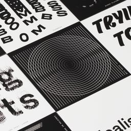
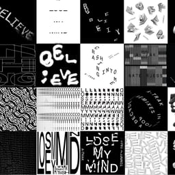
DIA is a design, research and innovation studio based in the French Alps and originally founded in SoHo, New York. Co-founders Meg Donohoe and Mitch Paone lead a practice focused on kinetic identity systems, typographic systems and generative tools, with locations in Chamonix and New York.
Works with Aldine, Antique Legacy, Means, Cooper Light, François Rappo, Söhne, Impact Nieuw, Times Now
Their own site is set in Rand
Designers and creative leads attributed to DIA in press coverage.
Technologies detected on DIA's website.
The Brand Identity’s feature, written by Ritupriya Basu in collaboration with Frontify, explores how contemporary studios like DIA, Madalena Studio, and Block are redefining branding fundamentals through dynamic and flexible identity systems. The article examines projects such as DIA’s generative identity for smlXL, Madalena’s biologically grown logos for Crucible, and Block’s adaptable color system for PICA. It argues that flexibility in branding should be rooted in strategy and authenticity rather than trend-following.
BP&O’s article by Thomas Barnett reviews Only Studio’s brand identity for The Beams, a new cultural venue in East London. The identity is built around the restrained use of Neue Haas Grotesk and a dynamic typographic system reflecting the venue’s industrial architecture and light-filled spaces. Photography and motion elements balance the minimalist design, resulting in a sophisticated and understated visual language.
BP&O’s article by Thomas Barnett reviews DIA’s generative brand identity for tech start-up smlXL. The identity uses a custom p5js-based tool to create dynamic visuals from the brand’s letterforms, producing animated patterns and portraits. The piece praises DIA’s innovative approach while noting potential accessibility concerns and its maximalist, Web 1.0-inspired aesthetic.
This roundup gathers seven expressive and unconventional brand identity projects spanning food, beverages, music, beauty, sport and technology. Featured work includes maximalist restaurant merchandise, AI-assisted festival imagery, custom type systems, a generative p5js identity, and patterns made through repeated printing and scanning.
BP&O’s Richard Baird reviews Studio Dumbar/DEPT’s rebrand for the NN North Sea Jazz Festival, highlighting its dynamic, motion-driven identity that captures the rhythm and energy of live performance. The project uses custom-coded typography and spatial motion to create a fluid, wave-like system that reflects both sound and the festival’s coastal setting. Baird compares it to Collins’ San Francisco Symphony work, noting its structured yet expressive approach to motion branding.
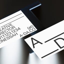
DIA created a new name and flexible generative identity for ADA, the tech-focused marketing agency formerly known as Listen. Inspired by mathematician Ada Lovelace, the system uses modular kinetic typography, equation-like connecting lines and the Office typeface, while a black-and-white palette prioritises ADA's project imagery.
The Brand Identity interviews Actual Source designer Gunnar Harrison about his path into design, the studio’s research-driven approach, and his personal projects. He discusses his bootleg typeface BedTimes, the Lake Effect project inspired by Utah’s Great Salt Lake, and the balance between client and self-initiated work. The conversation highlights Actual Source’s emphasis on research, production, and typographic experimentation.
The article covers Mate Act Now, a global poster campaign initiated by New Zealand designer Chris Flack to mark the 50th anniversary of Earth Day. Over 130 designers and studios worldwide contributed posters promoting climate action, with proceeds from a printed publication going to Red Cross Disaster Relief and Recovery Australia. The project demonstrates the design community’s ability to unite for environmental causes.
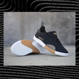
The Brand Identity interviews DIA co-founder Mitch Paone about the studio’s kinetic approach to branding, their new website designed by Bänziger Hug, and their relocation to Switzerland. Paone discusses DIA’s motion-based design philosophy, recent projects for clients like Squarespace and Adidas, and his new teaching roles at ECAL and HEAD – Genève.
The Brand Identity features DIA’s work for Primary, a wellness-focused co-working concept. The generative identity uses color psychology to adapt to moods, activities, and individual personalities, creating a dynamic and evolving brand experience. The project launched with Primary’s first location in New York’s Financial District in 2016, with expansion plans for Flatiron and Toronto.
The Brand Identity interviews DIA’s Creative Director Mitch Paone about the studio’s philosophy, process, and notable projects including Life or Death, Le Mise, and Parallel Projects. Paone discusses DIA’s collaborative culture, concept-driven approach, and the thinking behind their Input/Output website. The conversation highlights DIA’s balance between corporate branding and experimental design rooted in modernist influences.
The Brand Identity features DIA’s refreshed identity for Life or Death, a public relations and management firm rooted in music and expanding into fashion, art, and writing. The new logo combines a heart rate monitor and sound wave motif, symbolizing life, death, and music, while referencing graffiti culture through its tag-like form.