Gretel is an independent branding, strategy, and design studio based in Brooklyn, New York. Known for creating clarity of purpose and communication, Gretel combines strategic insight with striking design to build meaningful brand systems. Led by founder Greg Hahn, the studio partners with global and cultural leaders including The New York Times, Philadelphia Museum of Art, and Hija de Sanchez. Gretel’s multidisciplinary team crafts identities, campaigns, and experiences that define modern brands through precision, storytelling, and visual intelligence.
Works with Fairmount Serif (2), Hess Neobold (2), Garamond Serial, WT Zaft², NYCFC (Local and Express), Ivory Mono
Technologies detected on Gretel's website.

BP&O’s Emily Gosling reviews Gretel’s new identity for the Philadelphia Museum of Art, which reimagines institutional branding through a multi-typeface system and city-inspired design language. The project includes a custom typeface, Fairmount Serif, developed with Ryan Bugden, and revives the museum’s historic Griffin emblem. The rebrand positions the museum as open, inclusive, and deeply connected to Philadelphia’s cultural fabric.
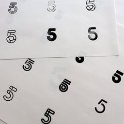
Gretel has evolved Hart Bageri’s identity to scale across more than ten locations, maintaining the bakery’s handcrafted spirit while introducing a flexible visual system. The rebrand introduces a tiered color palette, a new typeface (Basel Grotesk Mono), and a library of analog logos inspired by founder Richard Hart’s tattoo. Collaborations with illustrator Bráulio Amado and photographer Martin Kaufmann reinforce the brand’s artisanal, human-centered ethos.
The Brand Identity interviews Beijing-born, Brooklyn-based designer and art director Zitong Zhao about her multidisciplinary career spanning studios, agencies, and major brands. Zhao discusses her independent projects like #dobservations and her new creative label pioklepiokle, emphasizing authenticity, curiosity, and the value of being a generalist. The conversation explores her creative process, lessons from industry giants, and her philosophy on slowing down in a fast-paced world.
Creative Boom reports on Gretel’s refresh of New York City FC’s identity, marking the club’s tenth anniversary. The Brooklyn-based studio developed a new badge, custom typeface, and visual system inspired by New York’s boroughs and subway heritage. The rebrand emphasizes community involvement, authenticity, and the city’s eclectic energy.
BP&O features Pentagram’s new brand identity for Bacàn, an Italian restaurant in Williamsburg led by partner Andrea Trabucco-Campos. The identity uses a custom typeface, Grand Bacàn Sans, inspired by early 20th-century Italian Futurism and Vorticism, with bold monochrome graphics and motion elements that evoke the energy of a lively dinner party. The project stands out for its typographic focus and fresh take on Italian visual language.
The Brand Identity’s interview, presented by Brandpad, explores how leading studios North, Matchstic, and Gretel manage their portfolios of brands after project completion. Designers discuss strategies for brand handoffs, maintaining consistency, and building flexible systems that evolve with clients’ needs. The conversation highlights the importance of digital tools, clear guidelines, and collaborative relationships in sustaining brand integrity.
BP&O features Gretel’s rebrand for Mode, a data intelligence company seeking to balance approachability with authority. The identity uses a dynamic variable typeface, a shifting grid system, and a layered green palette to convey flexibility and optimism. The result is a clean yet expressive system that repositions Mode as inventive and accessible.
The Brand Identity interviews designers Andrea A. Trabucco-Campos and Martín Azambuja about their first publication under their new imprint Vernacular. Their book, 'Artificial Typography,' explores the intersection of art history, typography, and artificial intelligence, using MidJourney to reinterpret letterforms through the styles of iconic artists. The project reflects on AI’s creative potential and its implications for the future of design.
This interview with designer Maddy Angstreich explores her transition to working at New York-based studio PORTO ROCHA, her experiences with remote collaboration, and her evolving relationship with design, illustration, and coding. She reflects on her education, internships at Gretel, and projects like Laboratory for Suburbia and Food Court Magazine. The conversation highlights her curiosity-driven approach and the supportive culture at PORTO ROCHA.
BP&O features Gretel’s rebrand for WeWork, titled 'Framework', which visualizes the company’s role as a supportive structure for its community. The identity uses a dynamic, modular system that adapts across media, emphasizing type and space rather than a fixed logo. Richard Baird praises the programmatic approach and its reflection of WeWork’s flexible, evolving environment.