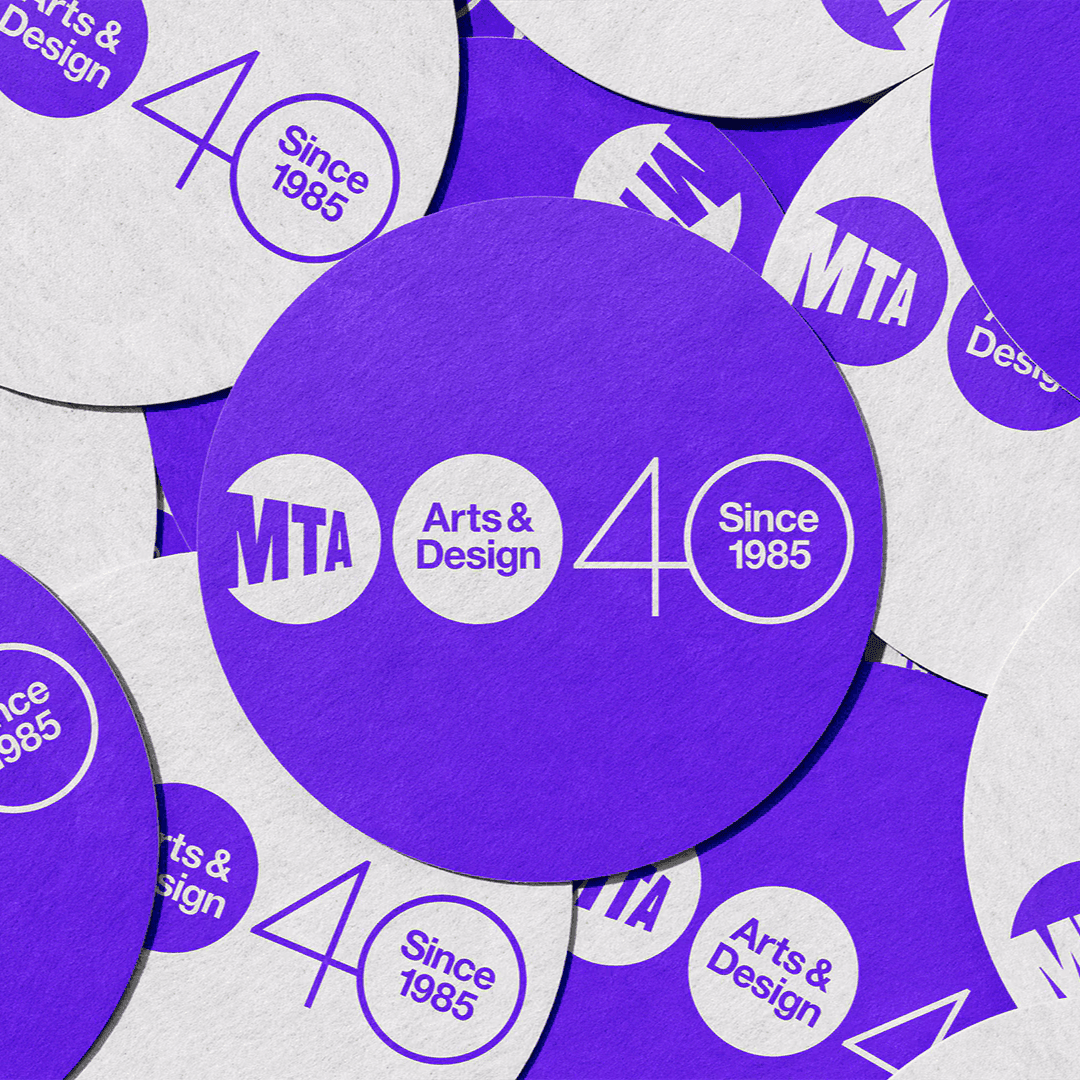
Christian Schwartz’s faithful digital restoration of Miedinger’s original 1957 design — Helvetica before it was Helvetica. View at Commercial Type →
Used by Mast (3), Pentagram (2), Order Design (2), Mucho (2), High Tide (2), Wedge
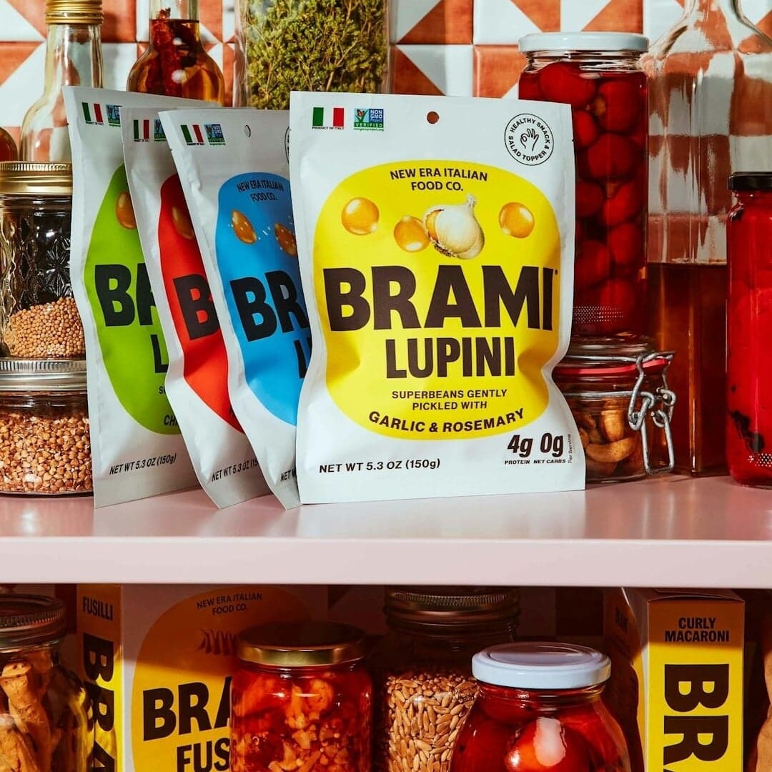
Set for Bloomberg Businessweek (2), Brami, Coho, FasterLines, Firaxis Games, Fredensborg Bolig, Freeform, Knoll, LBDO, Leon Michels
Find design references using Neue Haas Grotesk. Browse project images and studio credits, then follow each case to its source. Typeface names come from catalogued studio writeups; coverage is limited to projects with recorded credits.
Lettering and typefaces for Bloomberg Businessweek
Corridor by Tim Ripper for the MIT Alumni Association
Sign in free to browse more cases using this typeface.
Sign in freeADDRESS ARTS developed the brand identity and packaging for Swiss hydration brand REVIVR, emphasizing minimalist design and precision inspired by Swiss watchmaking. The project included naming, strategy, and packaging design, featuring a direct-printed can and sustainable PR box. The design reflects Swiss restraint and craftsmanship, positioning REVIVR as a refined alternative in the sports drink market.
The article profiles ARKETYPE, a new digital brand system created by Celsey Jones of Studio&Jones in Wales. ARKETYPE reimagines design templates as cohesive brand systems rather than disposable graphics, beginning with a clear creative direction and expanding into a suite of adaptable digital tools. The debut Edit, BLANC, offers over 60 customizable social media templates built in Canva and Figma, reflecting the studio’s minimalist and flexible design ethos.
SMLXL and motion designer Gerard Mallandrich collaborated on the identity for Spatial Festival 2025, an immersive sound event at Berlin’s Funkhaus. The project integrates motion and spatial depth as core design principles, resulting in a kinetic, three-dimensional brand system. Using 3D scans, cinematic techniques, and a clean typographic approach, the identity reflects the festival’s experimental and interactive nature.
The Brand Identity’s feature explores Caserne’s rebrand of Quebec health food retailer Avril, created in collaboration with Studio 15%. The new identity transforms Avril’s existing growth symbol into a modular system, supported by vibrant colors, bold illustrations, and approachable typography. The result reframes health food branding as accessible and joyful rather than austere or intimidating.