Target
Design work for Target, collected from the studios behind it.
- Design cases
- 17
- Studios
- 7
- Latest work added
- Dec 2025
- Brand Identity 6
- Campaign 4
- Advertising 2
- Print Design 2
- Environmental Design 1
Design cases by studio
A preview of 6 cases across 6 studios. The full collection is included with Pro.
WDW (8)
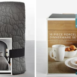
- Packaging Photography Direction for Target Home
- Target Home includes thousands of products, and this project showcases a curated selection of packaging developed by Target’s in-house teams. The design team collaborated with photographers to define a consistent photo style, emphasizing strong horizontal compositions and open space for product details.
Mythology (3)
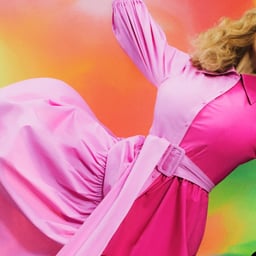
- Anthem Campaign for Target
- Mythology created a national anthem spot for Target that captured the brand’s cultural presence and emotional connection with its guests. The campaign reimagined a beloved Y2K pop song through the voices of real Target fans, celebrating the joy and humor of the Target experience. It served as a unifying expression of 'That Target Feeling' across multiple designer collaborations and seasonal campaigns.
Mother Design (2)
- Visual Identity for Target LA Live
- This project page appears to be unavailable, showing only an error message. No details about the design work or client collaboration are provided.
Stink (1)
- Augmented Reality In-Store Experience for Target and Google
- Stink Studios collaborated with Target, Google, 72andSunny, and Psyop to create Bullseye’s Playground — an immersive in-store augmented reality game powered by Google’s Project Tango. Shoppers explored a 3D world mapped to the store’s layout, interacting with characters and discovering hidden surprises through motion-tracked gameplay.

Imaginary Forces (1)
- Commercial Animation for Target X Christina Aguilera
- Imaginary Forces collaborated with Marvel comic artist Alex Maleev to create a pop art-inspired commercial for Target featuring Christina Aguilera. The project transformed the singer into a comic book superhero to promote her greatest hits album release.

Snask (1)
- Art Direction and Campaign Design for Target’s U.S. Hispanic Market
- SNASK collaborated with Latinworks to create a year-long social media campaign for Target, celebrating Spanish words with nuanced meanings that lack direct English translations. Each campaign featured handcrafted typography and playful photography inspired by the cultural essence of each word, blending traditional Hispanic themes with modern visual storytelling.
See all cases
Sign in to your Pro account to see all 17 cases for Target. Full client collections require Pro.
Sign inDesigners behind the work
Designers and creative leads credited on Target projects in press coverage.
