
The missing bridge between 19th-century American Gothics and 20th-century European neo-grotesques. View at Grilli Type →
Used by Mast, Size, Universal Favourite, Anagrama, Oddity, Des Signes
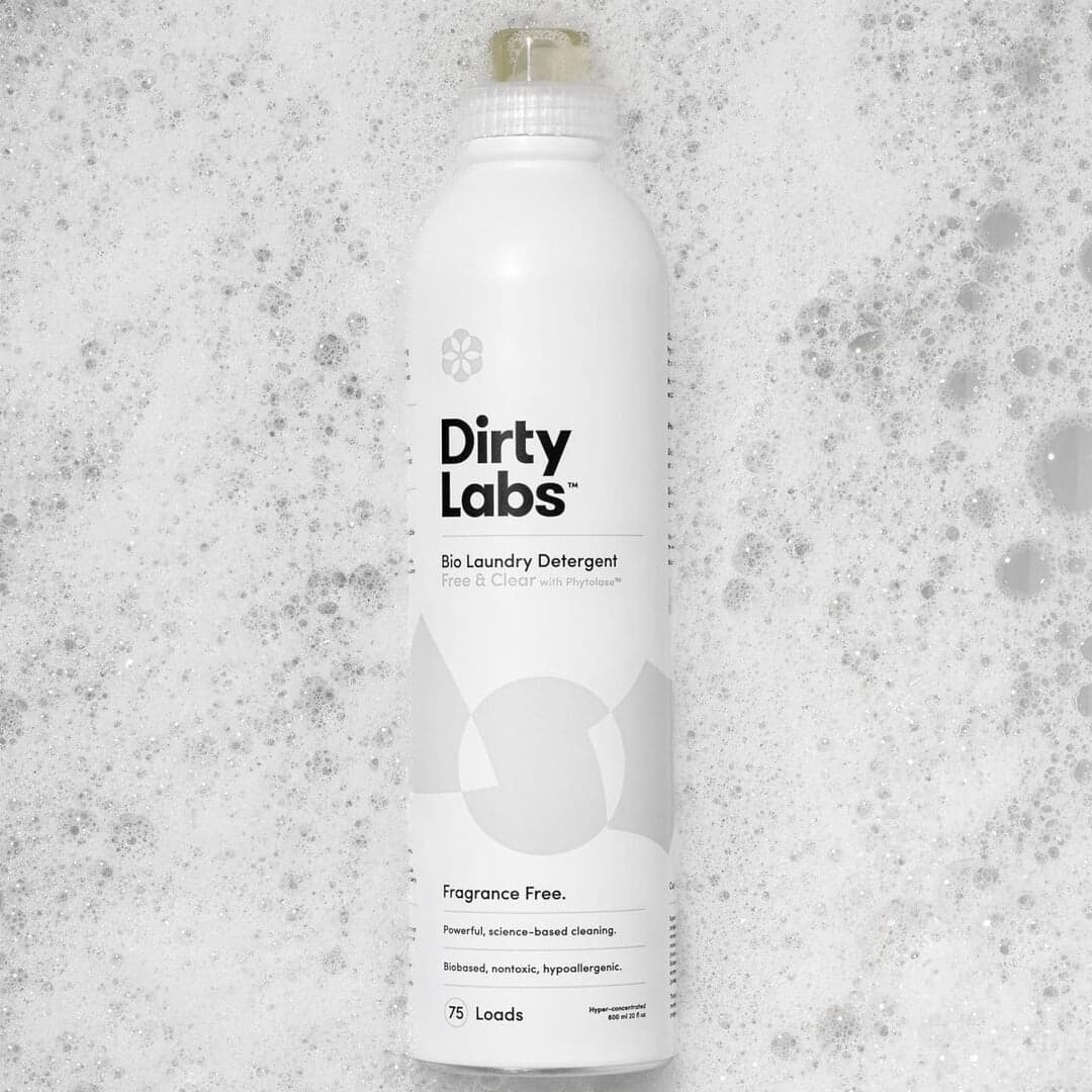
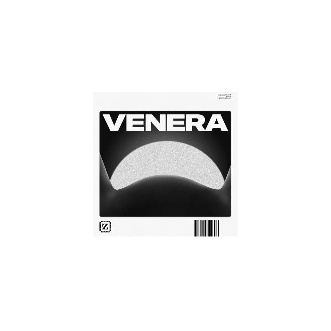
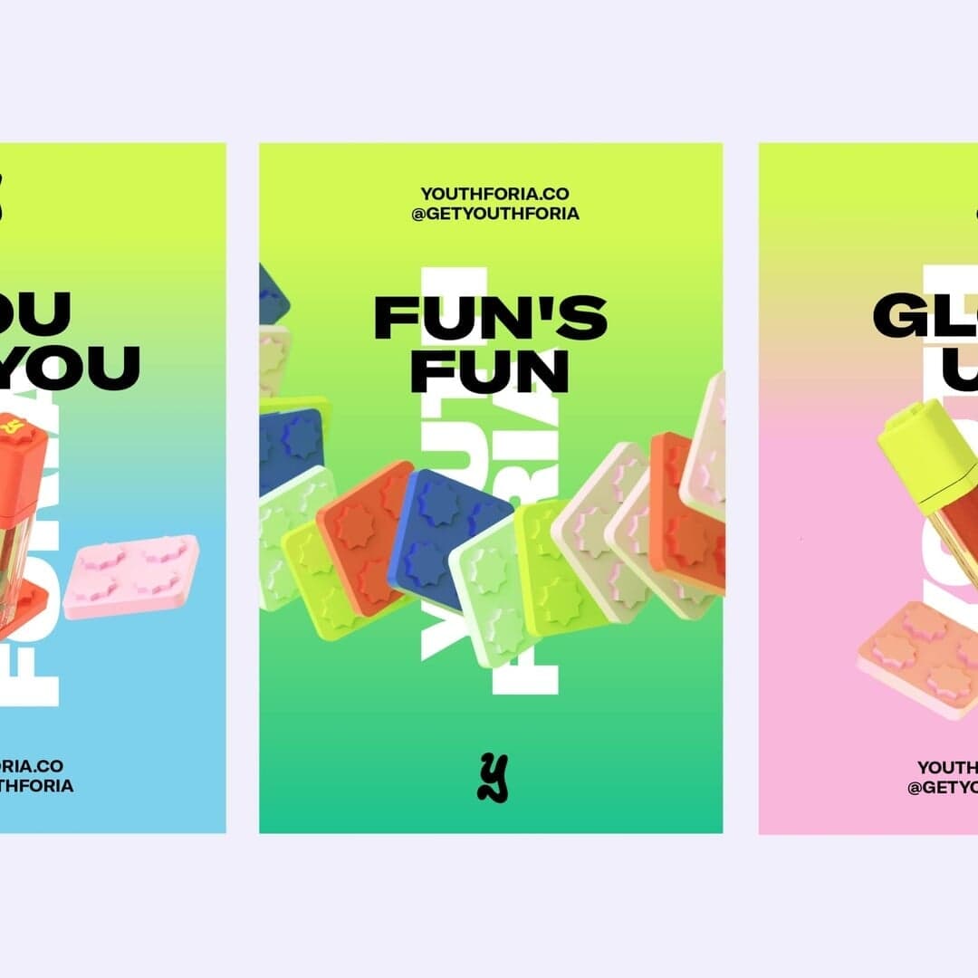
Set for Bibliothèque nationale de France, Dickies, Dirty Labs, Gush, IMMI, Inne, Seabird Technologies, Type Directors Club, Youthforia, Zembo Latifa
Cases set in GT America, as credited by the studios in their own writeups.
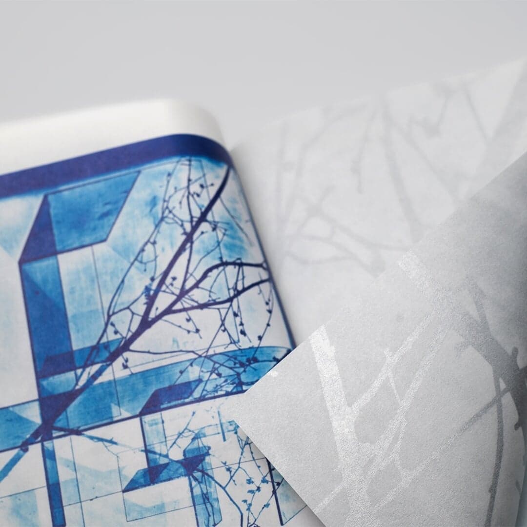
Editorial Design For Épreuves De La Matière Exhibition Catalogue
Sign in free to browse more cases using this typeface.
Sign in freeThe Brand Identity’s article by Poppy Thaxter highlights five standout sans serif typefaces—Neue Montreal, ABC Favorit, Aeonik, Roobert, and GT America—showcasing how they’ve been used across various branding projects. The piece references multiple studios and designers who have applied these fonts in identities spanning fitness, real estate, fashion, and technology sectors. It celebrates the versatility and enduring appeal of sans serif typography in modern brand design.
The Brand Identity features Justified Studio’s rebrand for The Earthshot Prize, a global environmental award founded by Prince William. The new identity centers on a dynamic globe motif and motion system symbolizing collective action, paired with GT America typography for clarity and flexibility. The design balances prestige and accessibility, ensuring the Prize’s mission and winners remain the focus.
Creative Boom profiles Toronto-based studio Vanderbrand, founded by Julie Vander Herberg, known for its strategic, place-rooted brand identities across real estate, hospitality, and cultural sectors. The article explores the studio’s collaborative ethos, research-driven process, and typographic sophistication through projects like Burnaby Lake, Niagara Benchlands, and Together Design Lab. Vander Herberg shares insights on leadership, adaptability, and building meaningful creative practices.
New York brand studio Kingsland rebranded New York Distilling Co.'s rye whiskey line as Jaywalk, creating a new name and visual identity intended to support national and global expansion. The packaging-led identity rejects conventional Old West whiskey imagery in favor of minimal, bold typography informed by New York City street signage, ghost signs, subway tokens, and prohibition-era posters.