Ori
Design work for Ori, collected from the studios behind it.
- Design cases
- 4
- Studios
- 2
- Latest work added
- Dec 2024
- Brand Identity 2
- Product Design 1
- Web Design 1
Design cases by studio
Opposite (3)
- Website Design for Ori Edge Computing Platform
- Opposite collaborated with Ori to design and develop a website that clearly communicates the company’s edge computing platform and its capabilities. The project focused on refining content, enhancing UX/UI, and visually expressing Ori’s brand language through the site and the DNA platform launch page.

- UX and UI Design for Ori DNA Platform
- Opposite collaborated with Ori, a London-based edge computing company, to design the UX and UI for their pilot platform, DNA. The interface was structured to simplify complex technical relationships and provide developers with an intuitive, familiar experience inspired by cloud service tools. The result was a layered, developer-native dashboard that consolidates key information and streamlines onboarding.

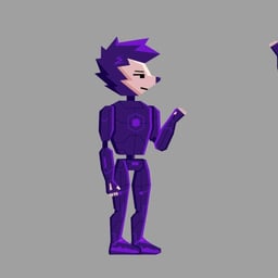
- Character and Brand Design for Ori Edgehog
- Opposite collaborated with Ori, a London-based edge-computing platform, to create the 'Edgehog' character and develop a cohesive brand identity. The character merges the ideas of edge computing and a hedgehog, incorporating robotic elements to appeal to Ori’s developer community. The result is a playful and adaptable mascot that strengthens the brand’s connection with its users.
Red Antler (1)
- Brand Identity and Digital Design for AI Infrastructure Company Ori
- Red Antler developed a bold and imaginative brand identity for Ori, an AI-native infrastructure company redefining how software interacts with hardware. The design embraces vibrancy and wonder, using AI-generated imagery and a symbol representing infinite potential to express Ori’s vision of boundless technological possibility.

Designers behind the work
Designers and creative leads credited on Ori projects in press coverage.
