One bean shapes an entire pantry
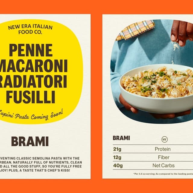
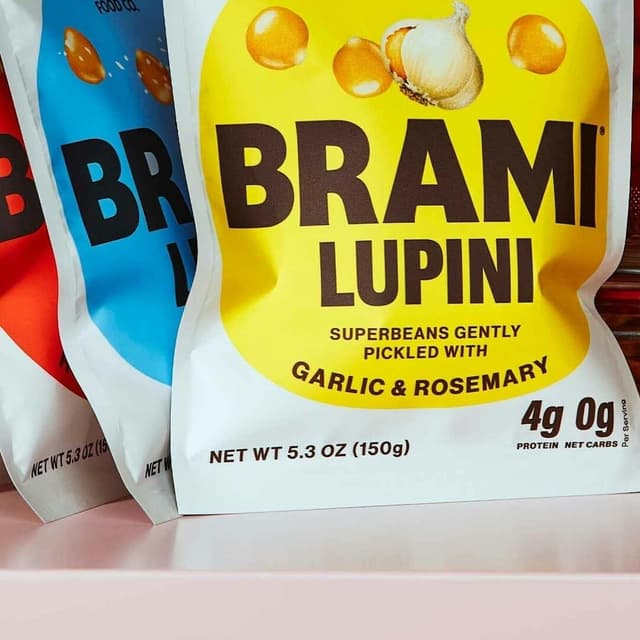
Wedge’s rebrand for Brami launched in 2022, translating founder Aaron Gatti’s Italian pantry ambitions into a system centred on the lupini bean. The bean’s silhouette becomes a modular shape that connects ready-to-eat beans, dips and pasta. Bold benefit information and open white space provide nutritional clarity, while hand-painted ingredients, illustration and Italian-inspired lettering add warmth and appetite. The project paired ethnographic research with strategy, voice, packaging architecture and a broader visual world. Rather than tying the identity to one product format, the design uses a recognisable ingredient reference that can carry across the expanding range.
Set in Marr Sans, Quimby Gubernatorial, Saint Regus, Neue Haas Grotesk
Keep exploring
The article announces the winners of the 2025 DIELINE Awards, one of the world’s largest packaging design competitions. Rollr by Mother Design won Best of Show for its sustainable refillable deodorant packaging, while Wedge and Nice People shared Studio of the Year honors. The piece highlights trends like sustainability, inclusivity, and innovative material use across global packaging design.
The Dieline announced the winners of its 2025 Awards, celebrating excellence in global packaging design. Mother Design’s work for Rollr won Best of Show, while Wedge and Nice People shared Studio of the Year honors. Established received the Editor’s Choice Award for its inclusive and accessible packaging for Tilt Beauty.
Montreal-based studio Wedge launched ‘Collaboration 001,’ a self-initiated partnership with artisanal cidrerie Entre Pierre et Terre to create a duo of natural cidres. The project features hand-drawn, Marimekko-inspired illustrations and tactile packaging that reflect the organic, small-batch nature of the product. The limited-edition release sold out quickly, marking the start of future collaborative editions by the studio.
Montreal studio Wedge redesigned the packaging for Entre Pierre & Terre's exclusive range of artisan ciders from Picardie, France. Inspired by traditional French brasserie signage, the new labels combine handwritten, serif and sans serif type with a warm two-colour palette to convey product information while retaining a premium, handcrafted character. The redesigned range reportedly sold four times faster.