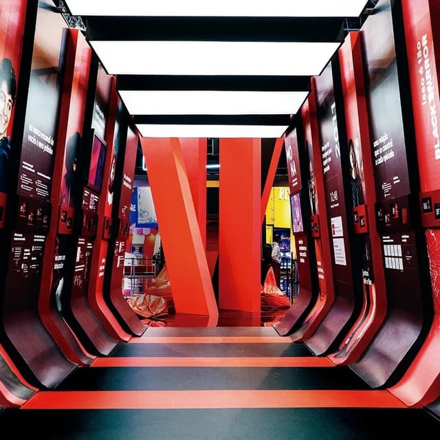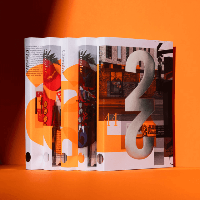
Pentagram collaborated with Netflix to design and launch Queue, a print and digital editorial platform that celebrates the talent and storytelling behind Netflix’s original films and series. Each issue features a unique visual language, blending dramatic photography, dynamic typography, and evolving color palettes to reflect the diversity of Netflix’s content. The project expanded into digital covers and a website, creating a cohesive yet ever-changing editorial experience.
Keep exploring
Amelia Nash reviews Taschen's The Elements of Brand Design, a 496-page survey by Katharina Sussek and Jens Müller covering 110 identity systems. She praises its design, breadth, case studies, and interviews, while arguing that it mistakes visible brand elements for the underlying strategic judgment that creates enduring brands. Nash contends that as AI commoditizes logos, palettes, type pairings, and motion, defensible decisions and point of view become the true source of brand value.
In this opinion piece, designer and writer Elizabeth Goodspeed argues that design writing benefits when designers themselves take part in it. She explores how writing helps designers articulate their thinking, connect their creative and analytical practices, and make design discourse more reflective and nuanced. The article highlights examples like Ray Masaki, Michael Bierut, and Steven Heller to illustrate how writing and design can inform each other.
The article profiles the design and creative direction of A Rabbit’s Foot Issue 14, themed around California’s inventive film culture. Led by Fatima Khan of Broad Peak Studio, the issue blends photography, illustration, and archival materials to create a tactile, cinematic publication. The piece explores Khan’s design philosophy, collaboration process, and the magazine’s commitment to analogue craft and emotional realism.