Mo Design Cases
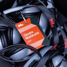
Designers behind the work
Designers and creative leads credited on Mo projects in press coverage.
Designers and creative leads credited on Mo projects in press coverage.
The Dieline’s June 2026 roundup highlights notable packaging and branding stories, including Pirate’s Booty’s redesign, Moozy’s canned milk, and Coca-Cola’s World Cup collectible cans. The article also mentions collaborations like Fortnum & Mason’s biscuit tin with Design Bridge and broader discussions on AI’s role in design. It serves as a snapshot of the month’s most talked-about creative projects and industry trends.
Mountain Dew has released a limited-edition commemorative can that celebrates its 1948 origins. The design features a deep forest green palette, gold accents, and an engraving-style illustration reminiscent of 1940s national park posters. The nostalgic packaging is being sold for five cents on TikTok Shop as part of a heritage-driven campaign.
Mexican studio Brands&People refreshed the identity of Moctezuma, a cement and concrete brand, drawing inspiration from Mesoamerican architecture and glyphs. The new system extends across packaging, vehicles, digital platforms, buildings, and merchandise, bringing cultural pride into an industrial category.
The Dieline article by Chloe Cordover highlights Moozy’s unconventional decision to package milk in cans, marking a bold move in beverage packaging. The piece reflects on the evolution of milk containers and positions Moozy’s approach as a fresh, modern take on a classic product category.
Watson created the name and brand identity for The Moraine, a residential community in Colorado’s Rocky Mountain foothills. The identity blends rugged natural textures with modern simplicity, using a jagged rock-and-house logo, angular typography, and a cohesive icon set. Photography and CG renders combine to express both the outdoor lifestyle and architectural aspects of the development.
Mondelez has refreshed the branding and packaging for its long-standing Newtons snack line, formerly known as Fig Newtons. The redesign by Dragon Rouge aims to modernize the look and appeal to younger consumers while emphasizing the simplified 'Newtons' name.
BP&O features Pentagram’s brand identity for Tokyo’s Museum of Narratives (MoN Takanawa), designed by partners Luke Powell and Jody Hudson Powell. The identity centers on a spiral motif inspired by the museum’s architecture and inaugural exhibition, symbolizing cyclical storytelling and cultural evolution. The project combines clarity, playfulness, and motion, using Walter Neue type and a bright red, blue, and green palette to express inclusivity and energy.
UnderConsideration’s Brand New briefly spotlights a new logo and identity for Belgian furniture retailer Bedimo, created by design studio Nemesis. The post is categorized as a 'Spotted' entry, offering a quick mention of the rebrand rather than a full review.


