Untitled Case
Inverted contrast meets garalde italics
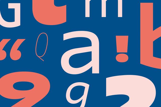
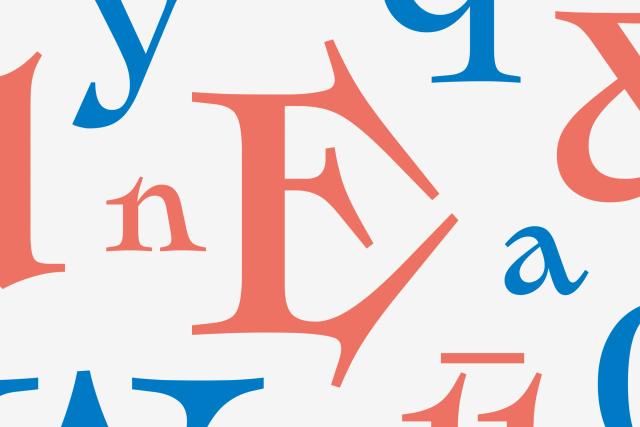
Gardez is a serif display typeface designed by Rafael Saraiva at Dalton Maag in 2022. It applies inverted stroke contrast to a bold, garalde-style italic structure, producing an expressive tension between classical form and unconventional weight distribution. The family supports Latin script across more than 800 languages and includes OpenType features such as small caps, alternates, and multiple numeral styles.
Set in Gardez
Insights
- The design concept rests on a single structural decision: reversing the expected thick-thin contrast within an established italic genre rather than introducing new letterform shapes.
- Despite its display orientation, the family's 800-language Latin coverage indicates substantial multilingual engineering scope.
Related articles
Keep exploring
Related cases