Swiss type foundry publishing retail typefaces and designing custom type and wordmarks for clients, including TikTok Sans and Pinterest Sans.
Works with TikTok Sans
Designers and creative leads attributed to Grilli Type in press coverage.
Creative Boom’s May 2026 roundup highlights six notable new typefaces from global foundries. The selection spans expressive scripts, historical revivals, and variable fonts, showcasing innovation from designers at Grilli Type, Monotype, Typofonderie, 205TF, Sproviero Type, and Dalton Maag. The article celebrates the diversity and technical evolution of contemporary typography.
Creative Boom’s January 2026 roundup by Tom May highlights standout new type releases from Grilli Type, W Type Foundry, Frere-Jones Type, and The Northern Block. The featured fonts balance functionality with personality, ranging from pragmatic corporate sans serifs to revived historical scripts. The article celebrates how modern type design merges utility, warmth, and historical awareness.
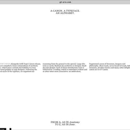
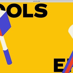
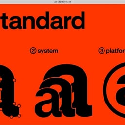
The article introduces GT Era, a new variable typeface from Swiss foundry Grilli Type, designed by co-founder Thierry Blancpain. Inspired by 19th-century grotesks and early Bauhaus aesthetics, the typeface balances warmth and functionality for both display and text use. The launch includes a primary-coloured website showcasing the typeface’s expressive yet practical design approach.
Creative Boom’s September 2025 roundup by Tom May highlights eight new typeface releases that blend historical inspiration with modern functionality. The article showcases global multiscript projects, expressive display fonts, and modular experiments from leading foundries such as TypeTogether, Grilli Type, and Lineto. It emphasizes the ongoing trend of balancing personality and utility in contemporary type design.
BP&O features Manual’s brand identity for North Road, a global content studio founded by Peter Chernin. The identity centers on a custom serif typeface developed with Grilli Type and a motion system inspired by film title sequences. The work extends across digital and print applications, combining cinematic typography with tactile materials to convey authority and craft.
Grilli Type has launched GT Flaire, a new typeface family described as the 'mullet of typefaces' for its balance of professionalism and playfulness. Designed by Reto Moser and co-founded by Thierry Blancpain, the project includes a witty, interactive launch website exploring the tension between 'business and pleasure'. The release reflects Grilli Type’s irreverent approach to corporate design and typographic experimentation.
Creative Boom’s November 2024 roundup by Tom May highlights eight new typefaces from leading independent foundries. The selection spans from expressive display fonts to versatile workhorse families, showcasing the innovation and maturity of contemporary type design. Each release demonstrates a balance between historical inspiration and modern functionality.
Episode 126 of The Spark podcast from Creative Boom reflects on Luigi Carnovale’s insights into reinvention and authenticity in the creative industry. The episode also covers D&AD’s 2024 creative trends, Headspace’s AI chatbot Ebb, and highlights independent type foundries to watch in 2025. It concludes with a preview of an upcoming interview with Lisa Smith of JKR and a creative tip about embracing vulnerability.
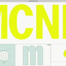
PRINT Magazine’s Type Tuesday feature introduces GT Mechanik, a new monospace-inspired type family from Grilli Type designed by Shiva Nallaperumal, Reto Moser, and Noël Leu. The article describes the typeface as a reaction against the speed and noise of digital communication, celebrating constraint, texture, and deliberate design. GT Mechanik includes three styles—Mono, Semi, and Poly—each offering a distinct voice within the same mechanical DNA.
SUPERHAUS created a fiery and playful brand identity for LULU, a new Pan-Asian restaurant in Bondi Beach and sister to Sydney’s Raw Bar. The identity draws on Japanese and beachside influences, using GT Maru typefaces and a bold, symmetrical wordmark to convey warmth and rhythm. The project balances cultural references with a vibrant visual system across print, signage, and digital applications.
BP&O features Wolff Olins’ new branding for the New York Botanical Garden, a vibrant and flexible identity that balances Bronx boldness with organic lushness. The rebrand introduces a bespoke typeface, NYBG Gothic, and a bold color palette inspired by the garden’s diverse landscapes. The project reflects NYBG’s renewed global mission under new leadership and positions it as both a cultural and environmental leader.
The Brand Identity highlights Placeholder’s visual identity for Crown Affair, a slow-paced haircare brand founded by Dianna Cohen. Led by Sho Shibuya, the design emphasizes tactility and calm through soft-green recyclable packaging, a custom typeface by Grilli Type, and bespoke paper materials by Colophon. The identity reflects the brand’s ‘Take Your Time’ mantra and commitment to thoughtful craftsmanship.