Two-axis variable font built around a melting-chocolate concept
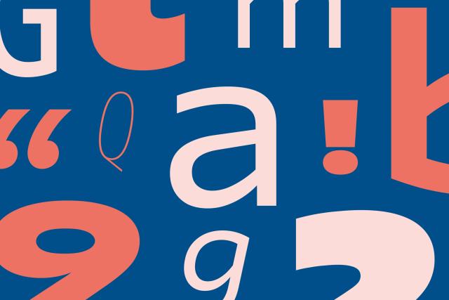
Caraque is a display sans-serif typeface designed by Pablo Gámez at Dalton Maag, developed between 2021 and 2026. Its concept draws from melting chocolate, informing a playful visual character suited to impactful display contexts across diverse media. The variable font ships with two axes—Weight and Melt—enabling a range from grounded to distinctly humorous expression.
Set in Caraque
Keep exploring
Kenshō has refreshed the identity of Thai bicycle brand Nich to support its international expansion. The project focuses on evolving the brand’s heritage through a refined wordmark, thoughtful typography system, and culturally grounded art direction. The result balances Thai authenticity with global appeal, positioning Nich for success in new markets.
The Creative Boom article by Tom May outlines nine common warning signs that a client project may be heading toward chaos, as shared by experienced creatives. It highlights issues such as vague briefs, disappearing clients, unclear budgets, and conflicting feedback, offering practical advice on how to address each scenario. The piece emphasizes proactive communication, structured processes, and knowing when to walk away from problematic projects.
Creative Boom’s March 2025 roundup highlights six innovative new typefaces from leading foundries and designers. The article explores how each font—ranging from Damien Gautier’s Naancy to Positype’s Boom Sans—demonstrates creativity, accessibility, and cultural expression in contemporary typography. It also notes the evolution of Atkinson Hyperlegible Next as a major step forward in inclusive design.